WORKPLACE
Marshberry Corporation
With sensitivity to spatial adaptability, brand identity, and user experience, Marshberry’s headquarters is evidence of beauty in minimalism.
—Always By Design
With sensitivity to spatial adaptability, brand identity, and user experience, Marshberry’s new headquarters is evidence of beauty in minimalism.
—Always By Design
With sensitivity to spatial adaptability, brand identity, and user experience, Marshberry’s new headquarters is evidence of beauty in minimalism.
—Always By Design
With sensitivity to spatial adaptability, brand identity, and user experience, Marshberry’s new headquarters is evidence of beauty in minimalism.
—Always By Design
With sensitivity to spatial adaptability, brand identity, and user experience, Marshberry’s new headquarters is evidence of beauty in minimalism.
—Always By Design
With a clean refreshed brand, Marshberry Corporation sought a corporate headquarters that would embrace its messaging, attract and retain new talent, and encourage a culture of collaboration. Previously set on multiple floors of a traditionally designed building with challenging interior spaces, Marshberry valued both form and function for their new space, particularly desiring spatial flexibility and versatile aesthetics.
With a clean refreshed brand, Marshberry Corporation sought a corporate headquarters that would embrace its messaging, attract and retain new talent, and encourage a culture of collaboration. Previously set on multiple floors of a traditionally designed building with challenging interior spaces, Marshberry valued both form and function for their new space, particularly desiring spatial flexibility and versatile aesthetics.
With a clean refreshed brand, Marshberry Corporation sought a corporate headquarters that would embrace its messaging, attract and retain new talent, and encourage a culture of collaboration. Previously set on multiple floors of a traditionally designed building with challenging interior spaces, Marshberry valued both form and function for their new space, particularly desiring spatial flexibility and versatile aesthetics.
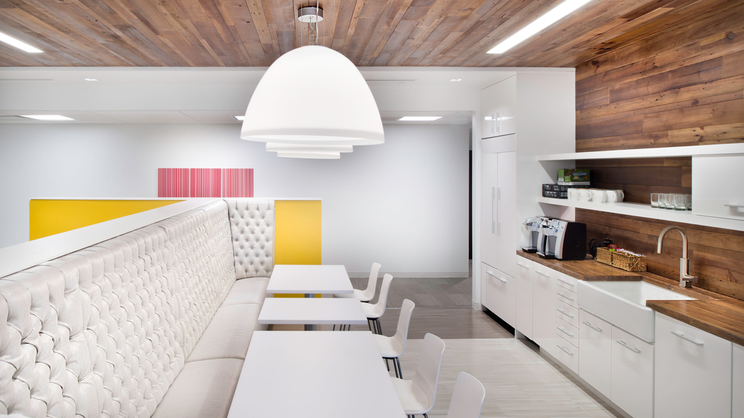
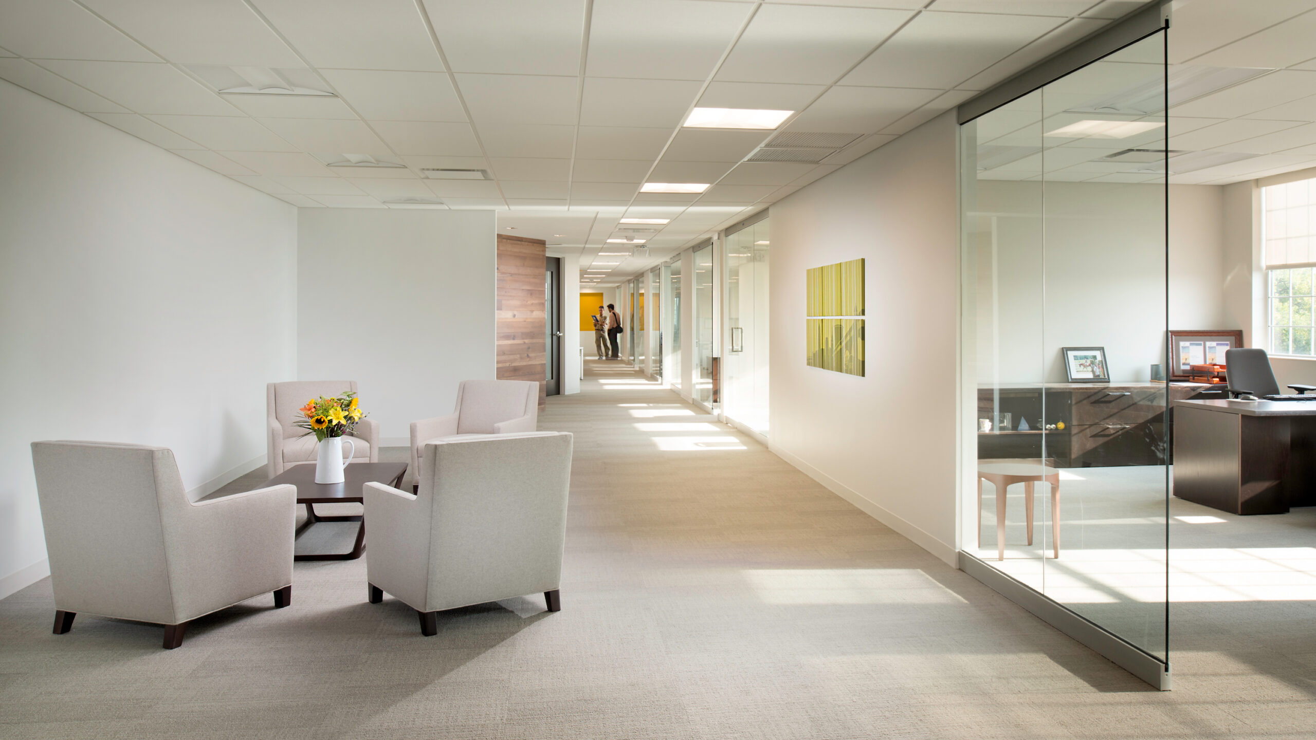
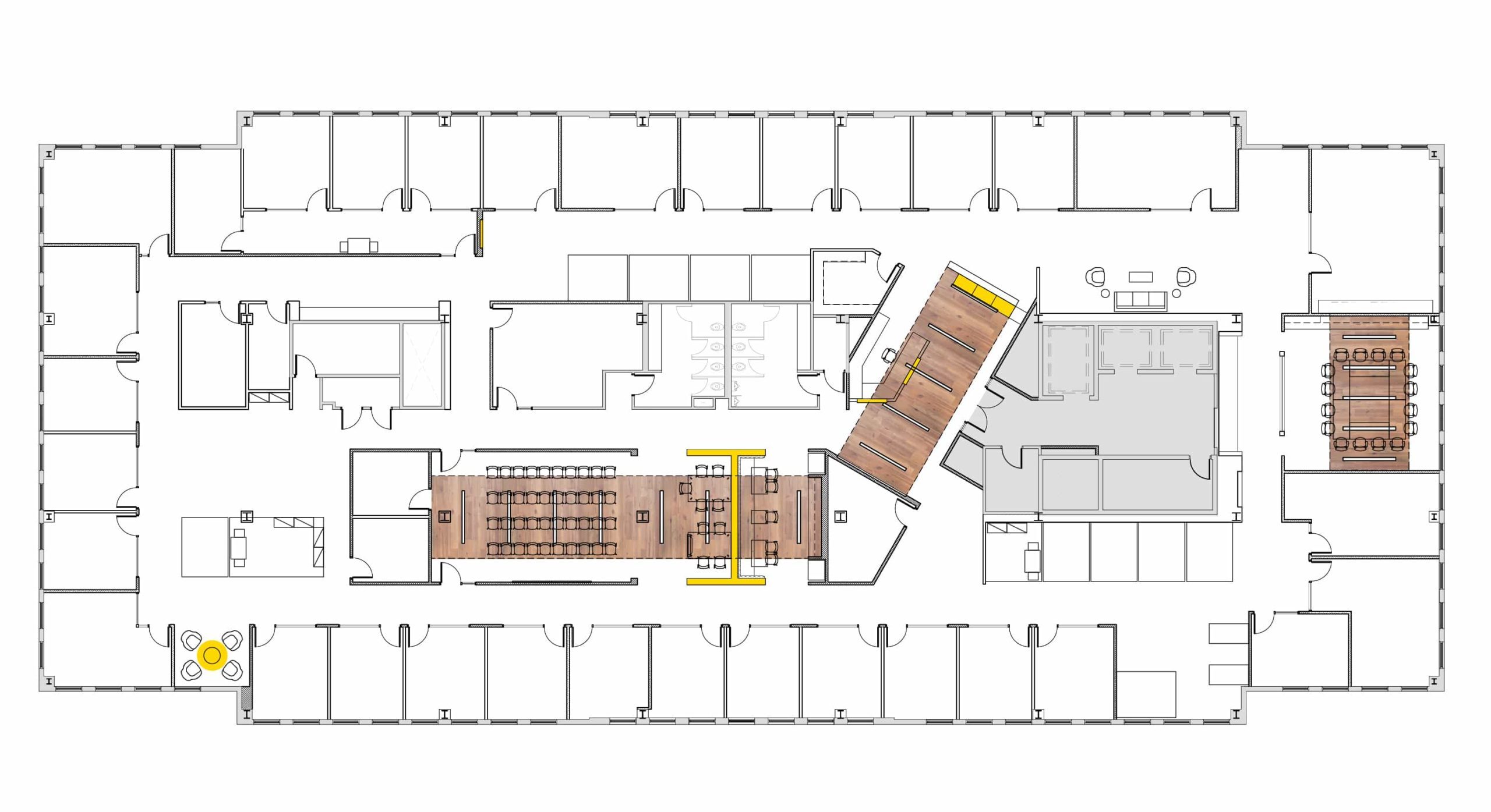
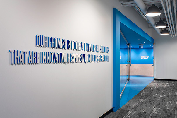
The new space boasts a vivid minimalist palette, based on clean neutrals and measured pops of color and texture. Brilliant yellow manifests in key spaces as a means of wayfinding, such as the vibrant acrylic panels cloaking the reception desk. Wrapping reclaimed wood elements similarly guide users through the space. The locally sourced recycled wood alludes to Marshberry’s own journey, as a material entering a new life cycle.
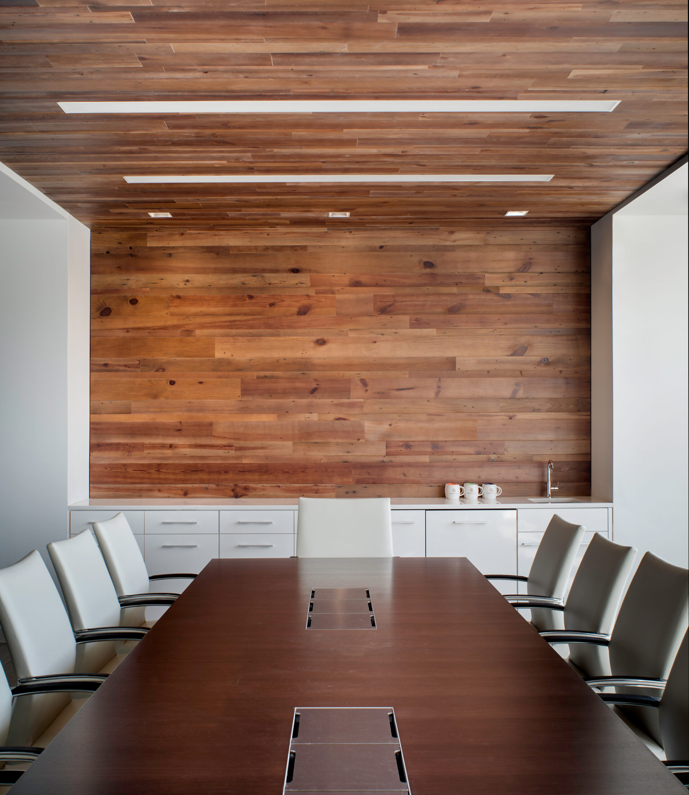
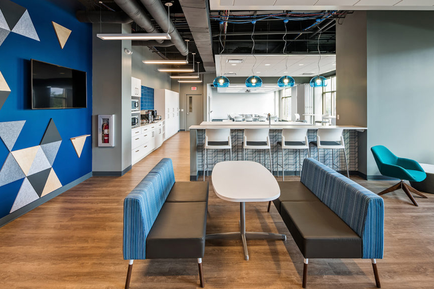
Locally crafted with a blend of Pine and Oak, the warm recycled wood alludes to Marshberry’s own journey as a material entering a new life cycle. Lighting is seamlessly integrated into the linear wood ceiling and elegant pendants are suspended over gathering spaces for a more intimate feel. The communal dining features a sliding glass wall for flexibility along with vibrant art and upholstery drawn from the bold Marshberry logo to enliven the gathering space. With sensitivity to spatial adaptability, brand identity, and user experience, Marshberry’s new headquarters is evidence of beauty in minimalism.
CERTIFICATIONS & AWARDS
IIDA Ohio/Kentucky Chapter
Best Small Corporate Office Interior Design
IIDA Ohio/Kentucky Chapter
Best Small Corporate Office Interior Design
CLIENT
Marshberry Corporation
LOCATION
Woodmere, OH
SIZE
17,900 SF
SERVICES
Architecture
Interior Design
