September 30, 2015

Shortlists Announced! Bialosky Team in Two Big Interviews Today (Good Luck!)

Today is a busy day for the Bialosky team as we have two interviews today both close to home and away.

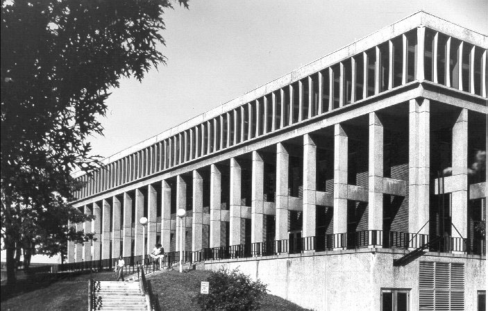
The first is the renovation/ rehabilitation of Taylor Hall at Kent State University, which today houses the College of Architecture and Environmental Design (CAED), the College of the Arts, the School of Communication Studies, and the May 4th Visitor Center. With the CAED moving to their new building in 2016, Taylor Hall will namely house the School of Visual Communications Design (VCD).

Taylor Hall Kent State University

Taylor Hall, the 1960's building set on "Blanket Hill", on the National Register of Historic Places, will be rehabilitated for Kent State's VCD program. The project is seeking LEED Silver Certification.

Shortlisted teams are:

  • Bialosky + Partners Architects
  • bshm architects
  • Payto Architects
  • Van Auken Akins Architects

The second interview for Bialosky today is in New York, for the renovation of the historic Carnegie Library in downtown Binghamton. Constructed in 1903 and listed on the registry of Historical Buildings, Carnegie Library will be renovated to house SUNY BROOME Community College's Hospitality Center.

carnegie

Over a century old, the Carnegie Library will find a new life as SUNY BROOME's downtown Binghamton campus, housing their Hospitality Program.

We are excited to team with Holt Architects for this endeavor! The architectural firm out of Ithica are also highly experienced in Higher Education projects, and ranked as one of Central New York's Best Places to Work (Sounds like we'd make a good team!)

Good luck to all of you today!

November 8, 2013

Complicity and Conviction

I hope to discuss, in a series of posts, books that have had a significant influence on how I think about and practice architecture. Paraphrasing Thomas Edison, I see architectural design as one part inspiration and ninety-nine parts decision making.  The three books I plan to discuss

  • Complicity and Conviction: Steps toward an Architecture of Convention by William Hubbard, 1980
  • Natural Capitalism: Creating the Next Industrial Revolution by Paul Hawken, Amory Lovins, and L. Hunter Lovins, 1999
  • Genius Loci: Towards a Phenomenology of Architecture by Christian Norberg-Schulz, 1979.

address the ninety-nine percent part of the equation.  On what basis do we make all of the decisions that ultimately determine what a building looks like, how it is used, and how well it functions? William Hubbard, one of my undergraduate studio professors, described what he called concatenation in design.  It occurs when the decision made to solve one problem solves many others and especially when that decision starts a cascade of decisions that simplify what was originally a complex set of problems in design.
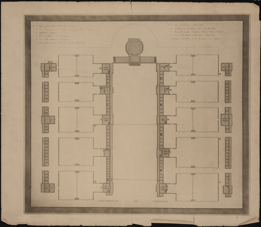
Plan for University of Virginia “lawn” designed by Thomas Jefferson

I did not pick up the first book I want to discuss, Complicity and Conviction, until I was in graduate school. In fact I didn’t know it existed until I saw it at the architecture school library used book sale and saw Bill’s name.   My understanding of the book is no doubt influenced by what Bill taught me in Studio. The book is in part a response to Robert Venturi’s Complexity and Contradiction in Architecture, 1966.  Venturi was criticizing modern architecture and advocating for post modernism, Hubbard was criticizing post-modern architecture and advocating architecture that gives “. . . testimony to human values. . .” Conventional architecture “. . . persuades us to want it to be the way it is.” The book explores several potential models for an architecture of convention:

  • The Scenographic Style
  • Games
  • Typography
  • and the Law

The Scenographic Style encompasses much of American architecture of the late nineteenth and early twentieth centuries: the work of H.H. Richardson; the Shingle Style of McKim, Mead & White and John Russell Pope; and the Collegiate Gothic Style of Goodhue and others.  He helps us to understand a little more about the design and drawing (sketching) technique that was used at the time.  While these buildings make good pictures, he finds that they lack meaningful depth, ultimately leaving us unsatisfied. Games are a set of rules that all of the participants agree to abide by.  They are a scrim that allows us to be judged not as a whole person but only by the way we play the game. We accept the rules not because they have to be the way they are, but because they provide a concrete framework in which we can enjoy play.  We are complicit, agreeing not to question why the rules are what they are. Typography like architecture can provide a Chinese box of levels of understanding.  You do not need to be a typographer to look at a page of text and have a feeling about whether you like the way it looks or how readable it is, but practitioners make very conscious decisions about the shape of the page, the size of the margins, the space between the lines of text, etc.  Those decisions are usually made consciously, intending to have an effect on how we feel about the look of the page.  The reader has the ability to find reasons for wanting it to be the way it is at many different levels.  More understanding brings more reasons to want it the way it is. This depth is one of the aspects that an architecture of convention should have. The Law is perhaps the most interesting model that is discussed. His discussion of the law is limited to the way in which judges construct rulings about which we can feel conviction.  The best judgments interpret previous decisions in ways that are consistent with what is currently deemed to be right and fair (this changes over time) and allow enough room for further interpretation in future cases.  The judge “forged a new link in the chain” of the law, when he does this.   Finally the author analyzes two projects that he believes achieve an architecture of convention in different ways.  The first example is the University of Virginia “lawn” designed by Thomas Jefferson in the early nineteenth century and the second is Kresge College at the Santa Cruz campus of the University of California designed by Moore Lyndon Trumbull Whittaker in the early 1970s. The author discusses how each of these projects achieves his six attributes of an architecture of convention:

  1. Slippage – is the link between the form and its possible uses somewhat ambiguous?
  2. Contingency – does it have features that make sense only because they feel right?
  3. Are there multiple possible interpretations of the intention?
  4. Does it call other buildings to mind?
  5. Are the analogies relevant?
  6. Does it make us want it to be as it is and not otherwise?
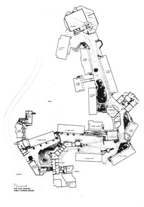
Plan of Kresge College at the Santa Cruz campus of the University of California designed by Moore Lyndon Trumbull Whittaker

When I first read this book it resonated with some of the discussions we had in the Studio (i.e.  The modern world has given us many more options for the materials we use and the way in which we put them together, and air conditioning allows us to ignore many of the implications of how the form, orientation, and construction affect the comfort of the occupants.)  The modern world has given the architect more “freedom”.  We are allowed to ignore many of the “rules” that used to govern the way we designed.  The architectural “rule” books by Vitruvius, Alberti, and Palladio no longer apply. This has left us searching for buildings that improve upon the architecture of the past.
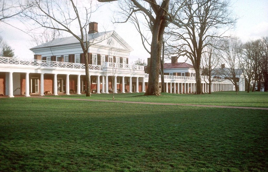
University of Virginia “lawn” designed by Thomas Jefferson

Bill leaves us with a charge: “But to realize that this situation has been brought about by our own actions is to realize that it is within our power to rectify it.  It is possible, even now, to produce architecture that gives testimony of human values. . . . We must find ways – in all areas of life – to engender in ourselves conviction about human values.  We must find ways to convince ourselves anew of human possibility.”

July 22, 2013

Christy’s History Lesson: Florence Architecture

Florence, Italy is an absolutely beautiful city and commonly known as the birthplace of the Renaissance. Having lived there for half a year and being immersed in the rich culture, art, and architecture every day, I can honestly say that it is one of the most beautiful places I have ever seen. If you have been lucky enough to travel to this amazing city hopefully the buildings and sites that I share today will bring back amazing memories, and if you have not had the chance to go, I hope this will inspire you to do so! Through my studies at Kent State University, I learned about the Basilica di Santa Maria del Fiore, or more commonly referred to as the Duomo (cathedral).  Seeing this building in person was far more breathtaking than looking at the pictures in my architecture books, which did not do it any justice. On our first walk around the city we came upon the Duomo, and I can honestly say my friends and I stood there speechless while admiring this famous piece of architecture. The Duomo was completed in 1436 by Arnolfo di Cambio, and still towers over the city today with its iconic architectural features.

Italian Architecture

Overlooking Florence, Italy, where our intern, Christy, studied abroad.

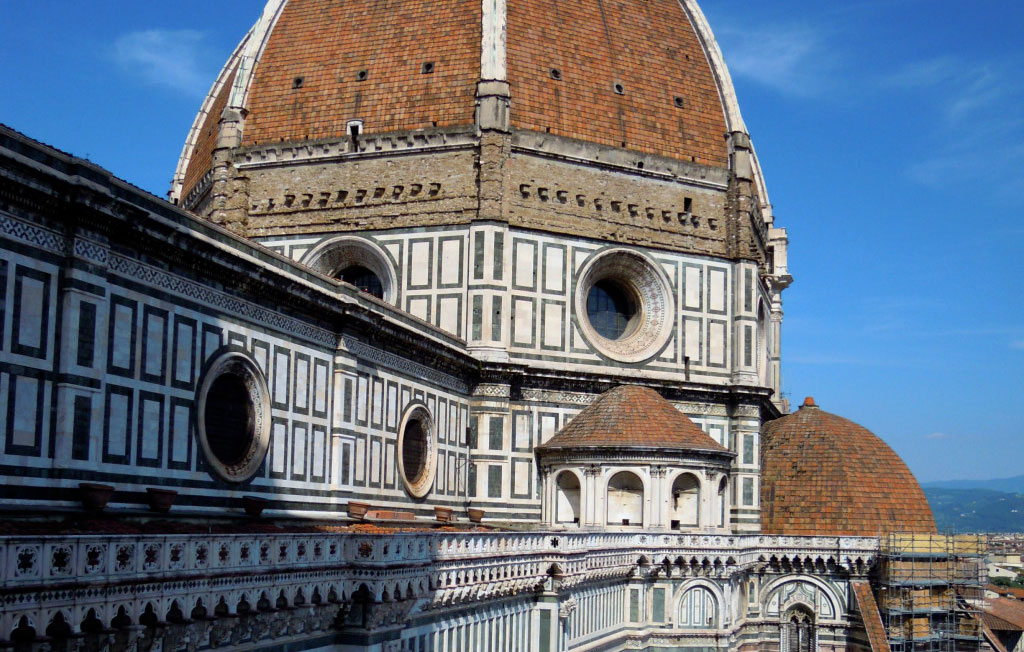
The dome, engineered by Filippo Brunelleschi, still remains as the largest brick dome ever constructed. On one of my last days in Florence, I had the opportunity to climb to the top of the Campanile (bell tower) opposite the dome and was able to admire the immense amount of beautiful details up close that went in to the architecture and ornament of the façade and dome.

Italian Architecture Duomo

Christy climbed to the top of the Campanile to take this shot of the dome.

My favorite part of the Duomo was the main portal’s massive bronze doors featuring scenes from the life of the Madonna. The doors date to around 1900 and offer a very grand entrance into the building. As you can see, I had to take a picture to represent the scale of these amazing doors!

Italian Architecture

Entry doors featuring the life of the Madonna.

A few of my other favorite places to visit in Florence were the piazzas (city squares), such as Piazza della Repubblica and piazza della Signoria. I was lucky enough to be in Florence during the celebration for the 150th Anniversary of the Unification of Italy. Viewing monuments such as the Arcone designed by Micheli and inspired by Florence Renaissance architecture or the impressive town hall of the city, Palazzo Vecchio, lit up with the colors of the Italian flag and feeling the pride that everyone celebrating on the street had for their country was a once in a lifetime experience. Italian Architecture I could go on forever about all of the amazing architecture and unique cultural experiences that I had in Florence, and I hope to return one day to this beautiful city. Italian Architecture As parting words, if you have been to Florence and missed this gem, or if I have inspired you to someday visit, you must go to Gelateria dei Neri for what I am convinced is the most wonderful gelato in the world! I strongly recommend the dark chocolate and pistachio! Italian Architecture

June 27, 2013

BPA Puts Masonry + Moisture to the Test

Rainstorms can send a shiver up an architect’s spine - especially as a designer of brick buildings. Masonry is naturally porous. It can absorb a large amount of water, compromising the bond strength between the mortar and the masonry unit. Not only that, but it can easily discolor the building’s facade. Recently Bialosky + Partners Architects had a visit from Professional Products of Kansas, offering an interesting potential solution. Professional Water Sealant & Anti-Graffitiant is a “dual-purpose” silicone water repellent which provides an invisible protection from graffiti and moisture damage. The spray-applied repellent is recommended for brick, concrete, granite (and most horizontal surfaces) and will add years of weatherproofing protection to new or existing structures. [youtube]http://www.youtube.com/watch?v=leKRODMRABs[/youtube] This silicone repellent can be applied as a single coat to protect the building from moisture, and an additional coat will protect the building from graffiti. The key with graffiti protectant is it can be non-sacrificial or sacrificial. A non-sacrificial protectant does not dissolve once graffiti is washed away, meaning there is no need to reapply. [youtube]http://www.youtube.com/watch?v=S1ITRh8I37A[/youtube]   Now, for the test on our own office building: After learning about this water sealant, BPA tested our very own brick office building, here in Shaker Square. Our waterproofing consultants helped set- the RILEM II.4 test, which simulates wind-driven rain up to 98 mph.

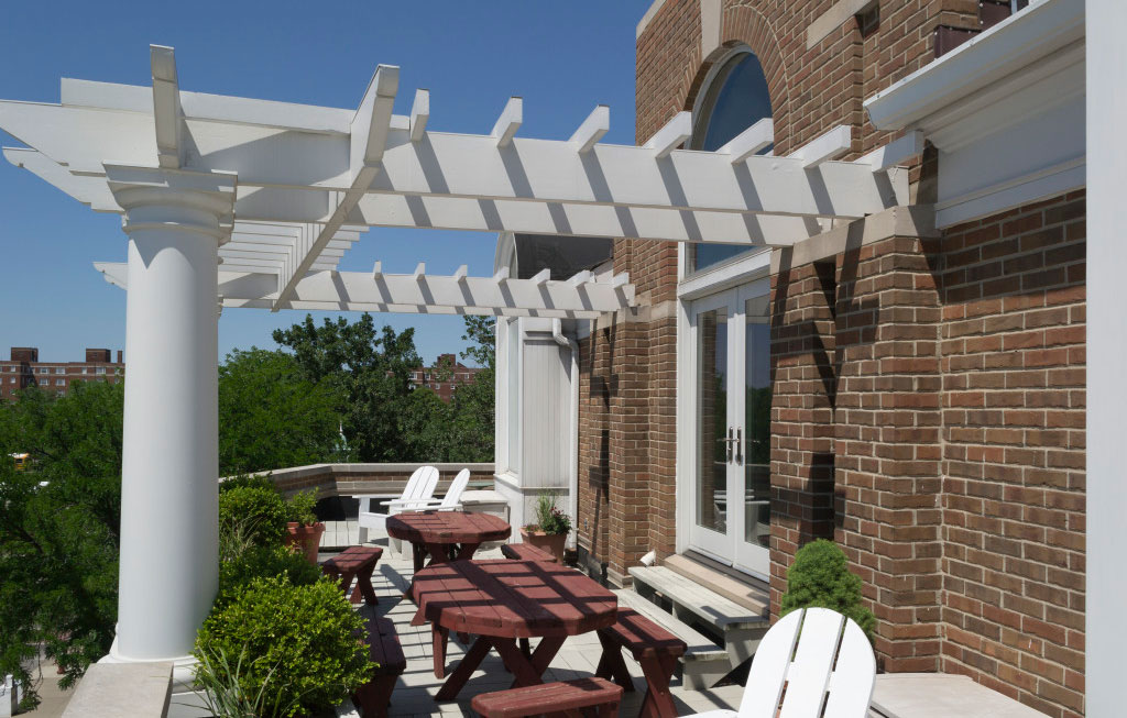
Bialosky + Partners Architects Cleveland Office - in the heart of Shaker Square.

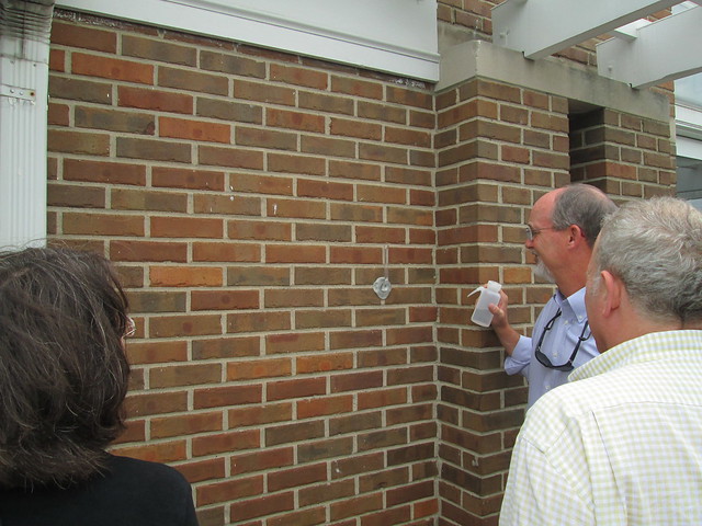
RILEM II.4 test on our office building begins!

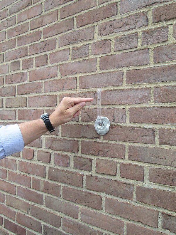
First, we fixed the RILEM tube to the testing-wall with a pinch of soft putty rolled to form a snake-like piece around the flat brim of the tube opening. It must be water-tight between the tube and the brick. We then filled the RILEM tube to the top mark of 0.0 mL and recorded the time.

Tracking the water during the test.

We checked intermittently at 1 minute intervals, but overall tested the wall for 20 minutes. (If the brick face or mortar joint absorbs 5 mL in 5 minutes, which is considered a failure of the test). We then measured the amount of water absorbed by the brick face, where we only absorbed 0.5 mL in those 20 minutes! So the brick face passed the test, but the building grout joints, which are the most common point of failure in a masonry system, failed this test.

While the building's masonry stood up to the test, the mortar joints absorbed quite a bit of water.

This product has been applied to several historic buildings in the area and would be a great product for our aging brick building.  BPA is excited to evaluate this product to improve our building’s water tightness and if applied, would be periodically tested and observed. BPA is looking forward to protecting and preserving many of our client's buildings too!

June 25, 2013

Bialosky Wins At NAIOP Northern Ohio 2013 Awards of Excellence!

Bialosky + Partners Architects is proud to announce that we recently received an award at the NAIOP Northern Ohio 2013 Awards of Excellence, winning best Mixed-Use Interior Design project for the Cuyahoga Community College Hospitality Management Center & Pura Vida Restaurant located at 200 Euclid Avenue in the heart of downtown Cleveland. Check out the rest of the winners by clicking here!

Lobby and Demo Kitchen at CCC Culinary