July 20, 2017

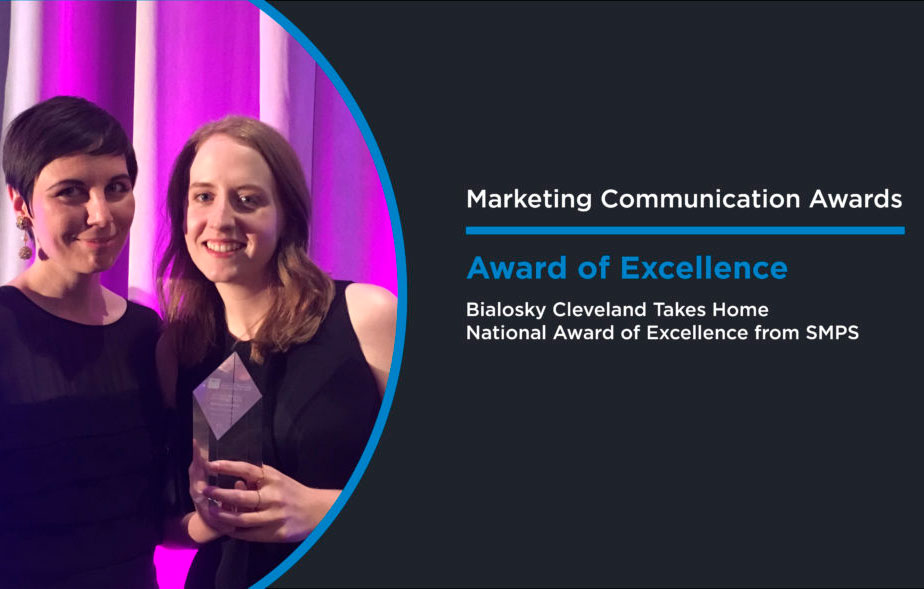
Bialosky Takes Home National Award of Excellence from SMPS

SMPS National Marketing Communication Awards 

Last week, Bialosky's marketing team headed to Indianapolis for the 2017 Society of Marketing Professional Services Marketing Communication Awards—part of SMPS's annual Build Business Conference. This annual competition is the longest-standing, most prestigious awards program recognizing excellence in marketing and communications by professional services firms in the design and building industry. The SMPS Marketing Communications Awards (MCA) recognize the individuals and teams who create outstanding communication vehicles for architectural, engineering, design, and construction firms.

This year's MCA Finalists were announced in June, but it was at the awards ceremony Thursday night in Indianapolis that SMPS revealed the Award of Excellence in each category.

We submitted in the Corporate Identity category for our recent rebranding efforts. The finalists in our category included:

Bialosky Cleveland, Cleveland, Ohio
Sasaki, Watertown, Massachusetts
Hafer Architects, Evansville, Indiana
NAC Architecture, Seattle, Washington


Competition was steep, but in the end, we came out on top! We're excited to share this win with our team and we're honored to be recognized amongst some of the most creative firms in the country.

You can find a list of all Award of Excellence and Award of Merit Winners in SMPS's Press Release here and their entries here. Congratulations to all!


What We Saw in Indy


September 26, 2016

Bialosky Receives National Marketing Excellence Award

Firms from all corners of America came to represent their firms at the Arizona Biltmore, Designed by Frank Lloyd Wright.

Industry leaders from all corners of America came to represent their firms at the Arizona Biltmore, designed by Frank Lloyd Wright.

Over the weekend, Marketing Director, Hallie DelVillan and Graphic Designer, Chelsey Finnimore accepted the 2016 Zweig Group Marketing Excellence Award at the Arizona Biltmore Hotel in Phoenix on behalf of Bialosky Cleveland. Bialosky placed 3rd nationally in the Integrated Marketing category for our refreshed  branding and marketing strategy.

Winners in our category include:

  1. Hickok Cole Architects
  2. WGI
  3. Bialosky Cleveland
  4. EAPC
  5. JLG Architects
Bialosky's integrated marketing, including branding, environmental graphics, vision and values, and digital presence, garnered a national award from the AEC industry.

Bialosky's integrated marketing, including branding, environmental graphics, vision and values, and digital presence, garnered a national award from the AEC industry.

It is an honor to be recognized by our peers for the hard-work and dedication our people have put forth in creating an outward persona that truly reflects the values our firm was founded on.

What the judges had to say:

"We were impressed by the quality of the overall submittal package. The custom binding, high quality printing and paper, mirrored the high quality of their integrated marketing campaign. High marks were given due to the level of detail in the graphic standards, creativity of the environmental graphics, and achieved results."

Take a peak inside our 2016 submission:
[soliloquy id="3258"]

May 22, 2014

Meet Chelsey Finnimore

Bialosky + Partners Architects welcomes our newest team member, graphic designer and Cleveland Institute of Art (CIA) graduate (Communication Design BFA ’13) Chelsey Finnimore. Growing up Chelsey wanted to be a fashion designer, a writer or a detective. Combining her creativity, a passion for communicating, and a strong desire for problem solving, graphic design seemed like an obvious choice. Chelsey’s skill set will come in handy if the office decides well designed private detective work is a lucrative market. At CIA, Chelsey’s Communication Design program included an emphasis in Fiber and Material Studies. This interest in the digital and tactile resulted in developing skills in silk-screening. One such project included a series of “fake products”, like the Apocalypse Survivor Backpack. Backpack contents included tools like bug spray to protect one from giant locusts, and a rope with carabineer set in case of accidental accession. The project was a commentary on the role of technology becoming a hindrance to our survival in times of crisis.

Be Prepared For Anything... With Chelsey Finnimore's Apocalypse Backpack!

Be Prepared For Anything... With Chelsey Finnimore's Apocalypse Backpack!

Chelsey’s favorite professor at CIA was Graphic Design professor, Gene Pawlowski. Chelsey learned from Professor Pawlowski’s “old school” style of teaching typography. He was detailed orientated, pushing his students to be specific and precise in their designs. Chelsey’s favorite class with him was a Hand Made Bookmaking Class. The class included learning and using tons of ancient gadgets for bookmaking. Chelsey is continuously striving to find a legitimate use for the font Adobe Giddy Up in her work. She loves storytelling and believes that great design can be used to tell great stories. Her dream project would be to design a coffee table book of objects organized neatly in rainbow order.

Adobe Giddy Up aka the New Comic Sans.

Prior to joining the team at Bialosky + Partners, Chelsey worked at Agnes Studio where she had interned since 2011. In addition to her work at Agnes, she has worked on freelance projects for Case Western Reserve University, Cuyahoga Community College, and Reclaimed Cleveland. Chelsey was attracted to the Bialosky team, as many of her favorite projects bridge the gap between the digital realm and the real world as tactile objects. This could be through environmental design or other means, with a particular interest in the ongoing life of projects and materials once the designer’s “scope of services” is complete. She brings value to our team with a multi-disciplinary skill set to engage with print and environmental design in unique ways. A native of Sharon, PA and former elevator operator at The World’s Largest Off-Priced Ladies’ Fashion store. Chelsey spent much of her childhood making “bad” fan websites for her favorite bands. Chelsey currently resides in Lakewood with her two feline roommates, Steve and Trevor. In her free time she enjoys riding bikes, drawing terrible horses, and telling bad jokes. One day she will own a kayak or a hammock to aid in her favorite hobby: marathon weekend napping.

The Winner - A Sharon, PA legend.

We recently sat down with Chelsey to learn a little more:  Favorite designed object / project in the last year (could be a building, piece of graphic design, product design, etc.): I am a huge fan of pretty much anything Vallee Duhamel has produced in the last year—super playful graphic and motion design. I love to see designers bringing in tactile/handmade elements into their work.

Cover art and album design for the album Bellevue, from Montreal electro-jazz band Misteur Valaire.

Hidden talent: Not so much a hidden talent as much as a deep dark secret—I played bass in a sludge metal band called “Lightning Bug Collection” in high school. And I can solve a rubik's cube in a minute and a half. Alternate  Reality Career: A florist or a CIA agent. If You Could Have Dinner With One Architect or Designer, who would it be and where or what would dinner be? Spaghetti with Massimo and Leila Vignelli off of their Heller dinnerware followed by an intense game of Risk and fashion parade of Leila’s jewelry.

Chelsey's table setting for dinner with Massimo and Leila Vignelli would look something like this.

We’re ignorant architects. What is the different between a typeface and a font? The best analogy I’ve ever heard for explaining the difference is that typeface is to song as MP3 is to font. Typeface refers to the design of the letter forms where as font refers to the physical (or digital) means for reproducing a letter. Bonus sub-question: Legendary designer Massimo Vignelli once said a designer should only use 5 typefaces (bodoni, helvetica, times roman, century and futura) in their career. Is he right or crazy? I obviously love Vignelli and think he’s pretty on point with this—while I love playing with new typefaces, I find that most that really stay with me are offshoots of those “classic” five.

February 12, 2014

Job Opening: Entry Level Graphic Designer at Bialosky + Partners Architects

Bialosky + Partners, one of the Midwest’s leading architecture / design firms is seeking a talented and motivated Graphic Designer for print and web projects that innovatively represent the Cleveland based firm. We aim to find a candidate who can balance finding creative solutions, while meeting deadlines. Weekly tasks include assisting our Marketing Director with graphically rich proposals and presentations, digital marketing initiatives, engaging website / blog content, email blasts, social media, onesheeters, promotional products and marketing collateral, including visual case-studies of our work. The Graphic Designer primarily supports the Marketing Director and Business Development Director in completing these efforts, with the ability to grow into larger design opportunities within the firm. This is a full-time paid position with benefits. Qualifications: 4 year relevant degree 1-3 years of graphic design experience Adobe CS Creative Cloud Creative problem-solving skills Precision in design execution Effective verbal and written communication skills Strengths in typography and web/print design A hearty interest in architecture / interior design / environmental design Basic Photography experience is a plus Basic Understanding of WordPress is a plus Basic Understanding of HTML is a plus Basic Understanding of SEO is a plus Strong Portfolio of Design Samples Required Contact: David Craun, Principal dcraunATbialoskyDOTcom Graphic Designer - Entry Level