Bialosky + Partners Architects is seeking an interior design intern with a passion for the field. This will be a paid internship with a minimum of 24 hours per week. Candidates should be collaborative, high energy, creative, well organized and confident. Proficiency in AutoCAD, Adobe Photoshop and Microsoft Office programs is required. Revit and InDesign experience is a plus. Candidates must possess an eagerness to learn, ability to show initiative, exhibit a strong professional work ethic, be detail oriented and able to handle multiple tasks. Submit resume to Tracy Sciano Vajskop, Senior Associate, Bialosky + Partner’s Architects 2775 S Moreland Blvd. Cleveland, OH 44120 or e-mail to [email protected].
"COLDSCAPES: New Visions for Cold Weather Cities" is a multi-disciplinary design competition that encourages artists, architects, landscape architects, and urban designers to explore the exciting and untapped potential of cold climate cities. The competition is organized by Kent State University's Cleveland Urban Design Collaborative (CUDC). Over 80 registrants participated in the 2013 COLDSCAPES Competition in its inaugural year, with submissions received from 15 U.S. cities and 13 countries spanning a wide range of cold (and warm) weather climates.

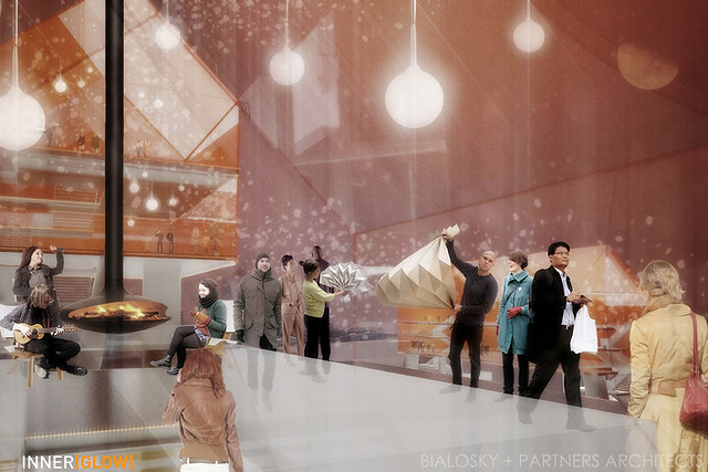
Bialosky + Partners Architects' submission for the 2013 Coldscapes Competition, titled GLOW, proposes iconic inhabitable relics to be built on Lake Erie.
PROJECT NARRATIVE GLOW ignites new poetic relationships between lake, city, and the rhythm of the seasons. A seasonal relic, GLOW engages the Lake Erie break wall, mediating the domestic (city side) and wild (north of the break-wall) sides of the lake, creating an infrastructure for cultures to develop that leverage the latency of water as public space – in both solid and liquid states. GLOW activates this linear infrastructure creating new experiences of the lake all year. Ramps bring users to an elevated deck that allows one to view and be viewed. The structures skin is inspired by the break-wall’s texture that becomes coated each winter by the crashing waves of Lake Erie. Inhabitable house-like (GLOW)bes hover still higher, creating an otherworldly, ethereal experience. The break-wall is a segmented lily-pad network by summer. In winter, when the lake freezes, the system becomes whole. This encourages engagement with the lake through skiing, snowshoeing, sledding, hiking, etc., to transverse the path and create their own way to engage with GLOW. An open canvas, GLOW is activated by each season uniquely, encouraging new cultures and economies in a non-prescriptive manner, providing the elements to awaken latent uses of one of our most important resources– water.
Bialosky + Partners Architects' submission GLOW, which proposed building captivating structures on Lake Erie, received one of ten Honorable Mentions. The three winning entries and ten honorable mentions were selected by a jury comprised of leaders in a range of design fields, including architecture, landscape architecture, urban planning and public art. These entries will be on exhibit in Cleveland in November 2013, and published in Volume 6 of the Cleveland Urban Design Collaborative’s Urban Infill journal series, focused on advancing the design of urban environments for winter weather. Leaders of the GLOW submission included David Craun, Hallie DelVillan, Theodore Ferringer, and Michael Abrahamson (University of Michigan Taubman College of Architecture; pre-PhD program, History/Theory of Architecture), and would not be possible without the hard work of Nathanael Dunn, Dave Berlekamp, Nick Dilisio, Andrew Vichosky, and Zach Anderson (Kent State University CAED).
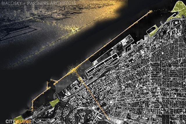
The engagement of GLOW with the lake's break-wall to create an iconic network that connects City and Lake.
Florence, Italy is an absolutely beautiful city and commonly known as the birthplace of the Renaissance. Having lived there for half a year and being immersed in the rich culture, art, and architecture every day, I can honestly say that it is one of the most beautiful places I have ever seen. If you have been lucky enough to travel to this amazing city hopefully the buildings and sites that I share today will bring back amazing memories, and if you have not had the chance to go, I hope this will inspire you to do so! Through my studies at Kent State University, I learned about the Basilica di Santa Maria del Fiore, or more commonly referred to as the Duomo (cathedral). Seeing this building in person was far more breathtaking than looking at the pictures in my architecture books, which did not do it any justice. On our first walk around the city we came upon the Duomo, and I can honestly say my friends and I stood there speechless while admiring this famous piece of architecture. The Duomo was completed in 1436 by Arnolfo di Cambio, and still towers over the city today with its iconic architectural features.

Overlooking Florence, Italy, where our intern, Christy, studied abroad.
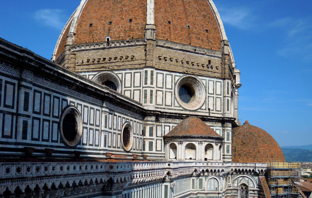
The dome, engineered by Filippo Brunelleschi, still remains as the largest brick dome ever constructed. On one of my last days in Florence, I had the opportunity to climb to the top of the Campanile (bell tower) opposite the dome and was able to admire the immense amount of beautiful details up close that went in to the architecture and ornament of the façade and dome.

Christy climbed to the top of the Campanile to take this shot of the dome.
My favorite part of the Duomo was the main portal’s massive bronze doors featuring scenes from the life of the Madonna. The doors date to around 1900 and offer a very grand entrance into the building. As you can see, I had to take a picture to represent the scale of these amazing doors!

Entry doors featuring the life of the Madonna.
A few of my other favorite places to visit in Florence were the piazzas (city squares), such as Piazza della Repubblica and piazza della Signoria. I was lucky enough to be in Florence during the celebration for the 150th Anniversary of the Unification of Italy. Viewing monuments such as the Arcone designed by Micheli and inspired by Florence Renaissance architecture or the impressive town hall of the city, Palazzo Vecchio, lit up with the colors of the Italian flag and feeling the pride that everyone celebrating on the street had for their country was a once in a lifetime experience.  I could go on forever about all of the amazing architecture and unique cultural experiences that I had in Florence, and I hope to return one day to this beautiful city.
  As parting words, if you have been to Florence and missed this gem, or if I have inspired you to someday visit, you must go to Gelateria dei Neri for what I am convinced is the most wonderful gelato in the world! I strongly recommend the dark chocolate and pistachio!
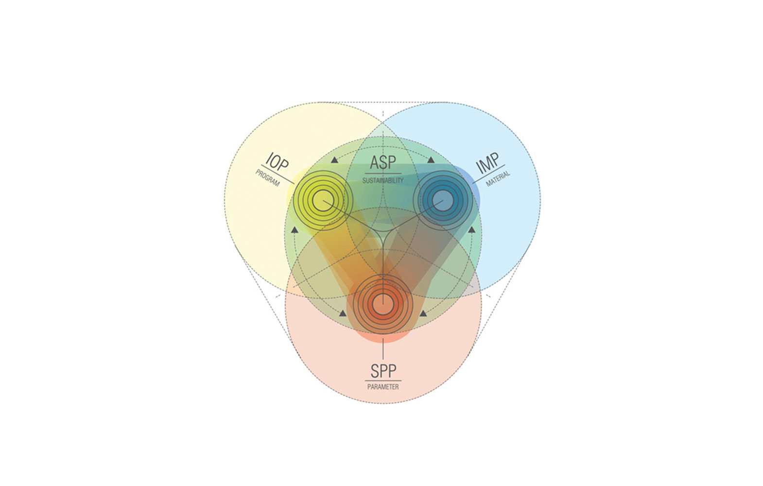
Last week the online design magazine, Dezeen, published an interview with Dutch architect Ben van Berkel of UNStudio on his plans to launch the world's first open-source architecture studio. Once launched, this network will hold great significance as it will begin to take the often secretive and exclusive mentality of knowledge sharing between architecture firms and reverse that thinking. As a "knowledge-based organizational" website, van Berkel describes a system "where knowledge can be shared, contributed and collected."

Diagram illustrating how UNStudio’s Knowledge Platforms reach out to external partners for collaboration - via deezen.com
This unprecedented system gives the profession of architecture a needed technological and collaborative leap forward. But to do so, designers must be willing to part with the exclusivity of their acquired building & design knowledge and adopt a more open-source mentality. Any creative knows the benefit of working in close proximity with other creatives, as opposed to working independently in a vacuum. Yet on a larger scale, the practice of architecture operates more independently than anything else. Understandably, business-mindedness and competition have led firms to rarely have a sort of academic, open dialog with other firms. Yet it is this same mentality that has kept practice architecture "in the Walkman phase", as van Berkel coins it.
So what does this mean for us? Spurred on by political obstacles in the Netherlands, van Berkel has realized he and his fellow dutch architects must band together to come up with creative solutions to the obstacles before them - so too must American architects, and perhaps more specifically architects in the nation's hard-hit Rustbelt of the Midwest. In times when sustainability and building performance are often leading factors in the design, construction and lasting performance of buildings, architects must be constantly advancing their own knowledge base. It is a task that is simply too great to be done internally. Instead firms must be willing to offer open seminars, write white papers, maintain blogs documenting design and construction processes. While this may seem as a monumental task, efforts are already underway to begin this knowledge sharing. Firms are establishing blogs that are beginning to informally do just what van Berkel aspires to do. Organizations such as the Building Envelope Council are gaining recognition and prominence as a resource to acquire building knowledge. Architects need to fully participate in such dialogues - not simply listen. To gain the credibility and respect of clients and critics worldwide, we must turn to each other to learn from our collective experiences.
What’s The Big Deal With Continuous Insulation?
Continuous insulation (CI) has been an energy code requirement since the release of ASHRAE 90.1-2004, but unfortunately is still a bit of a mystery to many designers, contractors, and building officials. So, besides complying with the building code, why do we need continuous insulation? Thermal bridging through framing components reduces envelope insulation performance by 15-20% in wood frame construction and by 40%-60% in metal frame construction. This means that a typical 6” metal stud wall construction with R-19 fiberglass batt insulation actually performs at a dismal R-9. When CI is properly installed you get the approximate full R-value of the insulation material. So, what exactly is continuous insulation?
ASHRAE 90.1 defines Continuous Insulation as insulation that is continuous across all structural members without thermal bridges other than fasteners and service openings. It is installed on the interior, exterior, or is integral to any opaque surface of the building. With further research we find that the definition of “fasteners” is meant to include screws, bolts, nails, etc. This means that furring strips, clip angles, lintels and other large connection details are excluded from the term “fasteners”.
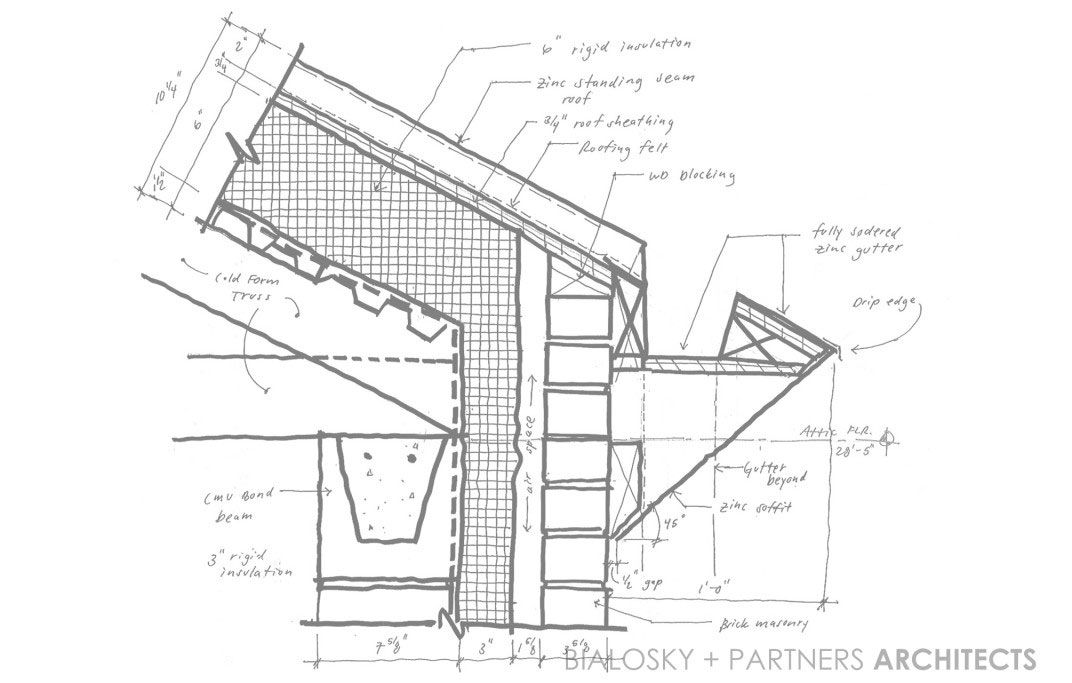
This is where the big problem lies, and why the industry seems to be so confused. Many designers, contractors, and building officials are still not informed about this important aspect of CI. For example, masonry veneer wall construction typically employs steel relieving angles and steel lintels at window and door heads. These steel angles are usually fastened directly to the building structure, providing a significant thermal bridge from the interior of the building to the exterior. There are a number of solutions to this issue including welding the angles to standoffs at +/- 4’-0” centers, which allows the CI to be installed behind the angles to minimize the effects of thermal bridging. There are also proprietary clip systems being marketed to perform this same function.
Another cause for confusion is the fact that many building claddings such as metal panels, fiber cement board/siding, etc. are not approved for attachment through more than 1” of non-supporting material. In climate zone 5 we are required to have a minimum CI of 7.5, resulting in a CI thickness of about 1 1/2". There are proprietary systems that have been developed to deal with this issue such as the DOW-Knight CI System . This system has been engineered to allow up to 3” of continuous insulation to pass behind the girt supports. If you or your client don’t desire to specify proprietary systems, the New York State Energy Research and Development Authority (NYSERDA) commissioned a testing report that describes a number of other fastening system options for continuous insulation. It’s a long read but has a lot of useful information regarding this matter.
In summary, the proper use of continuous insulation is all about paying attention to the details. There are a growing number of resources out there aiming to help designers detail buildings properly. A few of my favorites are www.buildingscience.com and www.bec-national.org . Happy reading, and let’s keep it sustainable.
