January 29, 2014

So You Want To Build a Culinary School?

Dollar signs ($$,$$$,$$$) are what every College administrator imagines at the mention of a new Culinary Arts Program. Its launch may be one of, if not the most costly investment an institution of higher learning can make. For these reasons and more, its recipe must be artfully constructed with consideration given to both the end user and community’s palettes. Its conception must be artfully balanced to satisfy the institution’s curriculum needs, the technologically entrenched student user’s expectations and prospective donor philanthropic objectives. The development of such a facility affords opportunities for public outreach, rectifying existing campus master planning shortfalls, and the development of synergistic opportunities between existing internal and external College partnerships.
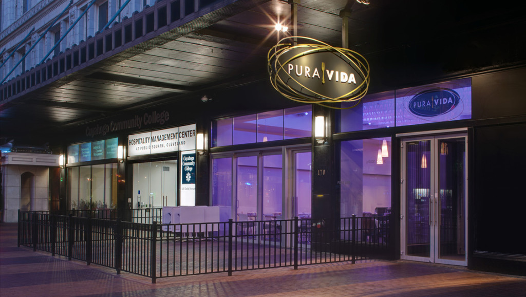
The May Company Building Store Front

The May Company Building in downtown Cleveland, OH is home to both Cuyahoga County Community College's Hospitality Management Centeand acclaimed restaurant Pura Vida.

At first glance, the creation of a new or revival of an existing culinary arts program appears self-contained and finite, when in fact it is quite the contrary. Many of a College’s existing facilities can and should be evaluated for their potential symbiotic relationships with your new culinary facility.  Its only when your perspective elevates to 20,000 feet do these synergies truly reveal themselves.  Performing art centers, conferencing centers, sports facilities, central food service, public programming, are all venues that can take advantage of and enhance a culinary program/facility. This new facility, in addition to fulfilling its primary use teaching the culinary arts, can provide the college with a marketable team-building outreach center, special event pre-function space, or an elegant on-campus restaurant to aid in its fund-raising endeavors.
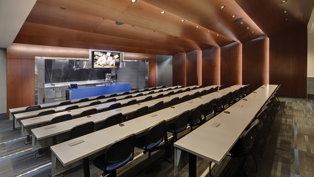
LCCC Culinary Demonstration Kitchen

Demonstration Kitchen with smart classroom technology for distance learning at Lorain County Community College Ben & Jane Norton Culinary Arts Center

In addition, this investment must exploit the potential of each space beyond its original program and consider the opportunities to utilize its physical environs for alternate educational offerings. Flexible and well-planned teaching kitchens may convert to an A-La-Carte kitchens, with a simple equipment reconfiguration, to service gala events being held in the culinary school’s new multi-purpose lounge/lecture hall/special event space. Accessory spaces normally considered off limits to students should now be seen as invaluable educational tools in support of your new culinary curriculum. Shipping and receiving areas, for example, can serve as a working sanitation and safety labs, or prep kitchens, where students attain first-hand experience receiving, inventorying, cleaning, and prepping food product. Better yet, your new program could celebrate the locally grown food movement with the inclusion of a greenhouse/garden adjacent to or on top of your new facility showcasing the advantages of locally grown produce, while at the same time reinforcing the importance of sustainable building design.
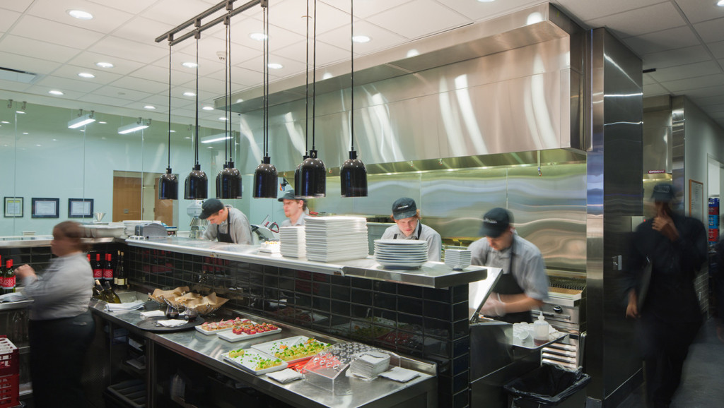
Pura Vida Restaurant Kitchen

Cuyahoga County Community College's Downtown Hospitality Management Center shares space with noted Cleveland restaurant, Pura Vida (pictured here). Having a professional kitchen adjacent and visible to culinary school students provides additional opportunities for students to be inspired, learn, and engage.

You can now imagine that these students, your students, graduate from a program with more than just the traditional culinary education but one with innovative business practices at its core, an embedded understanding of the benefits of local sustainable food communities with a creative approach that these prospective employees associate with added value.

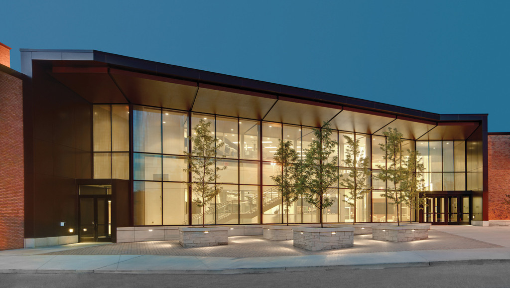
Ben & Jane Norton Culinary Arts Center - Exterior

Exterior View of the LCCC Ben & Jane Norton Culinary Arts Center at dusk.

This post was authored by Bialosky Cleveland Principal Mark Olson, AIA, LEED AP For more info: View this video produced by Lorain Community College with students, professors, and professionals discussing the opening of the Ben & Jane Culinary Arts Center and the launching of LCCC's Culinary Arts Program: http://www.youtube.com/watch?v=vZmZZQOJs9w Cuyahoga Community College offers a similar video with background on their program, focusing on the downtown Cleveland Hospitality Management Center and the Eastern Campus HMC programs, which were both designed by Bialosky: http://www.youtube.com/watch?v=m0iOeGQdoME

January 16, 2014

BPA Goes to Greenbuild 2013

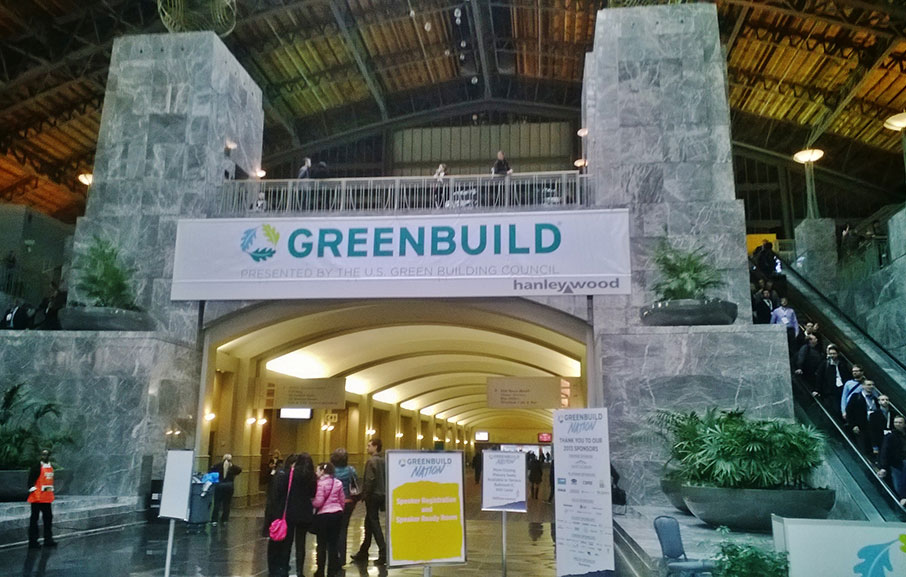
Philadelphia Greenbuild Once a year, for about a week, all eyes in green building culture turn towards a single focus - it’s been San Francisco, it’s been Toronto, Chicago, Phoenix, and Boston.  Every year it is a new city for Greenbuild, the world’s largest conference and exposition dedicated to the green building industry.  This year, its 20th year running, it was Philadelphia.  I had the pleasure of representing Bialosky + Partners Architects at Greenbuild 2013 this past November.  The international convention and expo hosted approximately 30,000 attendees from 90 different countries and touted speakers as varied and prestigious as Rich Ferizzi, President & CEO of the USGBC; Michael Nutter, Mayor of Philadelphia; Nate Silver, author of The Signal and the Noise; and the keynote address was given by former Secretary of State and former First Lady, Hillary Rodham Clinton. Greenbuild 2013 Philadelphia Convention Entry Greenbuild is more than just a world-class convention.  It is also a networking smorgasbord and showcase of all things sustainable.  This year the expo hall was packed with over 800 exhibitors of sustainable products and services.  Huge multinational corporations displayed their full suite of green products right next to small startup companies rolling-out their newest gadget or software to a captive, and captivated, audience. Greenbuild 2013 Convention Multiple parallel tracks of educational sessions provided a plethora of learning opportunities.  Lectures ranged from changes in the newest version of ASHRAE 90.1 to low energy lighting strategies, and from net-zero design to insights on the commissioning of existing buildings.  Some of the most highly anticipated and well attended sessions dealt with LEED v4, which was officially introduced at Greenbuild 2013.  It’s a lot to wrap your head around. Throughout the entire convention, a simple but powerful idea kept presenting itself to me… this is not an isolated, short-lived movement.  This is not a passing fashion.  This is not a fad. Greenbuild 2013 Philadelphia Convention Floor Whether the adjectives used to describe it are “earth-friendly”, or “sustainable”, or “eco”, or “green”… the fact is, the world is changing.  Greenbuild is one time a year when those people keeping track congregate and try to direct that change to be something manageable, and positive, and fun.  Another successful year… now on to 2014… this time it’s New Orleans.
January 14, 2014

Theory and Practice

In addition to being a firm that has taken on many higher-education projects (e.g. LCCCKSU CAED, Muskingum, Ursuline), Bialosky + Partners Architects (BPA) has always been a supporter of academia.  For years, the office has - when possible - encouraged employees to teach part time at the Kent State University College of Architecture and Environmental Design.  BPA staff has taught courses ranging from architectural /interior design studios to materials and process in digital fabrication classes.  Nearly every semester, Kent State CAED professors invite designers of all trades and career-levels from our office to participate in architectural and interior design reviews throughout the year.  This continued engagement with the academic design process is as meaningful for our staff as it is for the students with whom we engage. The designers and architects in our office have had an impact on the program - for example: BPA Associate Matt MacRaild, AIA, who is currently helping Kent State University restructure a Design Process and Principles class.

Jack Bialosky Jr. at a fourth year interior design review.

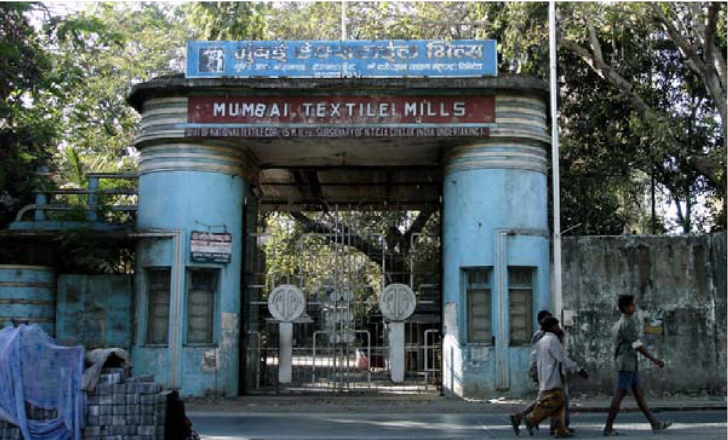
This past fall I taught my third semester of Interior Design studio at Kent State University. I taught a fourth year interior design studio in conjunction with two other adjunct faculty members, where we guided the students in two projects that involved both architecture and interior design. Having degrees in both Architecture and Interior Design and professional experience in both fields, I often look for projects for the students that incorporate principles from both disciplines. The first project involved a major conversion of an abandoned textile mill to low-rise apartment building located in Mumbai, India. There were two main learning objectives that the students were expected to take away from the project. The first was how to research environment and culture in order to better understand design techniques around the world. The second was the expectation that the students were able to take their findings from that research and apply it to a design project.  The idea for this project stemmed from a research paper I collaborated on at the University of Notre Dame which reported on the condition of the mills in Mumbai, and the following research trip to India where our team spent a month studying the construction, proportion and cultural context of historic structures in India.   It was rewarding to see how the students interpreted physical and cultural context as they prepared their designs for the renovation of the Mumbai mills.

A view of the entry gate to one of the existing textile mill complexes in Mumbai, India.

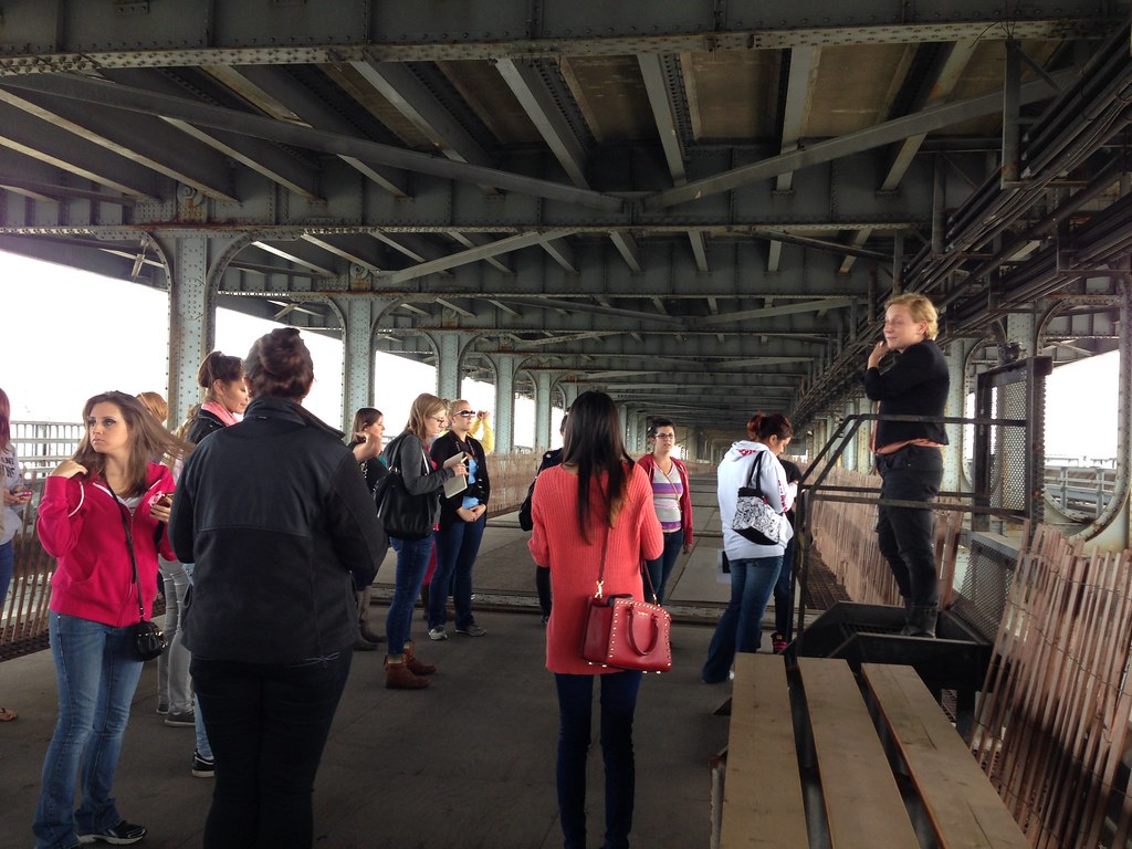
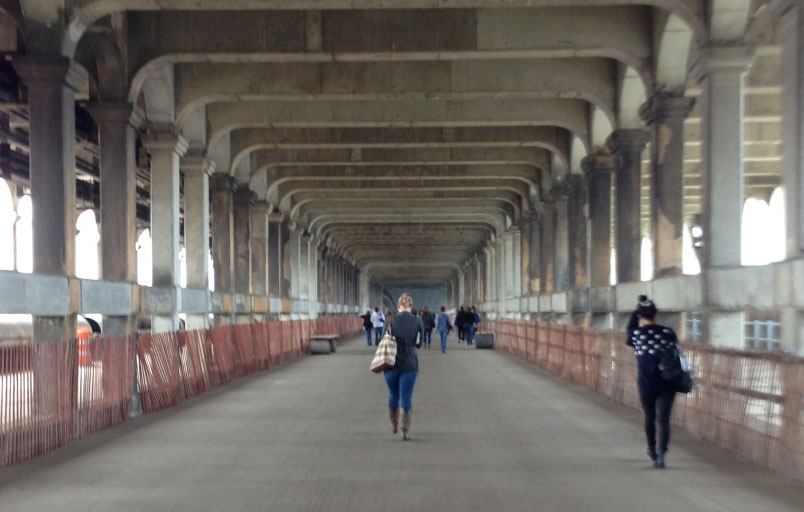
The second project was a pop-up retail shop located on the lower level of the Veteran’s Memorial Bridge (aka Detroit-Superior Bridge) in Cleveland, OH.  This group project, inspired by the 2012 Cleveland Design Competition and the Cleveland Urban Design Collaborative’s  Bridge Project, was a particularly difficult challenge for the students because of the extremely unique site condition and very minimal pedestrian/vehicular access.  The lower street car level has been abandoned for over 50 years with the exception of a few public events.  The 2012 Competition and Bridge Project were launched in hopes to help repopulate the beautiful structure.  The challenge of the pop-up shop prompted the students to study the history of the bridge, the surrounding context, and pop-up shops precedents in order to determine what use would be the best fit for Cleveland.  As the students began focusing in on the details for their retail spaces, each group also proposed a conceptual master plan for the full bridge with additional activities and shops.  With the location only 35 miles away from campus, we were able to take the students on a field trip to visit the site before the project began.

Students on a site visit of the lower level of the Veteran's Memorial bridge.


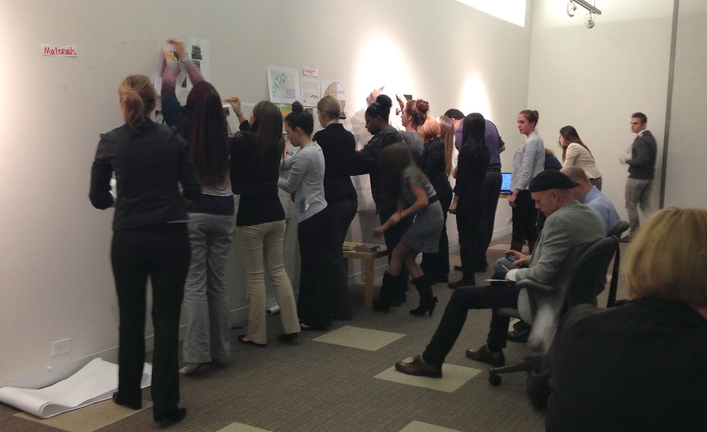
Working in groups allowed students to learn the values of teamwork and collaboration.


Students pin-up their work together during a mid-project review.

Not only has it been fun teaching students about design globally and locally, but it has been a valuable experience for me as well.  It’s amazing to see students collaborate on ideas and still be able to receive 34 different solutions for the same design problem.  Teaching a design studio enriches the design process and provides inspiration for projects both academically and in practice.

December 17, 2013

401 Lofts

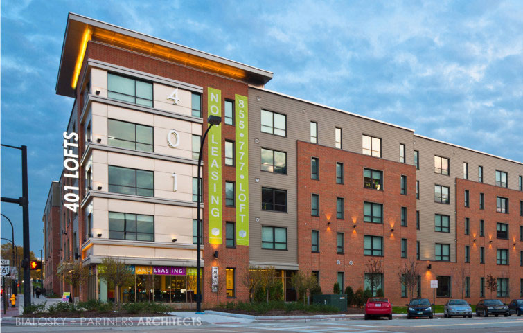
Young professional Akronites are filling the newly opened upscale apartments of 401 Lofts, in Downtown Akron, OH. Named for its address, 401 S. Main Street, the contemporary loft apartment building boasts walkable urban living in the same fashion of “22 Exchange”, its neighboring sister-building that houses Akron University Students. The two buildings, both designed by Bialosky + Partners for client Richland Properties, have started to visibly spark a new vibrancy of Akron’s downtown, and has in turn, become a highly desired location to live, work and play.

Exterior View of 401 Lofts in downtown Akron, Ohio. Designed by Bialosky + Partners Architects. Photography By Scott Pease Photography.

Comprised of predominantly Studio and 2 Bedroom lofts with a handful of 3 and 4 bedroom units, 401 Lofts has spacious floor to ceiling windows, hardwood floors, and 9’ or higher ceilings to achieve the “loft” feel.

View of a typical studio unit of 401 Lofts in downtown Akron, Ohio. Designed by Bialosky + Partners Architects. Photography By Scott Pease Photography.

The ground floor of 401 Lofts activates the site with 4300SF of amenities in its clubhouse, including a game/billiards room, lounge, coffee bar, fitness center, 24-hour tanning bed, and additionally outdoor swimming pool and deck.

Ground floor common space in 401 Lofts in downtown Akron, Ohio. Designed by Bialosky + Partners Architects. Photography By Scott Pease Photography.

Now for the design challenge: to achieve the client’s suite / bed count for 401 Lofts, the building required an additional story of apartments above the 4 story building base (totaling 5 stories). To stay on budget, wood frame construction fit the bill, but the framing system can only be employed on buildings totaling 4 stories or less. The solution? A hybrid system of ICFs (Insulated Concrete Forms) that provides for a noncombustible exterior wall construction and the needed fire rating , while still allowing wood frame construction for the building interior. Imagine ICFs as giant, EPS foam Legos which add a tremendous R value (R-22) to improve the building’s thermal performance. This naturally cuts the client’s anticipated utility bill significantly.

Construction photo of 401 Lofts in downtown Akron, Ohio, featuring the ICF walls system. Designed by Bialosky + Partners Architects.

This hybrid wall construction, coupled with energy-efficient, thermally broken aluminum windows and energy-efficient PTAC heating and cooling units (which have the ability to be monitored by building management) collectively work in harmony to deliver an energy-conscious design.

Exterior View of 401 Lofts in downtown Akron, Ohio. Designed by Bialosky + Partners Architects. Photography By Scott Pease Photography.

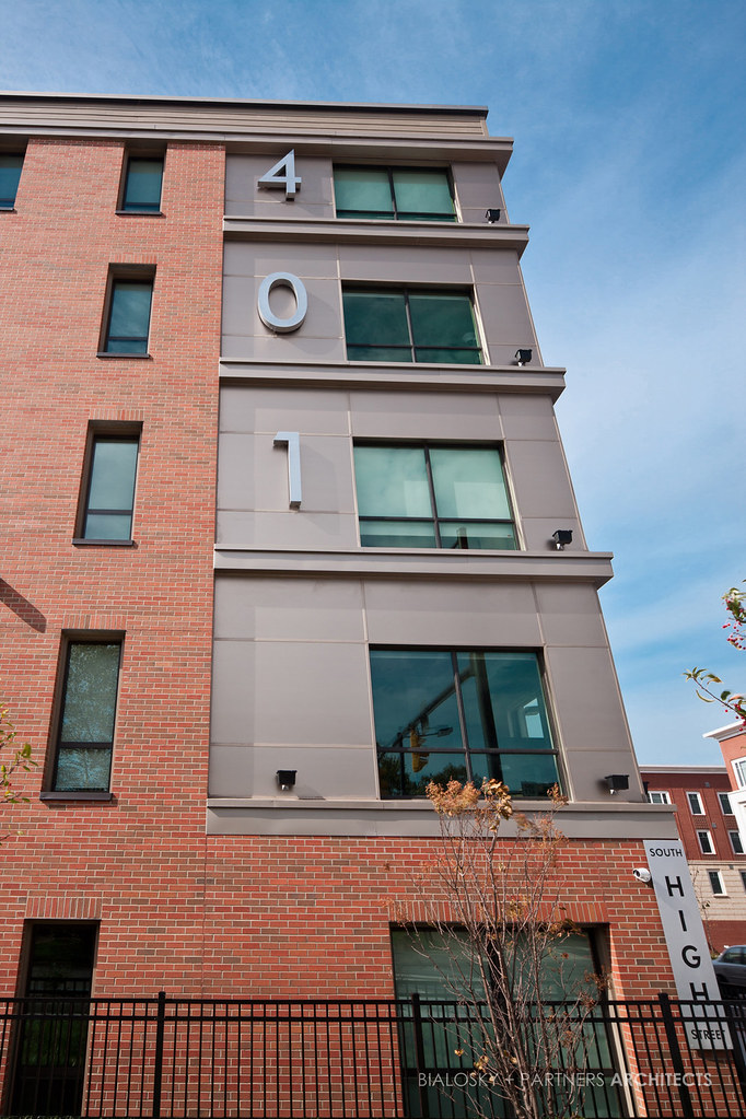
The sheer length of the building is quite breathtaking – at 330’, the façade could very easily become monolithic. By taking advantage of the tapering site (north to south), the building steps at strategic intervals driven by the standard ICF sizes, reducing the need for field modifications and custom fabrication.  401 Lofts is clad in a Tuscan brick, fiber cement lap siding and champagne-colored metallic panels that fluctuate in their color based on viewing angle. By exhibiting the street names in raised steel panel lettering at the building corners, we rooted the building to its place and (geo)graphically related the building its adjacent sibling, 22 Exchange.

Exterior View of 401 Lofts in downtown Akron, Ohio. Designed by Bialosky + Partners Architects. Photography By Scott Pease Photography.

ARCHITECT:  Bialosky + Partners, LLC INTERIOR DESIGNER:  Kathy Andrews Interiors (Houston, Texas) STRUCTURAL, CIVIL AND LANDSCAPE ENGINEERING: Thorson Baker Associates MEP ENGINEER: TES Engineering SURVEYING: L.V. Surveying, Inc. CONSTRUCTION COST: approx. $12 million

November 8, 2013

Complicity and Conviction

I hope to discuss, in a series of posts, books that have had a significant influence on how I think about and practice architecture. Paraphrasing Thomas Edison, I see architectural design as one part inspiration and ninety-nine parts decision making.  The three books I plan to discuss

  • Complicity and Conviction: Steps toward an Architecture of Convention by William Hubbard, 1980
  • Natural Capitalism: Creating the Next Industrial Revolution by Paul Hawken, Amory Lovins, and L. Hunter Lovins, 1999
  • Genius Loci: Towards a Phenomenology of Architecture by Christian Norberg-Schulz, 1979.

address the ninety-nine percent part of the equation.  On what basis do we make all of the decisions that ultimately determine what a building looks like, how it is used, and how well it functions? William Hubbard, one of my undergraduate studio professors, described what he called concatenation in design.  It occurs when the decision made to solve one problem solves many others and especially when that decision starts a cascade of decisions that simplify what was originally a complex set of problems in design.

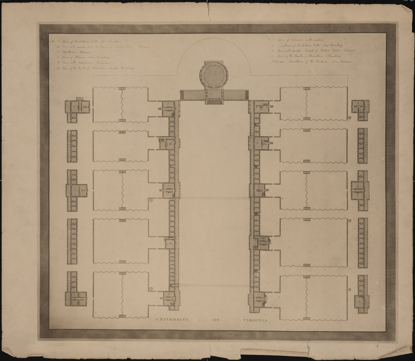
Plan for University of Virginia “lawn” designed by Thomas Jefferson

I did not pick up the first book I want to discuss, Complicity and Conviction, until I was in graduate school. In fact I didn’t know it existed until I saw it at the architecture school library used book sale and saw Bill’s name.   My understanding of the book is no doubt influenced by what Bill taught me in Studio. The book is in part a response to Robert Venturi’s Complexity and Contradiction in Architecture, 1966.  Venturi was criticizing modern architecture and advocating for post modernism, Hubbard was criticizing post-modern architecture and advocating architecture that gives “. . . testimony to human values. . .” Conventional architecture “. . . persuades us to want it to be the way it is.” The book explores several potential models for an architecture of convention:

  • The Scenographic Style
  • Games
  • Typography
  • and the Law

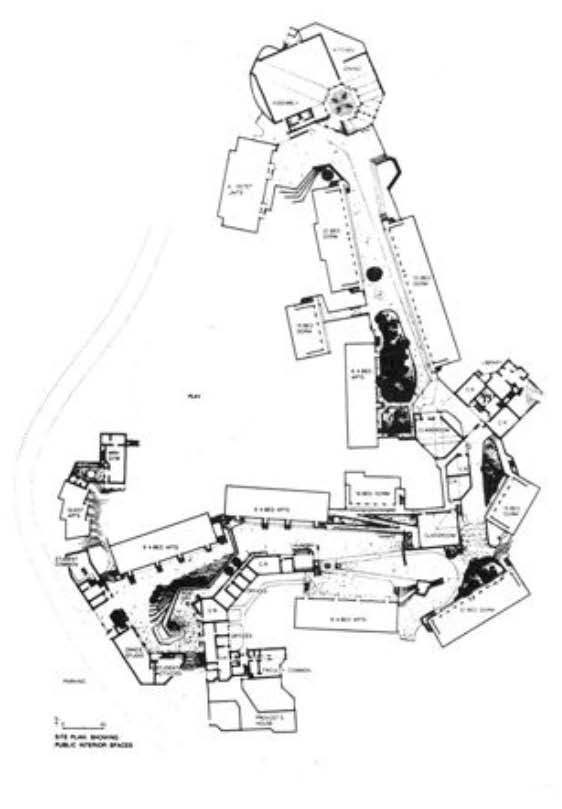
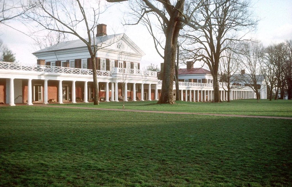
The Scenographic Style encompasses much of American architecture of the late nineteenth and early twentieth centuries: the work of H.H. Richardson; the Shingle Style of McKim, Mead & White and John Russell Pope; and the Collegiate Gothic Style of Goodhue and others.  He helps us to understand a little more about the design and drawing (sketching) technique that was used at the time.  While these buildings make good pictures, he finds that they lack meaningful depth, ultimately leaving us unsatisfied. Games are a set of rules that all of the participants agree to abide by.  They are a scrim that allows us to be judged not as a whole person but only by the way we play the game. We accept the rules not because they have to be the way they are, but because they provide a concrete framework in which we can enjoy play.  We are complicit, agreeing not to question why the rules are what they are. Typography like architecture can provide a Chinese box of levels of understanding.  You do not need to be a typographer to look at a page of text and have a feeling about whether you like the way it looks or how readable it is, but practitioners make very conscious decisions about the shape of the page, the size of the margins, the space between the lines of text, etc.  Those decisions are usually made consciously, intending to have an effect on how we feel about the look of the page.  The reader has the ability to find reasons for wanting it to be the way it is at many different levels.  More understanding brings more reasons to want it the way it is. This depth is one of the aspects that an architecture of convention should have. The Law is perhaps the most interesting model that is discussed. His discussion of the law is limited to the way in which judges construct rulings about which we can feel conviction.  The best judgments interpret previous decisions in ways that are consistent with what is currently deemed to be right and fair (this changes over time) and allow enough room for further interpretation in future cases.  The judge “forged a new link in the chain” of the law, when he does this.   Finally the author analyzes two projects that he believes achieve an architecture of convention in different ways.  The first example is the University of Virginia “lawn” designed by Thomas Jefferson in the early nineteenth century and the second is Kresge College at the Santa Cruz campus of the University of California designed by Moore Lyndon Trumbull Whittaker in the early 1970s. The author discusses how each of these projects achieves his six attributes of an architecture of convention:

  1. Slippage – is the link between the form and its possible uses somewhat ambiguous?
  2. Contingency – does it have features that make sense only because they feel right?
  3. Are there multiple possible interpretations of the intention?
  4. Does it call other buildings to mind?
  5. Are the analogies relevant?
  6. Does it make us want it to be as it is and not otherwise?

Plan of Kresge College at the Santa Cruz campus of the University of California designed by Moore Lyndon Trumbull Whittaker

When I first read this book it resonated with some of the discussions we had in the Studio (i.e.  The modern world has given us many more options for the materials we use and the way in which we put them together, and air conditioning allows us to ignore many of the implications of how the form, orientation, and construction affect the comfort of the occupants.)  The modern world has given the architect more “freedom”.  We are allowed to ignore many of the “rules” that used to govern the way we designed.  The architectural “rule” books by Vitruvius, Alberti, and Palladio no longer apply. This has left us searching for buildings that improve upon the architecture of the past.

University of Virginia “lawn” designed by Thomas Jefferson

Bill leaves us with a charge: “But to realize that this situation has been brought about by our own actions is to realize that it is within our power to rectify it.  It is possible, even now, to produce architecture that gives testimony of human values. . . . We must find ways – in all areas of life – to engender in ourselves conviction about human values.  We must find ways to convince ourselves anew of human possibility.”