June 24, 2016

Three Dimensional Coordination Detailing

The production and execution of the built environment are not separate endeavors, but are byproducts of a truly collaborative relationship between the architect and builder through a common language. Coordination sketches are the vehicles of collaboration, with the power to reaffirm design intent through constructability, stitching the design and construction processes together. Often, these sketches are restricted to the two-dimensional realm of construction drawing overlays, but as technology evolves so can our visual language and ability to communicate three dimensionally. These details respond directly to the growing complexity of building systems in unique conditions where revisions to two-dimensional details will propagate confusion across multiple trades and project teams.

In 2015, Bialosky Cleveland and Walsh Construction Group endeavored to improve coordination through shared Building Information Modelling (BIM) and three-dimensional coordination sketches, when required, at the American Greetings Tech West Building in Westlake, Ohio. As an extension of the American Greetings Creative Studios and Headquarters, the project is located immediately to the South of Crocker Park. Inherent to the large amount of concurrent growth at Crocker Park, the project required intense collaboration between multiple project teams with the same completion date of Summer 2016.
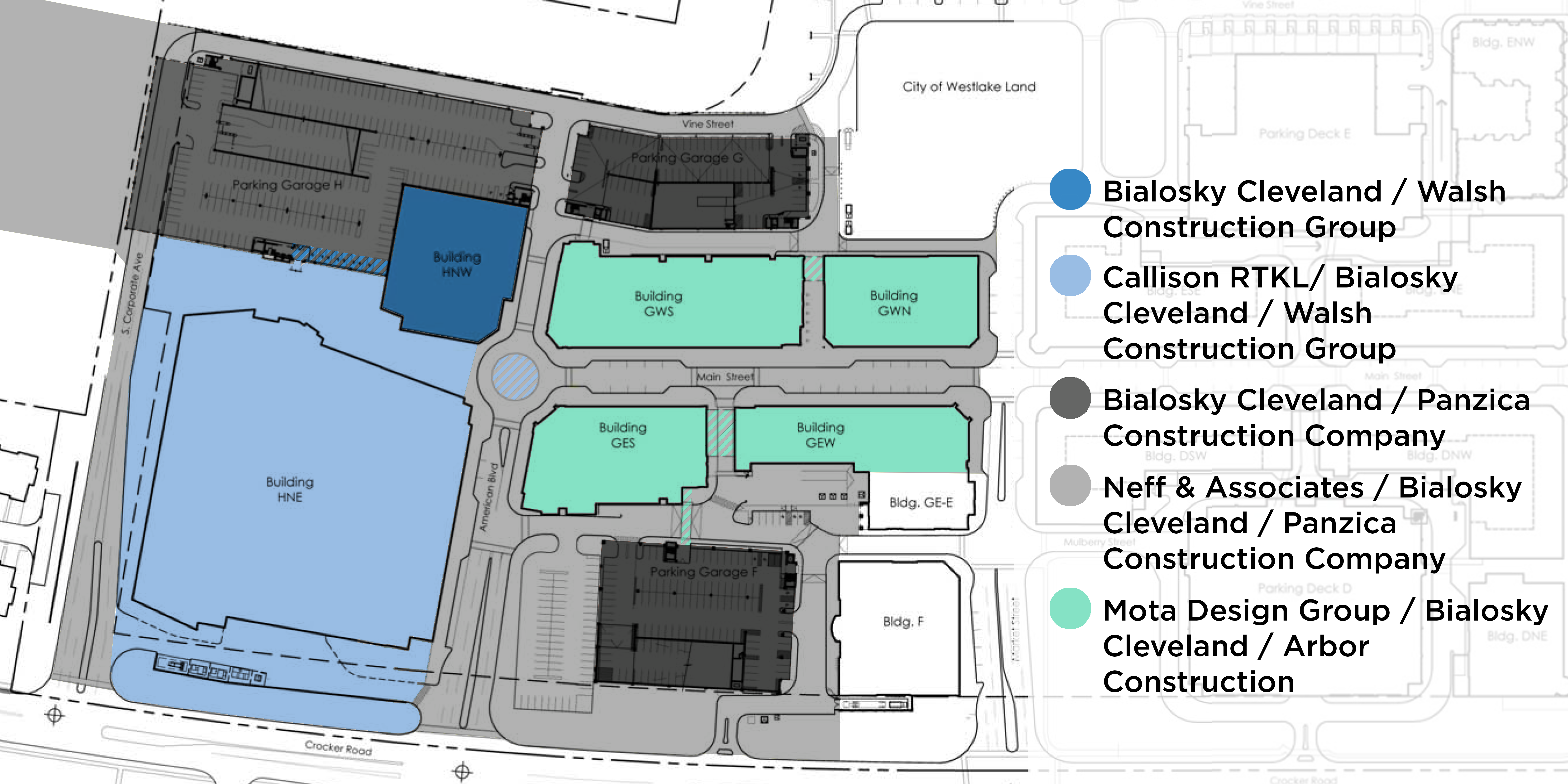
AG-CP Team Divisions REV

In all of these projects, Bialosky Cleveland is the common thread with varying roles, empowering a collaborative attitude on-site. By nature of the project location, adjacency and programming there were a number of items that required a greater level of collaboration which illustrate how project complexities were resolved through three-dimensional coordination sketches.
3d_Coord_02

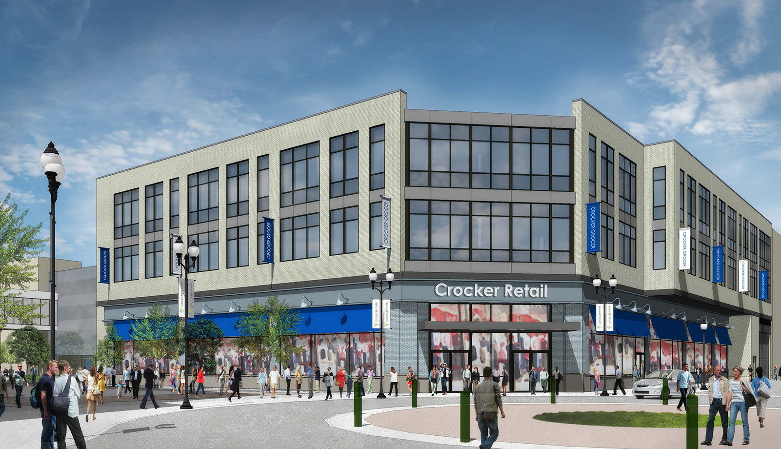
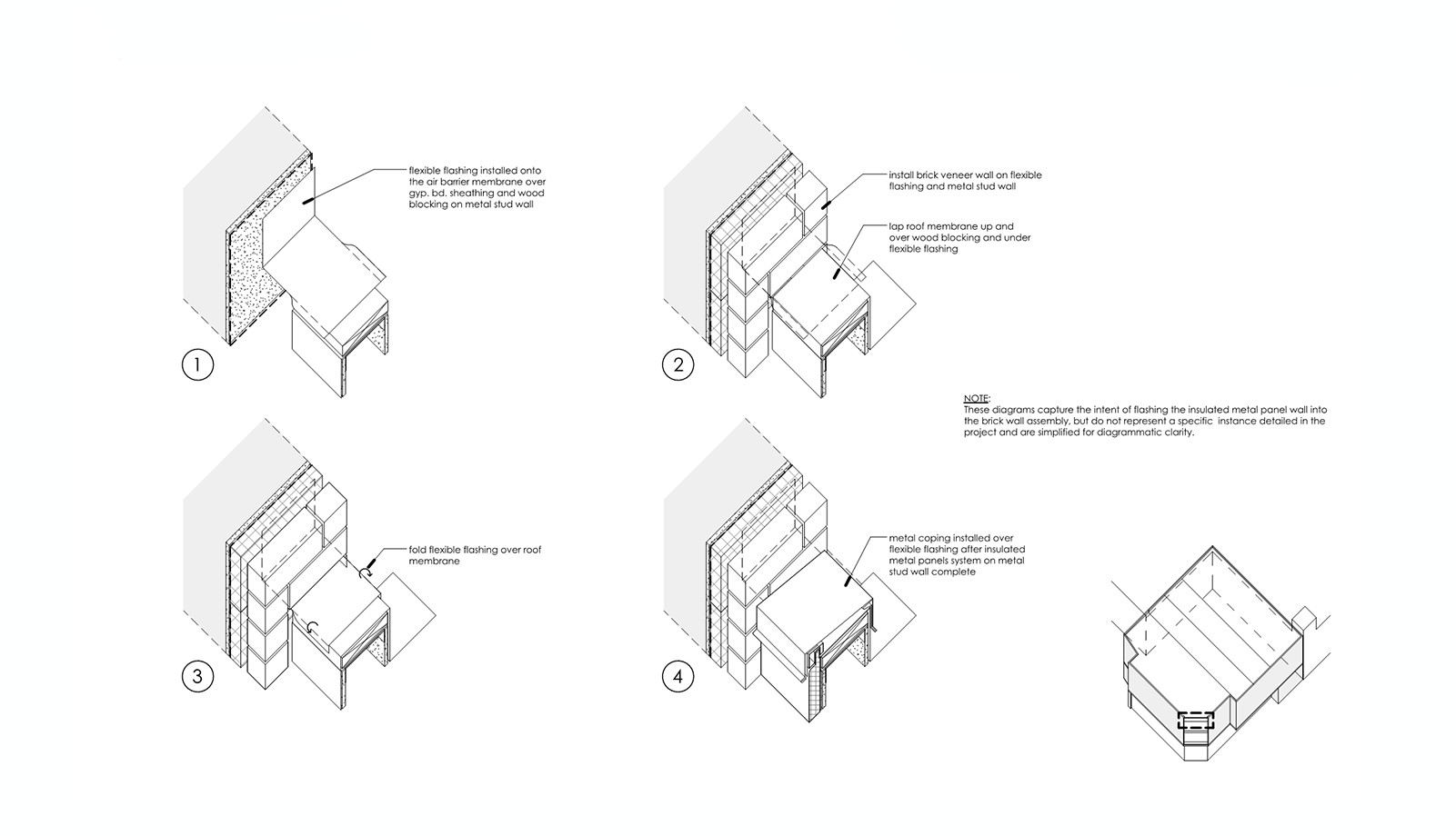
The project’s primary design gesture includes opening up the corner with glazing, highlighting the planar expression of the brick façade, which is continued through the parapet. To execute the design intent properly, a series of sequencing diagrams were generated and included in the construction documents illustrating how the insulated metal panel wall is to be flashed into the brick wall assembly. These diagrams acted as a tool to guide work in the field without being unnecessarily prescriptive.
  3d_Coord_03

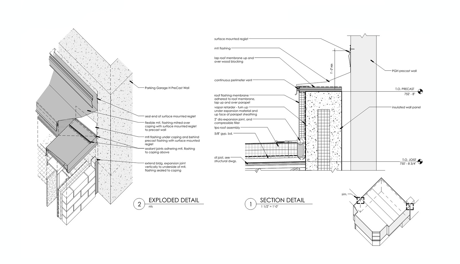
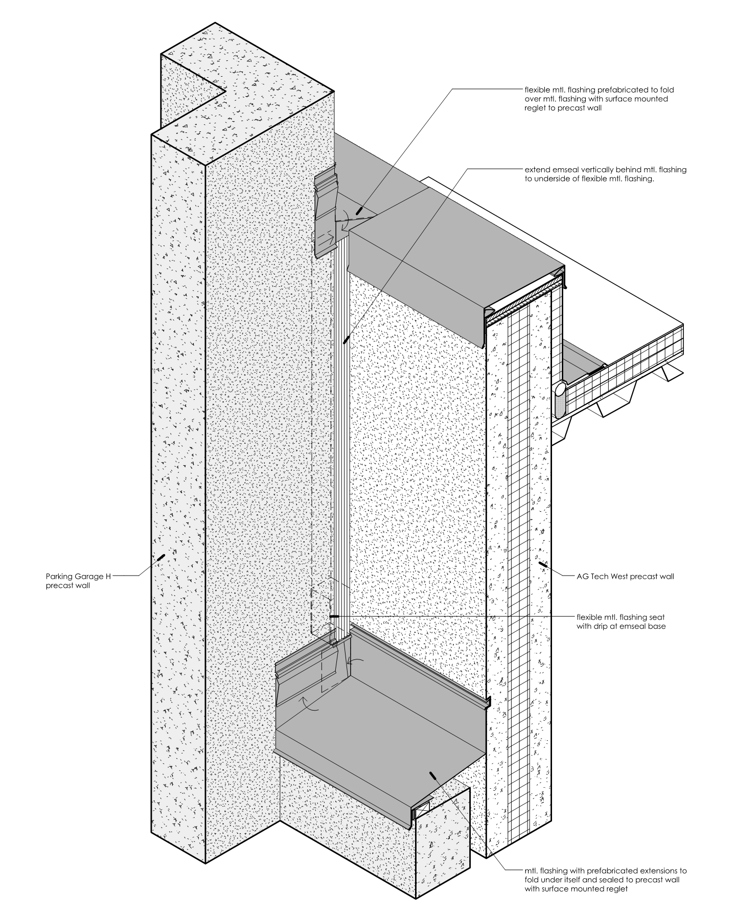
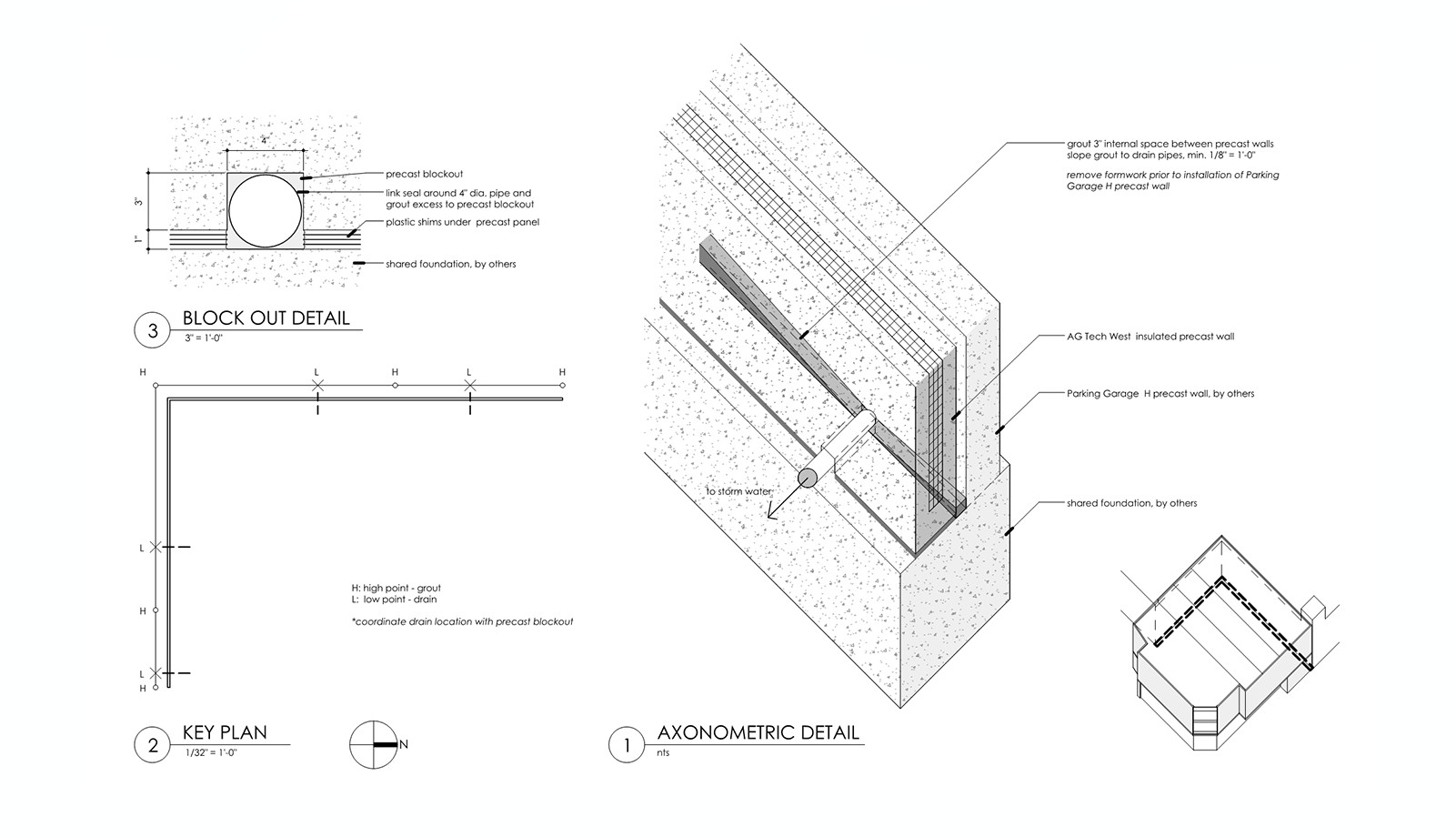
A challenge ever present in the design and detailing of Tech West was its siting with two facades bound by a 5 floor parking garage, requiring (2) two-hour fire walls separated by an air space. Both walls bear on a shared foundation with building expansion joints by two separate project teams, leading to a series of critical coordination details that responded to changing project schedules and construction sequencing.
3d_Coord_05

SKA-17 Precast Axonometric Detail
The stair and elevator core of the parking garage provided an added challenge as it rises above the Tech West parapet before falling to a guardrail height precast parapet. The use of three-dimensional detailing helped expedite discussions of scope ownership and responsibility in the field, evolving as agreements were made by all parties to clarify the path ahead.

Concurrent to the resolving of the building expansion joint details was the drainage at the base of the building separation airspace, which was required to be connected to the Tech West storm water. Here, timing was critical as grouting and caulking had to be coordinated by both projects to ensure constructability while maintaining the integrity of the drain path.
3d_Coord_06

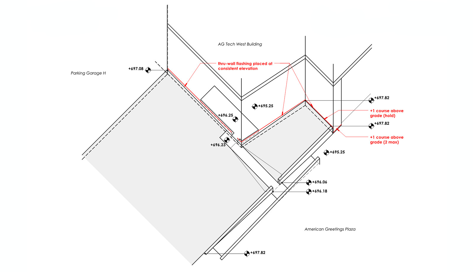
Issues related to site/context presented a different set of challenges as Tech West has no true site scope of its own, but is bound by Crocker Park Phase Three to the North and the American Greetings Creative Studios and Headquarters Plaza to the East and South. As Tech West came into being after the Plaza was designed, revisions and site coordination had to be finalized per grading and egress requirements to set the through wall flashing elevation prior to construction of the brick veneer façade. The three-dimensional sketch concisely reconciled information from 3 projects, turning a potentially lengthy coordination effort into a brief conference call without holding up construction progress.
3d_Coord_07

These coordination snapshots only offer a glimpse into a lengthy and complex process, but highlight the critical need for a collaborative approach to the construction administration effort. In all of this, American Greetings and Mark G. Anderson Consultants, played a critical role in expediting the approval process, making comprehensive sketches evermore important in closing the feedback loop. For any language to be universal it has to be legible, and three-dimensional construction details, when required, ensure the designer and contractor are on the same page. The American Greetings Tech West Building is an example of how collaboration can improve in the field throughout the building process as projects and adjacencies grow in complexity to ensure design intent is not lost.
April 5, 2016

Building the Bialosky Brand

2016 has brought along quite a few changes here at Bialosky—new projects, new hires, a new place to call home at 6555 Carneige Ave, a new name, and a new brand identity to celebrate and highlight these exciting milestones.

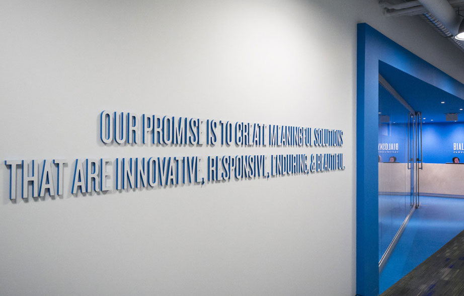
The first step in rebranding was to clearly define our promise to our clients and the process though which we make that promise a reality. To do this, we took a step back to analyze our design process and the values we hold as a firm. This introspection allowed us to define the four core values through which we interpret all aspects of the work we do: innovative, responsive, enduring, and beautiful. These four words and their corresponding promise were the jumping off point for the creation of the new Bialosky Cleveland identity.

Sketch, Discuss, Revise, Repeat

The cornerstone of the new identity is the name shift from 'Bialosky + Partners Architects' to simply 'Bialosky Cleveland.' Although we didn't intend for a name change when we set out on our rebranding mission, the name change grew organically out of the logo design process—reaffirming the value of an iterative design process of thoughtful discussion and intentional revisions. The design process began with a series of rough sketches exploring the basics of graphic identity: typography, mark, and color. These initial sketches were reviewed and discussed by our team and used to tease out successful ideas for further exploration. During the first round of sketches, we were drawn to concepts with bold typography that were simple, timeless, and clean while nodding to the idea of integration, cooperation and partnership. As these initial concepts were explored and refined, we found ourselves pairing down each iteration more and more until we landed on the final mark: a bold typographic treatment, stating simply 'who we are' and 'where we're from.'

02_LogoSketches_2

This pairing down of the logo to its key parts led to the discussion of what exactly it would mean to simply be 'Bialosky Cleveland.' Bialosky's equity is not only tied to its leadership and history as an architectural firm, but also to its employees and its multi-disciplinary approach. We are a diverse group of individuals anchored by strong leadership and an even stronger history. We are architects, planners, interior designers, engineers, and environmental graphic designers. It's how we answer the phone and it's what our clients call us—we are Bialosky. The name change makes more sense now than ever before.

04_Motion_2

Color & Type

Pushing the ideas of simplicity, flexibility, and equity was key in the continued development of the Bialosky graphic identity. Blue—representing trust, loyalty, wisdom, confidence, and intelligence—has always been at the core of the Bialosky palette. The updated palette plays off of this equity with a bold pairing of blue/black and cyan. A classic navy and middle gray provide depth, while a bold pop of warm red rounds out the palette with an unexpected brightness.

08_History_2

Strong typography is the basis of the Bialosky Cleveland logo and is a pillar of the extended identity. The typography pays tribute to the equity of the past Bialosky + Partners Architects marks while adding a contemporary twist. The primary Bialosky typeface, Knockout, is a condensed sans-serif that subtly nods to the Bialosky + Partners condensed logotype of the 1990s. The secondary typeface Gotham, a geometric san-serif inspired by mid-twentieth century architectural signage, is a well-balance blend of new and old that adds a great deal of flexibility to the identity.

05_ColorAndType

Function & Application

The flexibility of the new identity is continued throughout its various applications. As an integrated architectural firm, the Bialosky brand needed to be easily translated across a number of platforms from formal business letters and proposals, vibrant marketing collateral and environmental graphics throughout the office.

06_Stationery

03_Reception

07_OurValues

This work is protected and owned by Bialosky Cleveland and cannot be used, distributed, or displayed without permission.

November 24, 2015

Project Spotlight: The Midway Cleveland Conceptual Planning

Bialosky + Partners Architects recently earned a Merit Award at the 2015 AIA/IIDA Cleveland Design Awards, for conceptual planning and design of The Midway Bicycle Network for a stakeholder group led by Bike Cleveland. Thanks to all involved, in particular, Bike Cleveland Executive Director Jacob Van Sickle, Board Member Barb Clint, St. Clair Superior Development Corporation, and Ohio City Inc.

news-2-1

Conceptual Midway Network Plan

The Midway seeks to re-utilize the historic infrastructure of Cleveland’s former streetcar network and leverages excess vehicular lane capacities to create an 80+ mile protected cycle track network. Protected cycle tracks provide continuous physical protection to cyclists while still being a part of the curb-to-curb street right of way. While the application of this typology to Cleveland is wholly unique, protected (or separated) cycle tracks are common throughout the world and are proven to make streets safe and comfortable for “all users from 8 to 80”. This infrastructure provides significant economic benefits and significantly increases the mode share of cyclists. Learn more about this vision at midwaycle.org andbikecleveland.org/midway/. Follow the project on Facebook here:facebook.com/TheMidwayCleveland

November 19, 2015

Ingenuity Festival Cleveland – The [switch] Box

Editor’s Note: The Bialosky team was proud to have Chris Persons be part of our team for a summer internship this past year. Chris is currently pursuing his Masters of Architecture at Kent State University’s College of Architecture and Environmental Design. This is a recap of an installation at this year’s Ingenuity Festival Cleveland that Chris and colleagues collaboratively designed, fabricated, and installed. 

The design team for this piece included myself  Adam Prtenjak, Greg Stroh; electronics and arduinos (an open-source electronics platform) by John Popple and myself; budget and grant acquisition by Greg Stroh and Nick Young; and construction was completed by Michael Carnessali, Adam Prtenjak, myself, and Nick Young.

Our original position was this:

Our original position was this:

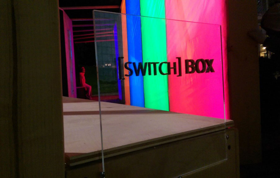
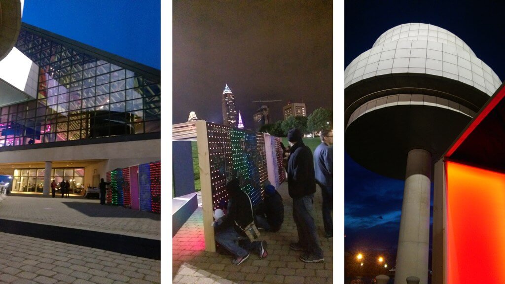
The [switch] box is intended to be a low-resolution speculation on future architectural possibilities when digital technologies disrupt traditional built environments. Digital technologies< i.e. sensors, big data, smart cities > have the embodied potential to mediate spaces in a manner with no comparable historical precedent. In this case, the line drawn between user and observer of space in the form of a wall is blurred. Exterior passersby [observer] trigger, through an arduino-linked sensor, a binary color change of a specific interior module, thus informing the construct’s occupants [user] of ambiguous yet located activity outside. This tactic can not only be scaled up indefinitely; it can be implemented through digitally complex mechanisms to fundamentally alter the relationships between users, observers, architecture, and digital technologies.

May 13, 2015

The Year of the Advocate: Pro Bono and the Genius Loci

Pro bono, civic, and community projects have always been deeply embedded in the culture of our firm. We wholeheartedly believe that as architects, we have a distinct responsibility to serve and strengthen our community. But the value of pro bono work runs deeper than the neighborhoods it touches, it has transformed and elevated our very profession. Pro bono projects are a powerful medium for architectural firms to grow and empower leadership and heighten awareness of local expertise that can often be overshadowed. Too often we hear bemoaning around awarding projects to outside architects.

LeBron said it best, “In Northeast Ohio, nothing is given. Everything is earned. You work for what you have.” In Cleveland, “being of this place” means rolling up your sleeves, and chasing what you want. For Cleveland architects specifically, it means fueling ourselves (and each other) to rise up, advocate for architecture, and serve our city.

Consider the following article I wrote for AIA Cleveland as a call to our local design community - to challenge the notion of pro bono work being categorized as simply “other”, “charity” or “unpaid” projects, but rather as an ingrained part of architectural practice.


AIACLE_logo

Pro Bono and the Genius Loci

Jack Bialosky, Jr., AIA Cleveland President-Elect

For AIA, this year is intended to be "the year of the advocate". The recent national "I Look Up" ad campaign has engendered comments, both positive and negative, about architecture and advocacy (for more information on the campaign, read AIA Cleveland President Aaron Hill's recent article Why "Looking Up" Is Important). It is good that there are strong feelings about this, especially if you ascribe to the theory that any press is good press. But more importantly, the campaign has empowered dispersed dialogues to surface as one national conversation.

Personally, I believe that every year should be the year of the advocate for architects and architecture. As President-Elect, and a fairly new comer (or late returner) to active duty in AIA Cleveland, I have been educating myself on the issues that our local members prioritize as the most relevant and important to our community. In response to our recent member survey, most of the respondents felt that one of AIA Cleveland's most important roles was to advocate for local architects. Many architects feel they have lost power, voice and position as leaders of the built environment. Furthermore, Cleveland and Northeast Ohio have suffered for years from a low self-image which has fueled a desire for outside experts. Compounded by an economic downturn spanning half a decade, this triple-whammy has left some architects in our community feeling under-appreciated and unable to compete for important commissions in their own market.

There have been past efforts at advocacy for local architects. The Design Forum of Cleveland was founded in 2006 as a multi-disciplinary organization with the goals of improving awareness of area design professional services, increasing the consumption of area design professional services, and enhancing and sustaining the professional careers within the local design community. The forum sought to educate area leaders on the quality of available services and the economic impact of the commissions going out of town. Unfortunately, the efforts foundered when confronted by the Cleveland malaise described above; Corporate cultures that inherently value the corporation over the community at large have failed to see the connection and synergy that strengthens them both, while political authorities focused on feathering their own nests or occupied with surviving the times.

Fast forward to 2015, Cleveland has been rightfully labeled as a "Comeback City", as a new sense of optimism pervades our town. The City of Cleveland has new momentum and the economic cycle appears to be stable and in our favor. Downtown Cleveland, no longer a ghost town at night, is experiencing a resurgence of pride from its residents. Clevelanders are feeling better about the future of their city and architects in Northeast Ohio similarly seem to be doing a bit better than years past. AIA Cleveland has new energy and engaged members in all stages of their careers. We have schools of architecture nearby who are engaged in the community and turning out great students, many of whom are choosing to stay in Northeast Ohio. Now seems like a good time to start the conversation again about local advocacy, and to develop our own virtuous cycle.

To propel the local architectural and design community to the  position of leadership and respect to which it aspires requires a concerted effort by the whole A&D community to work together in a collegial and non-self-serving manner; to strengthen and elevate the design culture of our internal community. If you want to be the best, play with the best; taking pride and ownership in our place calls for addressing challenges facing our community as thought-leaders of the issues we feel passionately about.

We become thought leaders by educating and pushing ourselves, by looking outside our own immediate surroundings, by learning from each other, and reaching out to the community at-large. I believe that local advocacy should not be the focus of our efforts, but rather the byproduct of how we lead our lives, demonstrate our creativity, navigate complex systems, solve problems, give back to and strengthen our own community.

If I look around, I see that this is happening even now in many encouraging ways, although we have never been good at bringing attention to ourselves. Just as it has taken many years for Cleveland to begin to understand its place as a world-class, second tier city, it may take a long time to establish Cleveland architects in the appropriate place in the hearts and minds of our fellow Clevelanders. That's no reason to stop trying.

I recently learned about a Not For Profit group in San Francisco called Public Architecture http://www.publicarchitecture.org/, who propose that firms donate 1% of their firm hours towards pro bono work and track these efforts* . I started thinking about this and wondered what percent of effort Northeast Ohio architectural firms are already donating pro bono to charity, faith-based, community development, or public policy agencies. My guess is it exceeds 1% of firm hours- Let's find out and demonstrate that we are the geniuses loci.

* Bialosky + Partners Architects exceeds this benchmark set by "The 1% Project", donating 2% of their firm hours annually towards pro bono work.