“Is there a pony in there?” were the first words I heard at the Airline ticket counter on what should have been an uneventful flight back to Northeast Ohio.
I remember during my undergraduate at Kent State hearing rumors of how soon it might be till we would get a new College of Architecture and Environmental Design (CAED) building, and somehow I always placed it being in the far-off future. I was wrong. It has been a very busy last few months in preparation and design for the CAED Competition- and here’s a few highlights of working in NYC with Architecture Research Office during the last week of the competition.  Needless to say the scene was fantastic, who wouldn't love working in NYC? My commute to work consisted of walking through the historic Soho District of cast iron facades felt like a step back in time. And working in such an iconic city was pretty surreal. The whole crew at ARO was great, I love going to new places and meeting new people and this was a perfect combination of both. The hardest part of adjusting to the new environment was learning everyone’s name. Thankfully on the fridge in their kitchenette there was a clever celebrity doppelgänger for most everyone in the office - it was pretty accurate and it served as a great cheat sheet for learning everyone’s name.
 I knew from the moment I walked into the office that the physical model I was going to help construct was going to be killer. The entire office was surrounded by great presentation and diagrammatic models. The first day or so were getting the laser files ready, and over the next few days I became best friends with the laser cutter in the fabrication space. I went from hardly knowing anything about the settings for a laser cutter to knowing it possibly better than the back of my hand. A few things I learned that are important while using a laser cutter are: always tape down the basswood, stay hydrated, avoid wearing warm clothing like a sweater, and most importantly put on copious amounts of deodorant! Over the week it seemed like there wasn't a moment that something wasn't being built. Not only did the site and the architectural model need to be created, but since we were flying from NYC back to Ohio, a case to safely transport the site model needed to be created. As we worked on different portions of the model doing trials for roof materiality, façade articulations, and site patterns it was cool to see these isolated pieces of model began to piece together.
  The last few hours before we left were definitely all hands on deck as all the finishing touches and last-minute tweaks were done to the models. Kai from ARO was helping me transport the model and as we got to the airport and I've never seen so many inquisitive faces. As we approached the counter I heard in a semi-joking voice, "Is there a pony in there!?" As we placed the "pony" box on the scale we thought for sure it was going to weigh less than 100 lbs. As the numbers went up and down on the scale it settled on 108. We talked with Margaret at the airline ticket counter and discussed our options. Although a large box, the dimensions were not a problem - it was those eight pounds over 100. Margaret started calling supervisors to see if there was any way we could get this on the plane, and after a few phone calls the unanimous answer was still no. I even asked if the box could take my seat on the plane. Realizing that getting on this plane was not going to happen, Kai and I both shook our heads realizing it was time to initiate plan B. Needing to keep the offices in the loop we started calling our co-workers at ARO + BPA letting them know that our plan B was in effect and a road trip to Kent, Ohio was about to commence. We rented a car and Ethan from ARO and I got ready for the 7 hour trip to Ohio (no worries, both of us had gotten sleep the night before) with an ETA of 3:30am! We passed by many scenic overlooks through the mountains of Pennsylvania ( none of which we could actually see) and were thankful there wasn't a blizzard or hurricane coming our way, unlike ARO's last two trips to Ohio. Arriving in Kent right on time we dropped off the model, and Ethan and I drove to the Canton Airport to drop him off and to pick up my car. He flew directly back about an hour later only getting to see the great interstates of Ohio, and I went to catch some zzz's. That evening at the public presentation in Kent it was really rewarding to see the results of the collaborative effort of both Bialosky + Partners Architects and Architecture Research Office and to have experienced the collaboration in Cleveland, New York City, and that night in Kent. I have no doubt this will be a lasting memory and will continue to be a highlight of my early career in architecture.
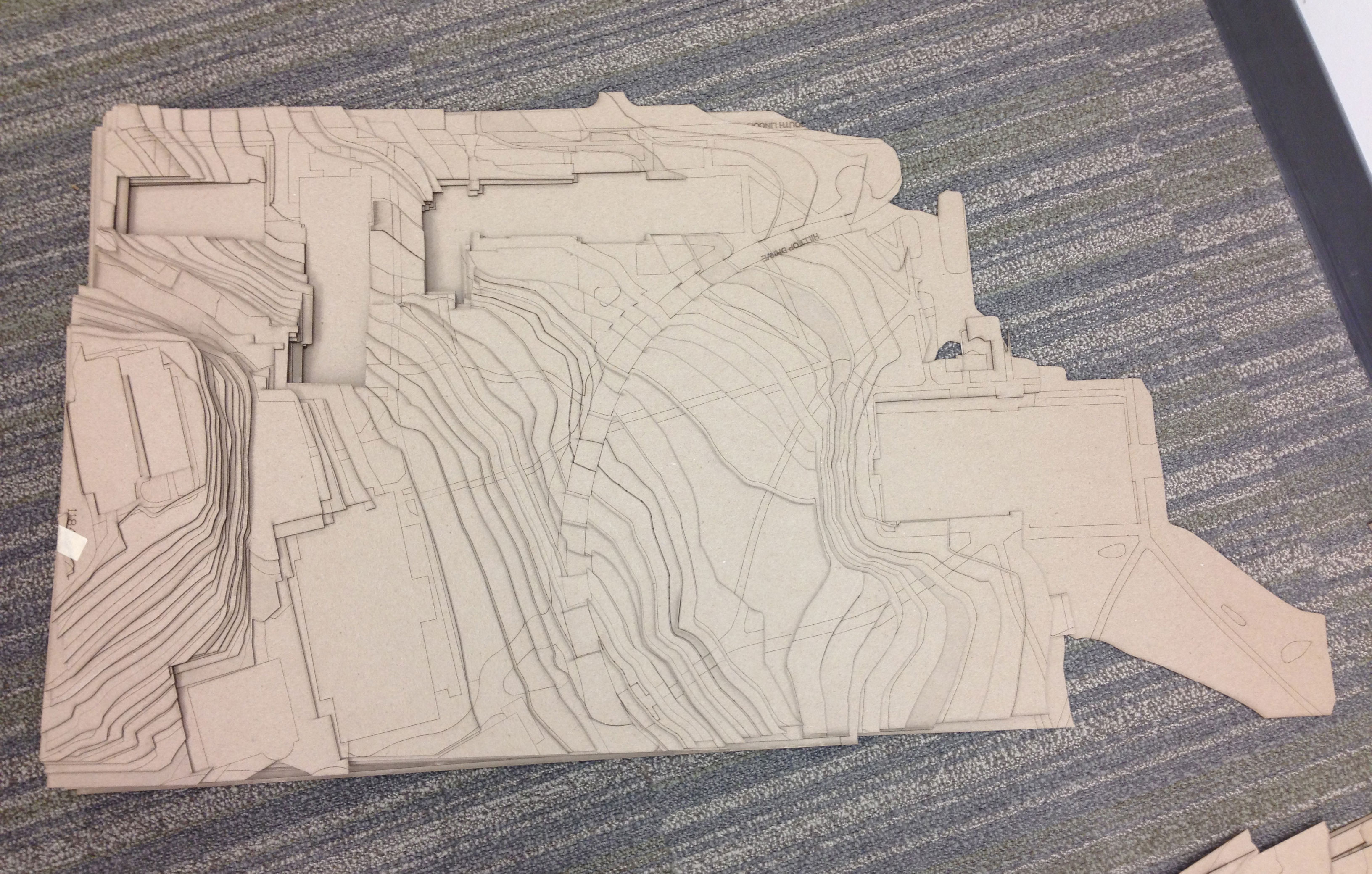

 The laser cut components do not output a model ready-to-go; we still needed to assemble it with great craft and with traditional tools (xacto knives, sobo glue, and the like) to create the final product. This assembly process still took a fair amount of time: sorting, carefully holding glued parts in place, and stacking dozens of pieces to create the contoured base with realistic topography. The buildings that surround the project site had also been laser cut, but are also sanded into typology profiles that express context and scale. Detailing 50+ buildings with roof slopes and profiles was a tedious process even with the use of shop tools to sand and cut the pieces, luckily only a little blood was shed in this part of production.
  To paint or not to paint the model became the final question. Everyone had an opinion on this topic and we discovered that the geographic location of one’s architecture school has something to do with it. East coast school = Paint, Midwest school = Not to Paint. So after 3-4 trips to the hardware store, the right color was found, the model was painted, and was ready for transport. Models, boards and other media are on display through February 15th at Kent State’s Main Library as part of Bialosky + Partners Architects Architecture Research Office’s collaborative proposal for the new Kent State University College of Architecture and Environmental Design.