February 21, 2013

A Designer’s Winter Hibernation Film List #4

Even though Northeast Ohio has had teases of spring, the past two days prove we still have some winter days ahead. So bundle up with flannel blankets and the fourth installment of A Designer's Winter Hibernation Film List, where both a designer from our office and a local design/film voice offer their top movies with a design/architectural/spatial element. This time, we have a documentary-geared list from our office's Dave Berlekamp that exposes truth and histories from graphic design to urban design. Timothy Harry, Assistant Director at the Cleveland Institute of Art Cinematheque offers a list that samples eye-opening perspectives of spaces/environments from all across the globe.

Visual Acoustics (2011) on the Bialosky + Partners Architects Cleveland Design Blog

Visual Acoustics (2011)

DAVE BERLEKAMP, Bialosky + Partners Architects If you hear "documentary" mentioned and your initial thought is "boring, low-budget educational film", this list will certainly make you reconsider.  My appreciation for a good documentary is not just in its production quality, but the fact that these films visually expose us to the reality around us.  

  1. Jiro Dreams of Sushi (2011) : This has been one of the most unexpectedly fascinating documentaries I have seen in a long time.  For most Westerners, the complexity and art of sushi cuisine is not as apparent as it is in its country and culture of origin.  The film focuses on the world's top sushi chef, 85-year old Jiro Ono.  Located modestly in the basement of a Tokyo office building, Ono has perfected his craft of sushi cuisine over a lifetime of focus and a restless work ethic.  Viewers can expect to gain a new appreciation for their work and the value each of us brings to our respective trades.
  2. Helvetica (2007) + Objectified (2009) + Urbanized (2011): I am going to cheat here slightly by grouping three documentaries into one, but really, Gary Hustwit's films need to be seen in succession as a trilogy.  Each film takes a closer look into the worlds of graphic design, industrial design and urban design, through interviews with a wide range of leading designers in the respective fields.  Any designer would benefit by seeing the cross-pollination between disciplines that these films highlight and celebrate.
  3. The Art of the Steal (2009): This fascinating documentary takes a close look at the (sometimes not-so-pretty) inner workings of art curation and dealing in the true story of the relocation of the Barnes Foundation collection from Lower Merion to downtown Philadelphia, a move that continues to spark heated and emotional debate.  This film will certainly give you a greater value and appreciation for the art that you view in museums and galleries around the world.
  4. Visual Acoustics (2008) : Highlighting the life work of the late Julius Shulman, this film offers commentary and depth to some of the most significant modern architectural photographs of the mid to late 20th century.  Credited with exposing the modern architecture movement of the West coast, Shulman celebrated American architecture as a whole through his self-taught photography.  Shulman's work, highlighted in this film, brings an understanding of architecture to the greater viewing audience, regardless of their prior exposure to architecture, and a renewed sense of purpose and meaning for those ingrained in the profession.
  5. 180˚ South: Conquerors of the Useless (2010): Perhaps one of the most inspiring films I have ever seen, this film follows Jeff Johnson's trip from California to Patagonia, Chile as he retraces Yvon Chouinard (founder of Patagonia) and Doug Tompkins' (founder of The North Face) similar trip in 1968, which is credited with setting the course for the pair's future.  Johnson, a climber, surfer and environmental enthusiast, brings an open & honest mentality which documents and exposes environmental injustices and the impact of our modern society's desire for progress.  This film will inspire you to shed the excesses of modern-day living and turn to a much simpler, truer way of looking forward.  (Warning: this film may make you want to quit your day job and road trip down to Chile.  Be advised.)
Samsara (2011) on the Bialosky + Partners Architects Cleveland Design Blog

Samsara (2011)

TIMOTHY HARRY, Assistant Director, Cleveland Institute of Art Cinematheque

  1. The Mill and the Cross (2011, Sweden/Poland) – Rutger Hauer stars in this unique, one-of-a-kind film in which Pieter Bruegel the Elder’s 1564 masterpiece, “The Procession to Calvary” comes to life.  It’s an amazing film which feels as if you stepped right into a painting.  The rugged architecture and landscapes are indelible of that time.  A must see.
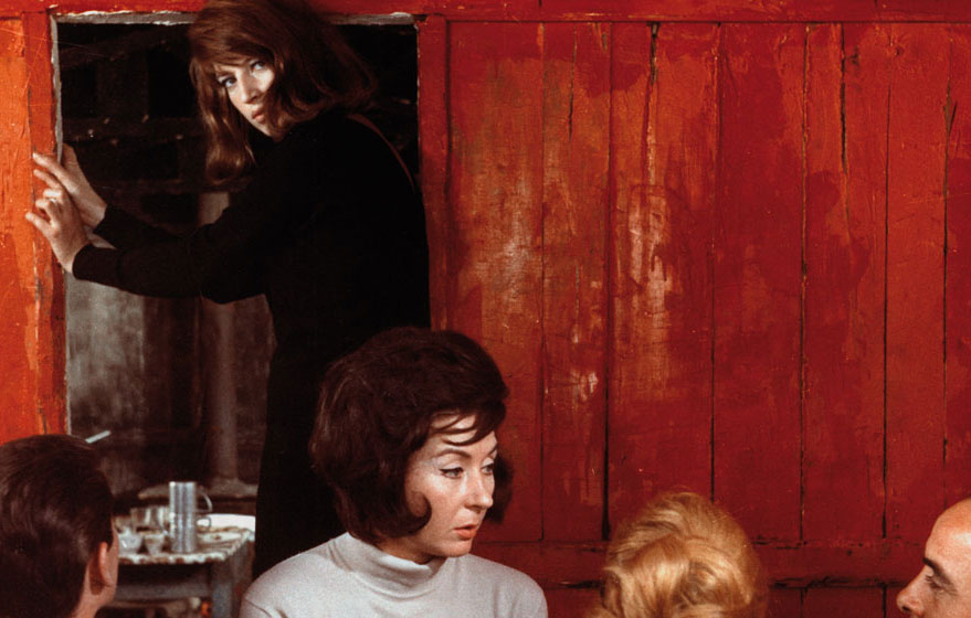
  2. Red Desert (1964, Italy) – A poetic film from the iconic director, Michelangelo Antonioni.  Red Desert was a highly manipulated film where the director had his film crew paint on grass, buildings, fruit, hair, trees, and sand to assume a soulless and stifling industrial landscape.  The unassuming acting from the lead actors creates a desperate and lonely feel to this famous film.
  3. La Jetée (1962, France) – This legendary film takes place in a post-apocalyptic world within the mind (or dreams) of the main character, a man obsessively and repulsively drawn to a meeting  that took place before the world was thrown into a nuclear calamity.  The scenes of this world are strangely evoked through dreamscapes.  La Jetée inspired Terry Gilliam’s Twelve Monkeys.
  4. Samsara (2011, USA) – From the director of Baraka comes this visually arresting, non-verbal film that takes place in remote, exotic locations.  The images create an amazing snapshot of our planet from the banal to the beautiful.

    Samsara will play at The Cleveland Institute of Art Cinematheque Fri., April 5, at 9:40 pm & Sat., April 6, at 7:00 pm

  5. On the Bowery (1956, France/USA) – One of the best American films (and largely forgotten) this non-fiction feature film follows natives of New York’s Bowery neighborhood in 1955.  The black-and-white imagery of the neighborhood (now long gone with Whole Foods and Gap stores replacing the bars and dark alleys of that era) and the characters that are followed make for an unforgettable image of what then was a dangerous neighborhood.
February 13, 2013

Tech Tips: USB 3.0, Microsoft Garage, and other Miscellaneous Techie Stuff

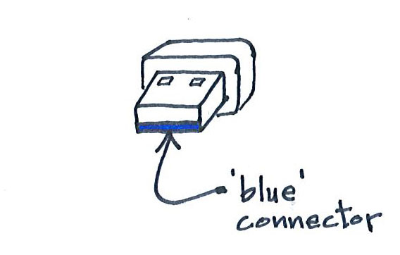
Have you noticed the prices dropping on USB backup drives and other USB devices? Well, before you decide to use your Paypal account to go on a shopping spree and purchase that "special" 4TB USB drive and those "awesome" 64GB USB sticks, there's a few things you may want to consider.  First of all, is the product being advertised as supporting USB 2 or USB 3.0? Why does that matter, you ask?  Well, in the simplest terms possible, USB 3.0 equates to a much, much faster file transfer speed.  So, if you plan to transfer large files or backup that huge music collection of yours, you may want to consider buying a USB device that supports USB 3.0.  But, before you make that purchase, make sure your computer has a USB 3.0 port!

You can spot a USB 3.0 by its blue connector. A USB 2.0 has a grey connector.

You can spot a USB 3.0 by its blue connector. A USB 2.0 has a grey connector.

Well, for those of you that are running multiple computers and small render farms out there, Microsoft has finally come up with something that’s not only cool – but it works and is FREE.  That’s right, you read that correctly; Microsoft, cool, works, and free, all in the same sentence.  Microsoft’s Garage has provided a program that will allow you to use a single keyboard & mouse to control multiple workstations.  The computers must be on the same network but can have different operating systems.  For you Apple fans – the software works with Windows OS’s and Linux but doesn’t work with the Mac OS (hmmm, an intentional outcome or not…I’ll let you be the judge).  For those of you that do have an OS X to add to the mix, you'll want to try a program called Synergy. Here’s the link to Microsoft’s site to download the software: http://www.microsoft.com/en-us/download/details.aspx?id=35460 For cross-platform systems that include at least one Mac OS X, here's the link to download Synergy:   http://synergy-foss.org/ And now for the other “miscellaneous” techie stuff. Have you heard of the International CES show? It’s basically a very, very large technology show that’s held every year. The 2013 show ended on January 11th. Here’s a link to PC Magazine’s review of some of the technology trends they noticed at the 2013 show: http://forwardthinking.pcmag.com/none/307264-7-more-big-trends-from-ces-2013 Well, that wraps up this post. Be smart out there…..but have lots of fun too!

February 12, 2013

Kent State University College of Architecture and Environmental Design Narrative + Images

Behind the Design: The Competition for Kent State University's College of Architecture and Environmental Design

  [slideshow_deploy id='967']

  Visit the presentation given to the public by Stephen Cassell + Jack Bialosky, Jr

Below is the design narrative created by the Architecture Research Office +Bialoksy Partners Architects team to help guide the design process for the KSU CAED Design Competition:

A Well-Balanced Architecture

Our  vibrant proposal for the College of Architecture and Environmental Studies (CAED) embodies the College’s pedagogic mission through its design as an integrated work of architecture. The project responds to the 21st century needs of today’s students while supporting the long-term growth and evolution of the College. CAED empowers  future architects who are sensitive to the diverse social, environmental, aesthetic, technical, and political demands required of great buildings. This holistic vision of architectural education links thinking and making. Through its site strategy, program organization, form, structure, mechanical systems, CAED’s new home functions as a daily resource for its students, a national symbol for the College, and a sustainable landmark for the University.

Site and Building

Bridging between the University and the city, the project is the vanguard of future campus growth. In recognition of its pivotal location, the building’s triangular plan strengthens circulation connections to the campus, downtown, and adjacent parking area. This configuration also establishes an efficient internal organization on the ground level with a multipurpose auditorium wrapped by glazed portico gallery/crit spaces, administrative offices, classrooms, fabrication spaces and the library. This is mirrored on the floors above by the studio atrium flanked by wings of studios and offices. Each corner of the plan aligns with a building entrance, creating clear connections to the various programs in the building. The east entrance is the front door of the school, addressing a new arrival plaza from campus that mediates between May Prentice House and the larger scale of the CAED building. This entrance opens onto the multi-functional galleries, the administrative offices, the central auditorium and the great stair that connects to the studio above.  Classrooms, fabrication shop and library  are accessed by the south entrance reached from the parking lot below.  The west entrance, activating the intersection of the esplanade and Willow Street, provides access to the café commons, which is a hub for the portico galleries, classrooms, library, fabrication shop and studio space. Set adjacent to the fabrication shop on the south side of the building, the fabrication terrace is both a work yard for large scale temporary structures and an informal, sunny gathering area.

Community and Individual

The great stair leads to the heart of the building -the studio is a large, daylit space, shared by all students in the spirit of the CAED’s collaborative culture. Enhancing the quality of the work environment, the majority of the studio receives natural light. The overall dimensions and proportions of the studio are set by a regular studio module. Individual studio units are defined by low walls that reinforce the bonds between studio-mates and between professors and students.  Comfortable module proportions enable  countless desk and meeting layouts. Designed to house up to 950 desks, the studio’s loft-like  openness, proportions and rational layout of structure and services provide a great degree of flexibility. Two story crit spaces, with tiered steps for seating, are carved out of the corners of the studio and link studio trays. Support spaces such as the computer lab and printing areas  are distributed to efficiently serve the studios. The studio is the functional hub of the building and all other spaces are conceived in relation to it.  The fabrication shop and library are clearly linked to the studio, fostering the students’ creative process of design. Along the south side of the building, a bar of faculty/staff offices on the third floor defines one side of the studio.  This adjacency fosters collaborative work within the faculty circle  mentoring between faculty and students.  Small surrounding spaces then become opportunities not only for students to exchange, but also integrating faculty. The upper level of the studio connects to a small terrace on the green roof, allowing a serene setting for gathering inspiration and refreshing.

Context and Distinction

The building expresses its relationship to its context and to the dynamic activities inside.  Stepped public levels at grade, tied to the slope of the site, enliven the esplanade with glazing to the east, north and west. Wrapping the south and west portions of the building at ground level, buff colored brick walls connect to the palette of nearby campus buildings. Poised above the glass and brick walls, the main studio volume is clad in a finely scaled pattern of warm gray panels of precast ultra-high performance concrete, emulating the limestone used on older structures. Within an overall regular module, the panels have varying opacity, patterns and folds that provide shade, create areas of greater transparency and register the spaces. At night, punctuated by apertures and glowing like a lantern, the paneled skin reveals the activity within.

Sustainable Strategies

Sustainability is integral to the design of the building, which targets a LEED platinum rating through a combination of pragmatic and innovative techniques. The building volume itself, consisting of narrow wings wrapping a central space, is compact and helps optimize the ratio of enclosed area to envelope while maximizing access to natural light. Organized around this three story atrium, the majority of the studios are top lit by a field of skylights.  A prefabricated, thermally efficient panel wall system is used for the construction of the exterior envelope. The overall area of openings in the exterior envelope is calibrated to reduce heating loss.  The building skin includes windows and glazing in response to daylight and views while providing shading to reduce solar gain and glare. The green roof helps to insulate the building, reduce cooling demand and capture storm water. Materials such as locally-sourced brick and reinforced concrete with recycled fly-ash, the exterior skin’s ultra-high performance cementitious panels, composite EPS/metal exterior wall framing, and green roofing system minimize transportation carbon emissions and help to stimulate the local economies. The ultimate objective for the new CAED center is for architectural students to conceive buildings not just as environmentally controlled volumes, but to view buildings and their inhabitants as living, adapting systems where the building learns from the occupants and the occupants learn from the building. There walls and enclosed spaces will transform into didactic classrooms, expressing each individual micro-environment and each working systems individual responsibility and symbiotic relationships. In concert with these architectural strategies, a hybrid HVAC system provides highly efficient geothermal cooling and supplemental heating sized to meet demand for all but peak periods (90% of time).   The geothermal system is supplemented with a water source cooling tower and high efficiency chiller that will serve as the stop gap for the remaining 10% and any unusual demand spikes. The secondary on-site cooling tower will provide efficient cooling, while minimizing potable water use through the implementation of a captured and stored grey water system. For demonstration purposes a small photovoltaic system consisting of several different types of photovoltaic arrays will allow students hands-on exposure to working onsite renewable energy systems.  In addition, the green roof has been designed to be PV-ready, so that in the future a photovoltaic array could be added when market costs and technological advancements justify the investment.

Rigorous Details

The architecture is itself conceived as a teaching tool.  Structure, mechanical systems and materials are exposed to view and expressive of their purpose.  Durability, flexibility and economy are essential.  The spacing of the steel frame structural system is set by the dimensions of the typical studio module. Inclined queen post cable roof trusses are kinked in response to the folding roof geometry, with variable depth based upon their span.  The concrete floors are cast in place, with an acoustical steel deck integrating channels for attachment of pipes, ducts and conduit.  Applied finishes are used sparingly in favor of concrete block shaft walls, homosote tackboards and other robust materials. To control noise within the studio while maintaining visual continuity, glass railings to the three story space create sound shadows and direct sound to the acoustical ceiling deck.

The Art of Balance

The CAED schools its students to embrace architecture through both sides - the technical and the poetic. As fellow believers of this ideology, this proposal embodies a balanced and exciting intent of such opposite poles, not merely coexisting, but marrying. A hunt for balance between the practical approach to sustainability and model of exemplary architecture, the mediation between an institutional scale and a residential scale, and the examination of a new and exciting architecture in the context of value/economy all weigh in on the final design. A balanced design, one that celebrates both the tectonic and creative integrity, now more than ever, becomes the way forward in this new integrated era of architecture. [AFG_gallery id='3']

February 7, 2013

A Designer’s Winter Hibernation Film List #3

Presenting the third installment of the blog series, A Designer's Winter Hibernation Film List, where both a designer from our office and a local design/film voice offer their top movies with a design/architectural/spatial element. This post features one of our newest BPA designers, Ted Ferringer. Additionally, Ted Sikora, director of Hero Tomorrow, and Professor Diane Davis-Sikora offer a joint list of films. (You'll notice all of today's film connoisseurs featured Manufactured Landscapes.)

Stranger Than Paradise (1984) Jim Jarmusch

Stranger Than Paradise (1984)TED FERRINGER, Associate AIA, Bialosky + Partners Architects This is a list of movies have been influential in developing my design thinking. Some directly speak to architectural issues, others are slightly more amorphous and tangentially related. This list is personal, it is not meant as an influential list to the architecture profession as a whole, which would surely look much different. 1. Eternal Sunshine of The Spotless Mind (2004): Produced by Michel Gondry, Eternal Sunshine is at once a surreal, melancholic, existential and whimsical trip through the nature of love and memory. The story, based around two ex-lovers, who “meet” after jointly but separately having their memories of one another selectively erased, is told in reverse from when they first (re)meet to backwards to their first (real) meeting. As notions on the relationship between time, place, and experience in design evolve, Eternal Sunshine offers a cautionary tale of happiness without memory or experience. 2. Zidane: A 21st Century Portrait (2006): "23 April 2005, an ordinary day, will events be remembered or forgotten?" opens this documentary that follows the French soccer great through a Spanish La Liga match between his team, Real Madrid and Villareal. Unlike a traditional movie, much less a traditional sports documentary, very little context is given to the viewer to what is taking place in the rest of the match or on the pitch. Featuring a moving score by Scottish post-rock band, Mogwai, the viewer often has little idea which team has the ball, where on the pitch Zindane is or where active play is –through editing, this documentary reminds us context can be constructed and manipulated to frame a story. While never released in the United States commercially, locally, The Cinematheque at CIA has had a few showings. 3. Notes For Those Beginning The Discipline of Architecture: Alternate Ending 1 – The Glimmering Noise (2006): Finally a movie on this list directly about architecture. Expect it is not at all. Created by one of the freshest young voices of the post-starchitect generation of designers, Michael Merideth of MOS, through a part-manifesto, part-mockumentary, part-critique, part-post modern performance art, tackles the dynamics plaguing a profession that is questioning its role and importance in contemporary society. Notes For Those... speaks directly to the insecurities designers feel explaining their work. This film is a densely layered post-crash treatise for a profession trying to find a raison d'etre as a culturally and intellectually meaningful discipline. 4. Manufactured Landscapes (2006): Featuring Canadian photographer and visual artist Edward Burtynsky's documentation of how humans have altered the landscapes of Earth. Rather than utilizing statistics, data, and analysis to convince the viewer to re-examine their relationship between human consumption, capitalism, and the environment, Burtynsky uses the emotion and beauty of visual language to craft a moving argument; the viewer is left to examine their own relationship between the haunting industrial landscapes and personal ethics. 5. Stranger Than Paradise (1984): Jim Jarmusch's first feature film, this indie flick, using a cast of non-traditional actors captures much of the detachment and emptiness of urban American living in the 70s and 80s. Jarmusch uses an attitude that was influential in capturing the detached urban cool of New York City and to a lesser extent, the Rust Belt post-industrial style grit of Cleveland as aesthetics to embrace, not ignore, while not so subtly taking a pot-shot that the money, fun, and success found in the Sun Belt of America isn't the bill of goods it is sold as.

Renaissance (2006)

Renaissance (2006)

TED SIKORA, Cinematographer, Hero Tomorrow & DIANE DAVIS-SIKORA, Professor of Architecture, Kent State University

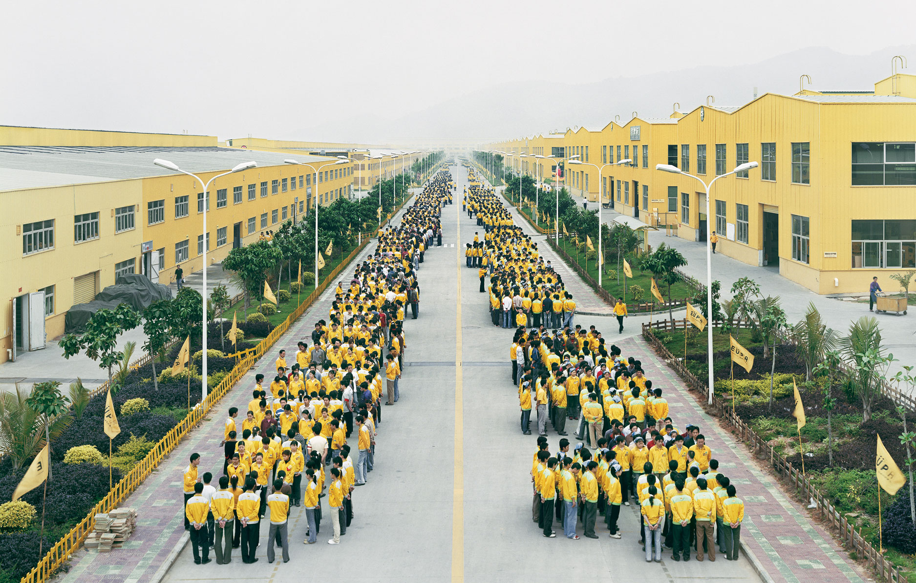
  1. Manufactured Landscapes (2006): A documentary that follows photographer Ed Burtynsky in his quest to capture a collection of incredible, jarring man-made landscapes.   The imagery is both breathtaking and alarming in its scale and environmental impact with extraordinary cinematography, including a haunting eight-minute opening dolly shot inside a massive Chinese factory.
  2. Dreams (1990): Film legend Akira Kurosawa crafts a series of his personal dreams in this surreal collection of short films.  Kurosawa introduces us to weeping demons, peach tree spirits, and ghostly soldiers, in gorgeous settings that include erupting volcanoes,  blizzards, waterwheel villages, and a walkable path within the brush stokes of van Gogh.   The result is unlike anything you’ve ever experienced within your waking life.
  3. Waking Life (2001): Shot on cheap dv cameras, then painstakingly rotoscoped, the film is both cinematically groundbreaking and intellectually profound.  Is it a dream or an after-death experience?  We can’t quite remember, but wow.
  4. Renaissance (2006): A beautiful high contrast, black-and-white, animated film executed exclusively through the use of motion capture and computer graphics.  The film’s highly stylized 3D animation is extraordinary in its depiction of Paris (circa 2054).
  5. Cube (1997): Natali’s Cube offers a technological game of cat and mouse.  Set within and sterile giant morphing ‘Rubik’s-cube-like’ space, this 92-minute journey is sci-fi maze of terror like no other.
  6. Arts Prize Channel (2011- present): A short documentary series by Ted Sikora, now with 34 films on some of Cleveland’s most diverse and talented folks who have had the honor of winning The Cleveland Arts Prize.  www.artsprize.com


February 4, 2013

Das Passive House: Taking A German Approach

What is a “Passive House”? A passive house comes from the concept of an ultra-low energy building, using 90% less heating and cooling than your typical built home.  First becoming a mainstream idea in the 1970’s, passive home construction is making a comeback in the United States as “green architecture” and Global Warming hit center stage in the building industry.  Wolfgang Feist, a German physicist, set the first definitive bar in 1996 with the creation of the Passivhaus Standard.  Although there are surprisingly few mandatory requirements in this German standard, the Passivhaus calls for extremely strict performance criteria. (see PH requirements below) There is little question that alternative energy and active green building systems are the future of the United States and the world as a whole.  However the journey must unavoidably begin with making more efficient buildings first and foremost.     5 Key Elements (Breakdown of a Passive House) 1. Super Insulation

  • R-value minimums:  Typical cold climate R-values =  Walls: R40-60 Roof: R50-90 Sub-Slab: R30-50  (PH requirement =  U < 0.15 W/m2K,  Uw < 0.8 w/m2K )
  • No thermal bridging:   (PH requirement =  < 0.01 W/mK )   Thermal bridging occurs when a conductive material in the building envelope "bridges" thermal heat or cold between the inside and outside of the building.
  • Continuous Insulation:  Although there are many passive house envelope options, continuous insulation serves as the primary concept/strategy against thermal bridging.

  wall_insulation     2. Air Tight Construction Air tight construction is critical for passive houses to work. Air leaks are not only the biggest contributor to loss of energy but also infiltration of moisture, which effects the indoor humidity. (PH requirement =  must be below 0.6 air change/hr at 50 pascals )     3. Highly Efficient Windows Although not cheap or easy to find in the United States, triple glazed windows are an important building block to the success of a passive house.  It's also important that the windows have "warm edge" spacers and super insulated frames. Good window U-values fall between 0.2 - 0.3 with low-e coatings and Argon gas.  (PH requirement =  3-pane glazing,  Ug < 0.8 W/m2K,  g-value = 50-55%)   4. Mechanical Ventilation with Heat Recovery Because of the strict requirements for air-tightness in a passive house, proper ventilation is critical in order to exchange stale indoor air with fresh outdoor air. (PH requirement =  mechanical heat recovery > 75% ) 5.  Solar Orientation & Shading Control The building's orientation on its site in regard to window placement and shading is one of the most efficient passive strategies to maximize the control of solar heat gain.  Although building orientation is not a Passivhaus requirement, it is a strategy that can have dramatic effects on the heating and cooling loads needed to maintain interior thermal comfort.   (PH requirement =  heat energy demand: < 15 kWh/m2a,  maximum heating load < 10 W/m2, frequency of overheating < 10%) Most of the building's exterior glazing should be located within 30 degrees of true South, gaining heat passively in the winter time.  Shading control in the form of roof and/or window overhangs, louvers, etc should by designed to block the steeper sun angles in the summer.  To supplement, building elements with thermal mass such as masonry or concrete can also be used to increase the effects of the passive solar heating by absorbing the solar gain and slowing releasing it for hours.         Local Case Studies

  Links & Resources