April 17, 2013

New Service Department for Orange Village to Open Fall 2013

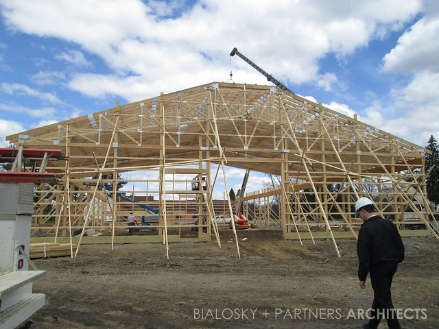
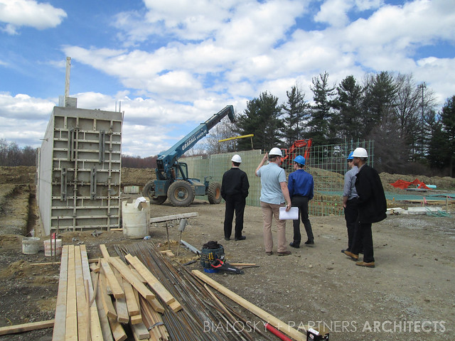
This fall, Orange Village, OH will have a brand new service department on Lander Road. The new 12,800 sf facility and 3,200 sf salt building will support the village’s service department, and provide a maintenance faculty for the service, fire and police vehicles.  Flexibility and efficiency were key design factors, which led to a timber frame pole structure. Notice in the construction photos, this structure allows the spaces to be free of columns that boast a versatile /open interior. As for sustainability, this type of pole construction also has the advantage of an energy efficient building shell, and the site itself encompasses bio-retention.

IMG_3989

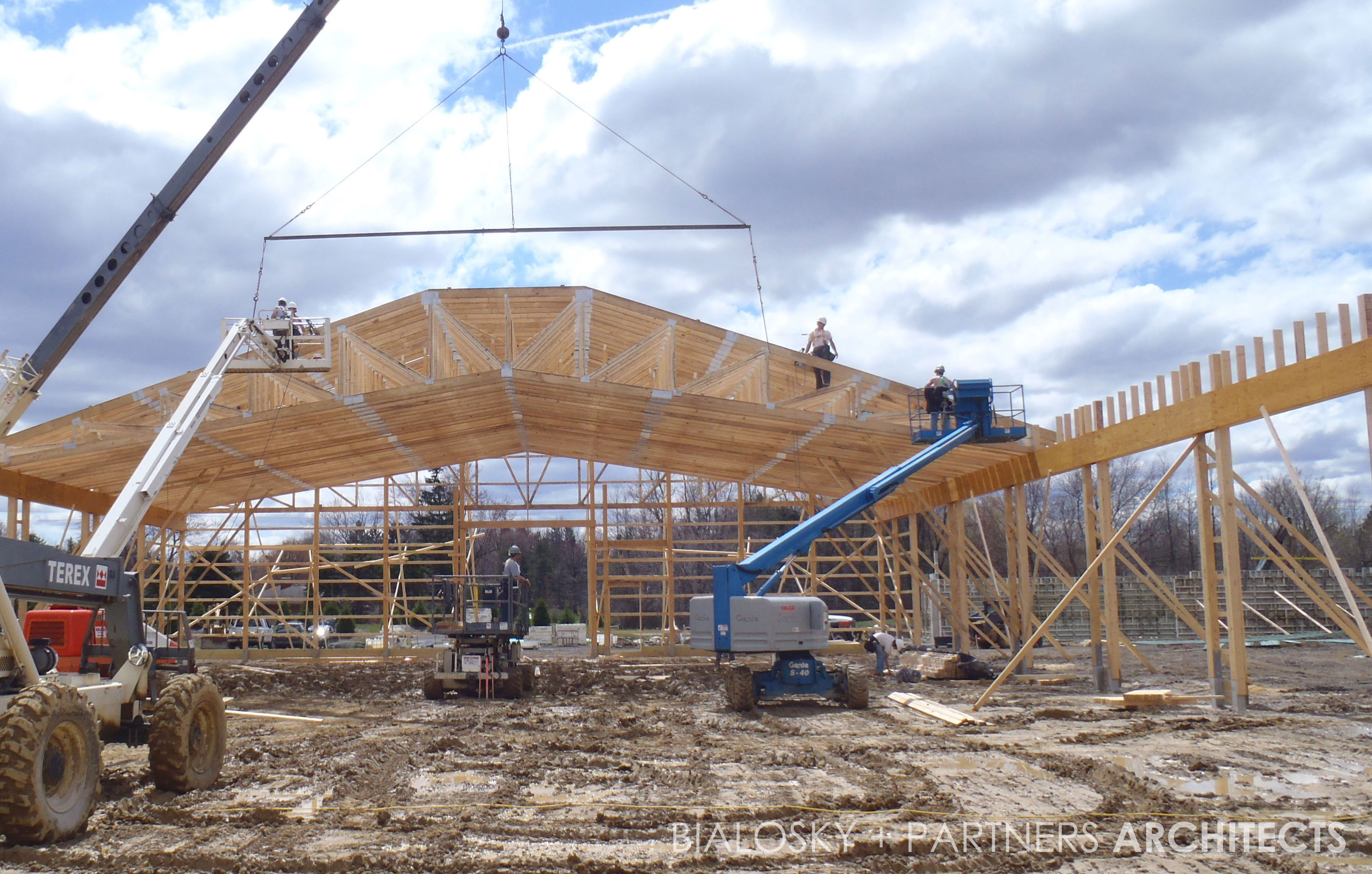
The project is now under construction alongside the city's existing Municipal Center. A few designers from office buckled up their boots, and visited the site Monday to see the large-spanning trusses installed (see the video if you couldn't visit the site).

[flickrvideo width="600" height="450"]http://www.flickr.com/photos/bialoskyarchitects/8658350052/in/photostream/[/flickrvideo]

IMG_3978

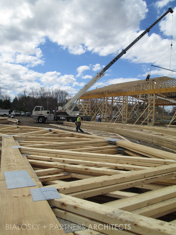
Trusses awaiting installation.

IMG_3977

About half the trusses were installed Monday, with the remainder installed today.

IMG_3982

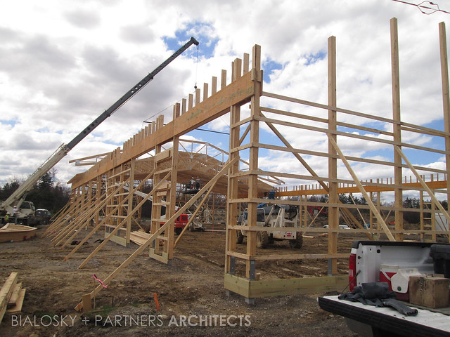
Orange Village's new Salt Building will store winter/ weather supplies for the city.

IMG_3984

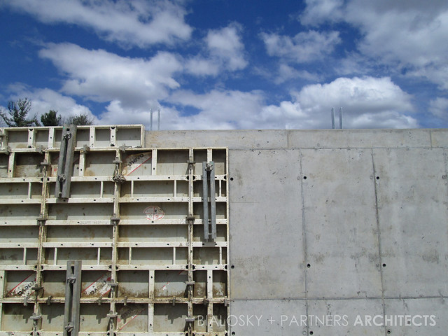
Detail of the Salt Building's retaining wall.

March 19, 2013

Architecture in the “Walkman Phase”

Last week the online design magazine, Dezeen, published an interview with Dutch architect Ben van Berkel of UNStudio on his plans to launch the world's first open-source architecture studio. Once launched, this network will hold great significance as it will begin to take the often secretive and exclusive mentality of knowledge sharing between architecture firms and reverse that thinking. As a "knowledge-based organizational" website, van Berkel describes a system "where knowledge can be shared, contributed and collected."

 Diagram illustrating how UNStudio’s Knowledge Platforms reach out to external partners for collaboration - via deezen.com Bialosky + Partners Architects Cleveland Design Blog

Diagram illustrating how UNStudio’s Knowledge Platforms reach out to external partners for collaboration - via deezen.com

This unprecedented system gives the profession of architecture a needed technological and collaborative leap forward. But to do so, designers must be willing to part with the exclusivity of their acquired building & design knowledge and adopt a more open-source mentality. Any creative knows the benefit of working in close proximity with other creatives, as opposed to working independently in a vacuum. Yet on a larger scale, the practice of architecture operates more independently than anything else. Understandably, business-mindedness and competition have led firms to rarely have a sort of academic, open dialog with other firms. Yet it is this same mentality that has kept practice architecture "in the Walkman phase", as van Berkel coins it.

So what does this mean for us? Spurred on by political obstacles in the Netherlands, van Berkel has realized he and his fellow dutch architects must band together to come up with creative solutions to the obstacles before them - so too must American architects, and perhaps more specifically architects in the nation's hard-hit Rustbelt of the Midwest. In times when sustainability and building performance are often leading factors in the design, construction and lasting performance of buildings, architects must be constantly advancing their own knowledge base. It is a task that is simply too great to be done internally. Instead firms must be willing to offer open seminars, write white papers, maintain blogs documenting design and construction processes. While this may seem as a monumental task, efforts are already underway to begin this knowledge sharing. Firms are establishing blogs that are beginning to informally do just what van Berkel aspires to do. Organizations such as the Building Envelope Council are gaining recognition and prominence as a resource to acquire building knowledge. Architects need to fully participate in such dialogues - not simply listen. To gain the credibility and respect of clients and critics worldwide, we must turn to each other to learn from our collective experiences.

March 7, 2013

A Designer’s Winter Hibernation Film List #5

As we see our final harmless snow flurries for the season, we have our final ten movies for this series A Designer's Winter Hibernation Film List. These special selections come from our own David Craun, and from film curator & blogger Tim Peyton. Some take place in colorful and mysterious cities and spaces, and in many cases, these cities and spaces live and breathe as actors themselves.

Amelie (2001)

Amelie (2001)

DAVID CRAUN, Senior Associate, Bialosky + Partners Architects For design inspiration, I often find myself turning away from architecture and towards other artistic mediums like film that can spark my imagination and change my point of view – this, to me is the true meaning of inspiration.  Oddly enough, the following five films can all be categorized under Romantic Comedy, a result that even I was surprised by when compiling the list.  If you think about it, however, fusing Romance + Comedy results in a full expression of human emotions.  Evoking an emotion through design, or “delight”, (as Vitruvius would say), is one of the most difficult but essential aspects of good design.  Also of note are two underlying themes in the following films that were not, altogether, intentional.   The first being that 3 of 5 films are foreign films and the other two are very low on dialogue – forcing the viewer to focus more on the visual and emotional aspect of the films.  The second being that 4 of 5 films are indirectly about architecture, either by character or by setting, which clearly points to the fact that we architects and urbanites are truly doomed romantics.

  1. Moonrise Kingdom (2012) : The story of two twelve-year-olds who fall in love, make a secret pact, and run away together into the wilderness. (Wes Anderson’s most beautiful movie to date - a hard won title over Life Aquatic – also stunning!).
  2. Sidewalls (2011) - A clever romantic comedy examining with charm how the architecture of a city conditions the lives of two of its residents. (A great depiction of modern urban planning and the love/hate relationship of high density living by its residents – not to mention a subplot involving an aspiring architect finding other means for creative output).
  3. (500) Days of Summer (2009) : A nonlinear romantic comedy about a man who falls head over heels for a woman who doesn't believe in love. (Also indirectly about architecture and an aspiring architect stuck in an unrelated, but creative career).
  4. Paris, je t’aime (2006) : Twenty acclaimed filmmakers from around the world look at love in the City of Lights in this omnibus feature. (With 18 short films in all, there is a little something for everyone – oh, and the city itself is the main character, as you might have guessed).
  5. Amelie (2001) : One woman decides to change the world by changing the lives of the people she knows in this charming and romantic comic fantasy from director Jean-Pierre Jeunet. (Possibly my favorite film of all time – delightful, quirky and absolutely beautiful).
2 or 3 Things I Know About Her (1967)

2 or 3 Things I Know About Her (1967)

TIM PEYTON, Film Curator, Akron Film + Pixel and Film Blogger

  1. Los Angeles Plays Itself (2003) : Like Mike Daviessic book 'City of Quartz' , Thom Anderson's archival essay film "Los Angeles Plays Itself"  is a radical look at the mesmerizing and highly misunderstood metropolis that is Los Angeles. Anderson uses hundreds of copyrighted film clips throughout the history of Hollywood and constructs a film about Los Angeles that speaks most profoundly about how the unconscious works in creating perceptions of places, thus also people and culture,  and how these images can be misleading and distorting. Anderson uses the power of editing and splicing found images as agency to reclaim the city he loves and lives in.  Film as political discourse in the most intimate way.
  2.  2 or 3 things I Know About Her (1967) :  Staring into a coffee cup, Godard as narrator whispers “I have to listen more then ever, I have to look around me”.  In this sprawling philosophical film that is about nearly everything under the sun we follow Julliette Jansons (played by Marina Vlady ), a Parisian housewife who decides to start prostituting herself in order to make more money. Godard whispers essay-like observations concerning his fears of consumer culture while the beautiful camera work by Raoul Coutard shows us the construction on the new banlieus ( the suburbs ) of Paris. Godard's thesis is that buildings and environments help construct ideologies. We need to look around ourselves and listen to what they are saying.
  3. The Shining (1980) :  This film really scared me as a child and it actually was not till a few years ago that I became re-introduced to it and then found myself obsessing over it.  Everyone looks terrified in the movie, like the spectre haunting the hotel is an illness of fear. The illness's symptoms are making Shelly Duvall bruise and decompose, while it seems like Jack Nicholson is working his way threw the incubation period of a rabies infection. It's not the actual hotel that is the star structure of the piece but the art and set design that is the interior of the film. The red carpets and the red bathroom, this bathroom being the location of one of my favorite scenes in film history were through a series of questions and answers Nicholson comes to know that he has always been the caretaker.  This is architectural horror at its scariest.
  4. 24 city (2008) : In this moving film that is part documentary part narrative, we meet the real workers of an airplane engine state – owned factory in Chengdu, China. In these interviews with three generations of people we learn about their time living and working at the factory that is in the process of closing to become an apartment complex also called “24 City”. The film is beautifully shot and has the unique position of having an actual living memory of a building and a time and place in this rapidly changing and continuing urban experiment that is modern day China.
  5. Journey to Italy (1954) : An aging couple, whose marriage is on the rocks, take a trip to Italy- a place whose very landscape is a museum of history and art. The structure of the film works in repetitive stages, we see the couple fight (Ingrid Bergmen and George Sanders) then the husband takes off to drink and flirt while we are left with his wife who travels to old religious sites and catacombs by herself. Eventually this leads up to the husband and wife's pinnacle fight at the ruins of Pompeii where they witness the archaeological unveiling of a couple embracing who have been mummified for centuries. Because of the way the structure of the film works we experience the tension and anxiety of a couples' quarrel and uncertain future and then we also experience, in an almost documentary style, the reflection of time, history and art while being at these magnificent locations, that like the film, is were built as an alchemic process that brings out the most that life has to offer in us.

March 6, 2013

What’s The Big Deal With Continuous Insulation?

What’s The Big Deal With Continuous Insulation?

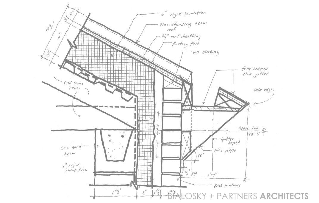
Continuous insulation (CI) has been an energy code requirement since the release of ASHRAE 90.1-2004, but unfortunately is still a bit of a mystery to many designers, contractors, and building officials.  So, besides complying with the building code, why do we need continuous insulation?  Thermal bridging through framing components reduces envelope insulation performance by 15-20% in wood frame construction and by 40%-60% in metal frame construction.  This means that a typical 6” metal stud wall construction with R-19 fiberglass batt insulation actually performs at a dismal R-9.  When CI is properly installed you get the approximate full R-value of the insulation material.  So, what exactly is continuous insulation?

ASHRAE 90.1 defines Continuous Insulation as insulation that is continuous across all structural members without thermal bridges other than fasteners and service openings. It is installed on the interior, exterior, or is integral to any opaque surface of the building.  With further research we find that the definition of “fasteners” is meant to include screws, bolts, nails, etc.  This means that furring strips, clip angles, lintels and other large connection details are excluded from the term “fasteners”.

This is where the big problem lies, and why the industry seems to be so confused.  Many designers, contractors, and building officials are still not informed about this important aspect of CI.  For example, masonry veneer wall construction typically employs steel relieving angles and steel lintels at window and door heads.  These steel angles are usually fastened directly to the building structure, providing a significant thermal bridge from the interior of the building to the exterior.  There are a number of solutions to this issue including welding the angles to standoffs at +/- 4’-0” centers, which allows the CI to be installed behind the angles to minimize the effects of thermal bridging.  There are also proprietary clip systems being marketed to perform this same function.

Another cause for confusion is the fact that many building claddings such as metal panels, fiber cement board/siding, etc. are not approved for attachment through more than 1” of non-supporting material.  In climate zone 5 we are required to have a minimum CI of 7.5, resulting in a CI thickness of about 1 1/2".  There are proprietary systems that have been developed to deal with this issue such as the DOW-Knight CI System .  This system has been engineered to allow up to 3” of continuous insulation to pass behind the girt supports.  If you or your client don’t desire to specify proprietary systems, the New York State Energy Research and Development Authority (NYSERDA) commissioned a testing report that describes a number of other fastening system options for continuous insulation.  It’s a long read but has a lot of useful information regarding this matter.

In summary, the proper use of continuous insulation is all about paying attention to the details.  There are a growing number of resources out there aiming to help designers detail buildings properly.  A few of my favorites are www.buildingscience.com and www.bec-national.org .  Happy reading, and let’s keep it sustainable.

February 28, 2013

Being Messy to Save the Creativity

John Cleese, in the video below, does a amazing job of explaining creativity with regards to two simple mindsets: open and closed.

I maintain a pristine, meticulously organized desk, the majority of the time. Custom designed marker holders, business card containers and form fit filing structures. Every pencil in its correct place and every post-it in its designated location. This gives me some measure of internal peace. But this is also a sad thing for me because it's an indicator of how I spend the majority of my time: in my closed mindset.

When I am creating and designing, or being playful as John Cleese puts is, my workspace is a mess. Pencils and markers everywhere. Sketch paper and reference materials scattered about, resembling no sense of it's normal organization. And I enjoy this process. It allows me to look at that what I’ve created and lean back and smile. Ahhhhhh, “I create. Me Good.”

When we are at play, we are not focused on organization.

As a profession, architects are seen as bastions of creativity. But, we are susceptible to the same stressful, humorless, closed mindset as the rest of the working world. It's even more important for us to harness the power of the open mode.

[vimeo width="600" height="450"]http://vimeo.com/18913413[/vimeo]

To summarize John Cleese, the 5 things you can do to allow yourself to engage the open mode:
1. Space: A quiet location where you will be undisturbed. Create an oasis.
2. Time: Create boundaries of space and time. Allow for play by separating yourself from everyday life for a set time.
3.Time: Give your mind as long as possible to come up with something original. Usually around 1 1/2 hours.
4. Confidence: While you're being creative, nothing is wrong.
5. Humor: Laughter instead of solemnity. It gets us from the closed mode to the open mode quicker than anything else.

There seems to be a notion that when we are at our desks, we are being productive. Most of us know that this can be far from the truth. In the design profession, it's even more important to cast off this "desk slave" mentality and embrace the unknown abyss of creativity. So, if you see me off in a corner somewhere, away from my desk, pencil and paper in hand, fear not, for you will know that I am three levels deep fighting the beasts of creativity.