Being involved in most of our firm’s higher education projects, I was naturally excited to be invited to the Ohio Educational Environments Forum sponsored by KI Furnishings and Contract Source Inc. as a guest panelist on October 9th. With projects like Muskingum University’s University Center, which will begin construction this fall and Lorain County Community College’s recently completed Ben and Jane Norton Culinary Arts Center under my belt, I design knowing the importance of spaces and buildings that will support and foster the education of others. With a passion for life-long learning, I looked forward to exchanging ideas about spaces programmed for education.
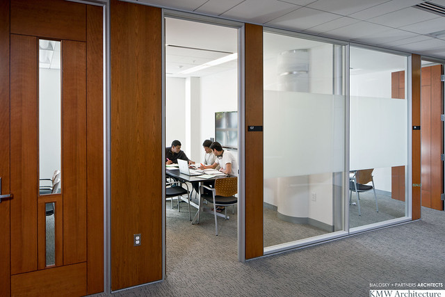
Study space at Ohio State University's Mason Hall, which Bialosky + Partners collaborated with Kallman McKinnell and Wood for the renovation.
The forum included two presentations followed by a panel discussion on changes in higher education based on new teaching pedagogies, shifts in campus and student culture, and how technology affects the design of higher education spaces and buildings. The opening presentations covered a lot of ground, and gave engaging examples of 21st century learning spaces:
- Amy Kiefer, Vice President, Education Markets for KI presented a CEU on Advanced Learning Spaces and Trends in Higher Education.
- Paul Mitnick, Senior Account Manager, Soundcom Systems discussed applications of how technology has been implemented in some recent projects.
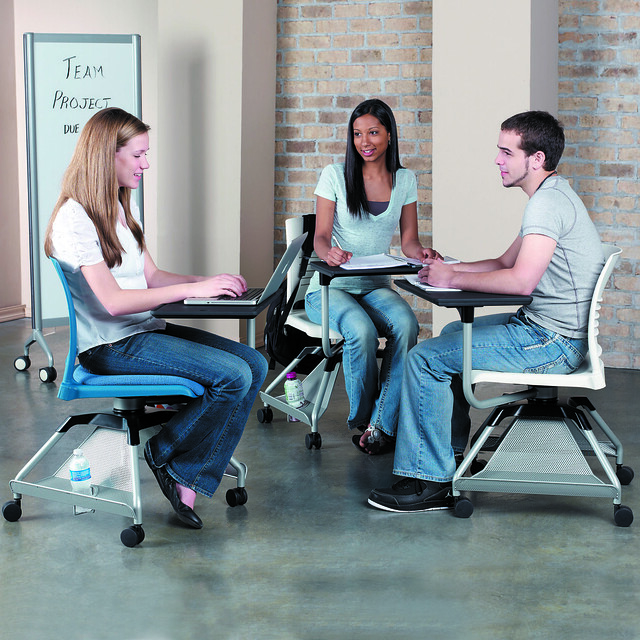
The "Learn 2 Tablet Armchair" from KI.
Lastly, the panel discussed the top themes and challenges each panel member sees in their roles and answered questions from the audience. I sat on the panel with our opening presenters, Amy and Paul, in addition to:
- Jack Miner, Senior Associate Registrar, The Ohio State University
- Tom Kemp, Director of Instructional Technology & Learning Management, Ashland University
We had great questions from the audience and the panelists discussed everything from how to maximize classroom utilization factors, safety on campus, incorporating distance learning courses into class offerings, and how to optimize learning environments with minimal funding. Education in general, and specifically higher education, is changing at a fast pace. We as architects and designers have to understand the challenges our clients are facing and offer creative and effective solutions. Many of the trends we see in corporate America are trickling down to higher education:
- Generational shifts – Millennials are driving the trends in higher education and beyond
- Global implications – the world is constantly getting smaller and more connected
- Collaboration
- Technology – of today, of the future, and how to plan for changes
- Ergonomics/ health and safety
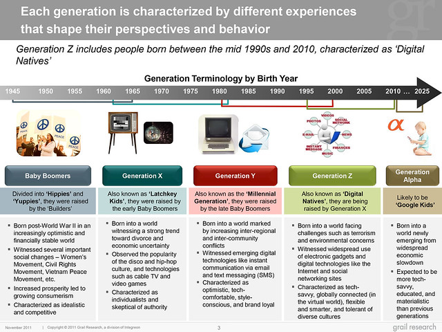
This chart highlights the differences in generations, and how these effect learning and society as a whole.
In addition to these factors, issues specific to higher education also have an impact on design:
- Demographic shifts of the “typical” student
- Teaching Pedagogies – the students of today no longer want to be lectured to, classes are becoming more interactive and collaborative
- Blended Learning – the combination of online and offline learning
- Age of our higher education institutions and their structures
- Budget limits – doing more with less
- Extending learning beyond the classroom – with technology, social media and collaboration, learning happens everywhere
- Increase in STEM education – Science, Technology, Engineering, and Mathematics
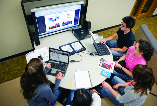
Collaborative learning spaces are being integrated into many higher education projects, as a result of Gen Z growing up and going to college.
This video, "Did You Know?/ Shift Happens" (Version 6, 2012) reinforces many of the ideas that are changing higher education. [youtube]http://www.youtube.com/watch?v=XVQ1ULfQawk[/youtube] Our educational environments must transform and be designed to support the learning environments of the future. There are no best formulas for these spaces. Key team members must recognize the relationship between teaching style and physical space, acknowledge that change is inevitable and faster than ever, and determine what is best for each institution, building, classroom, and learning space. There are no one-size-fits all solutions. Instead, an assortment of creative solutions should be included to fit the needs of their individual circumstance, students, and faculty.
For further reading: The Learning Environment Sweet Spot. Amy Kiefer, KI Vice President, Education Markets


 A case in point is a recently completed school in the Midwest. The building was designed by Bialosky + Partners Architects to very high standards, employed a wide variety of sustainable strategies, and achieved a LEED silver certification from the USGBC. While materials and systems used throughout the school were selected for their high performance characteristics and seemed to be functioning properly, there was a mystery developing. Occasionally an unpleasant odor would migrate through certain portions of the building. The locations were transient and the source was unidentifiable for quite some time. Eventually it was determined that the odor was caused by sanitary gasses escaping from dry drain traps within the ceiling plenum. The building’s geothermal system provides heating and cooling for the school with the help of heat pumps distributed above ceilings around the facility. When operating in cooling mode these heat pumps generate condensate that must be conveyed away by hub drains attached to the plumbing sanitary lines. The drains had the code-required trap primers to maintain an air-tight seal, but investigation revealed that an exceptionally high percentage of the trap primers had failed due to mineral deposition. Lab testing indicated that unexpected quantities of copper, zinc, and lead precipitate on the primer valves were making them stop functioning. This meant that when sufficient condensate water evaporated from any of the hub drain traps, sanitary gasses would escape and circulate through the return air plenum and into the mechanical units conditioning the building’s occupied spaces.
  The question was why the water was depositing such levels of particulates on the valves, especially in a newly opened green school. Parts of the mystery began falling into place once it was understood that the residue on the trap primers was actually metal being dissolved from inside the water supply pipes. Further testing showed that the water within the building’s pipes was significantly more acidic than the water being provided to the school by the public utility. The pH of water provided by municipalities around northeast Ohio tends to fall between 7 to 7.6 due to the presence of naturally occurring limestone in Lake Erie but somehow the water in the schools lines was closer to pH of 6.1 and was actually corroding the copper pipes and brass fittings.
 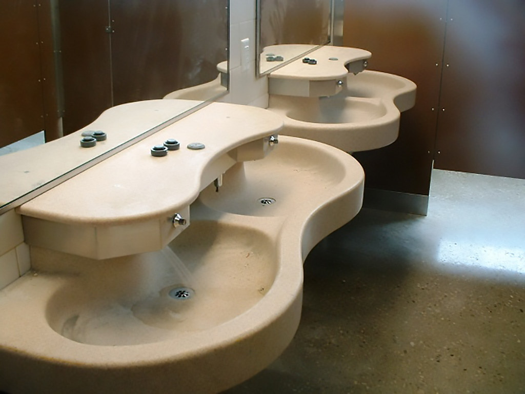 A water chemist was engaged to help explain the situation and propose a resolution. Ultimately a water softening and treatment system was installed to address the corrosion issues and alternate trap seals were installed on the hub drains to supplement the trap primers. Regularly scheduled testing will confirm that the corrective actions are working as intended. The actual reason for the water acidity in this instance appears to be a fairly frequently encountered, but little-known, case of standing water inherently decreasing in pH over time. The use of low-flow fixtures and water saving technologies in this building resulted in significantly less water use than a building of comparable size and occupancy, but may have actually contributed to the problems being experienced. Schools tend to have very intermittent water use. Users may call for fairly high volumes at certain times of day, but from dusk to dawn, all weekend and holidays, and most of the summer, there is very little water use. Couple that with new technologies intended to reduce use and virtually eliminate waste of this precious resource, and the water in those pipes can sit unused for long stretches of time. It appears that this very scenario resulted in the mysterious series of events in this new LEED certified building.
  In this case, it was perhaps lucky that a specific alignment of circumstances resulted in the mysterious odor that alerted the project team to the greater issue of high water acidity before significant damage was done to building systems. Undoubtedly similar low pH water conditions are eating away at water pipes in many buildings today – perhaps due in part to the well-intentioned use of water saving technologies. Damage to piping, fittings, equipment, and general water quality will likely go unresolved until architects, engineers, building owners, and managers are more aware of the potential issue. Architecture is a wide-ranging and fascinating field and we learn more every day. In addition to the practice of art and science, sometimes an architect is called upon to play the roles of chemistry student and detective as well.


