November 21, 2016

Bialosky Cleveland Honored for Recent Work and Service at Cleveland Design Awards

On Friday night, a record-breaking 500 people from the Cleveland architecture and design community gathered at the sparkling new Hilton Cleveland Downtown for the annual AIA/IIDA Cleveland Design Awards. An impressive, diverse pool of projects by local architects were showcased and honored, by juries led by Roberto de Leon, FAIA and Christopher Stulpin, IIDA. It was a magnificent affair, with an uplifting spirit of collegiality and unity from the design community.

Bialosky Cleveland earned three design awards for recent projects. Also, three of our employees were individually recognized. Congratulations to our teams behind The Schofield, Roberta A. Smith University Library, and our own offices.

Congratulations to Chris Persons and Kate Walker, two of our recent grads, who also took home honors for their grad work at Kent State University! Also, the President's Citation was awarded to our own Hallie DelVillan for her service and leadership in the chapter, and her commitment to advancing equity in the profession.

More posts to come, that will profile these award-winning projects.
Congrats to all our peers who were also recognized, and to every firm who submitted this year!

Project Awards

awards-stamped2

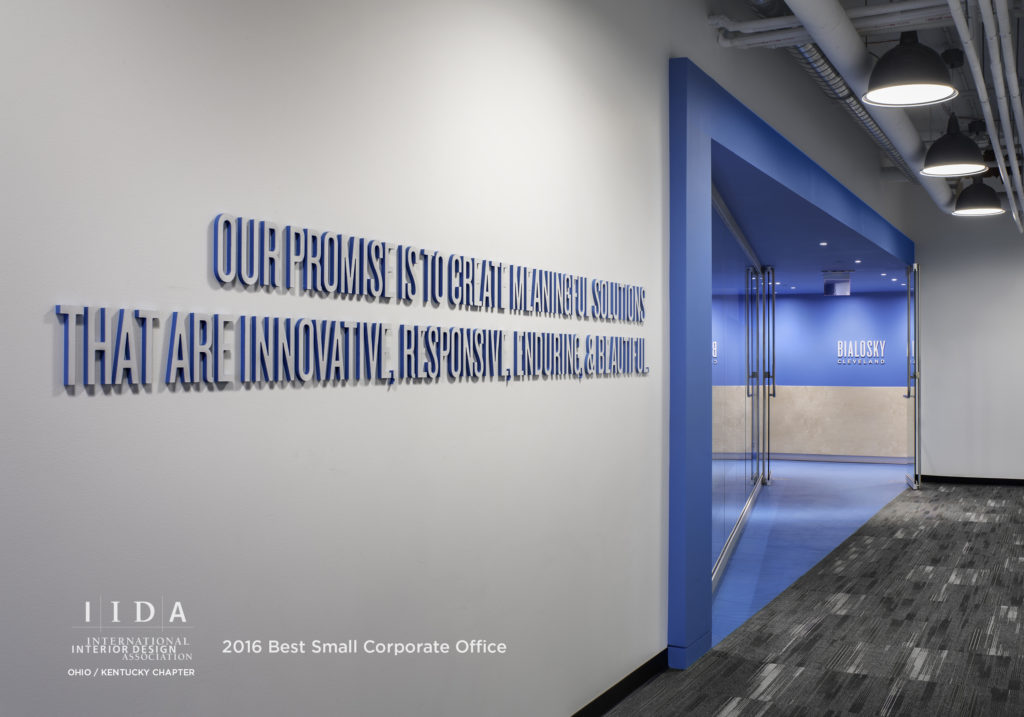
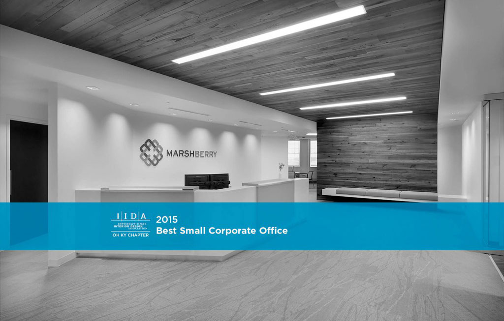
IIDA Best Small Corporate Office
Bialosky Cleveland Offices
Bialosky Team: Jack Alan Bialosky, Jr., Paul Deutsch, Paul Taylor, Mandisa Gosa, Philip Erb, Chelsey Finnimore

awards-stamped

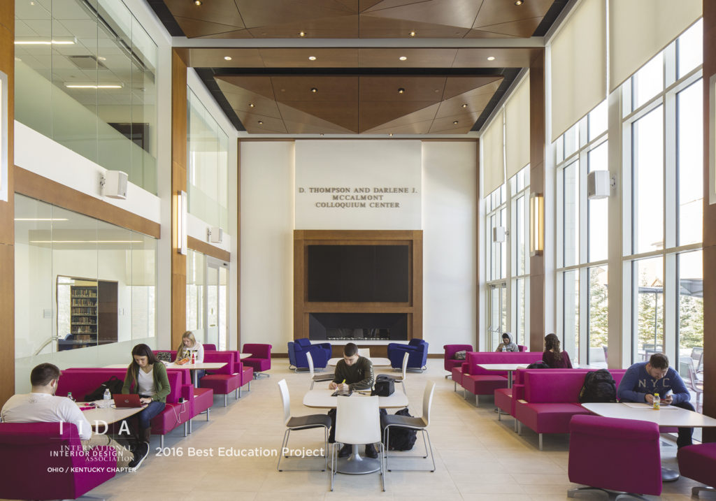
IIDA Best Education Project
Roberta A. Smith University Library
Muskingum University
Bialosky Team: Bruce Horton, Brandon Garrett, Tracy Sciano Vajskop, Philip Erb, Nick Dilisio

schofieldfinalv2-stamped

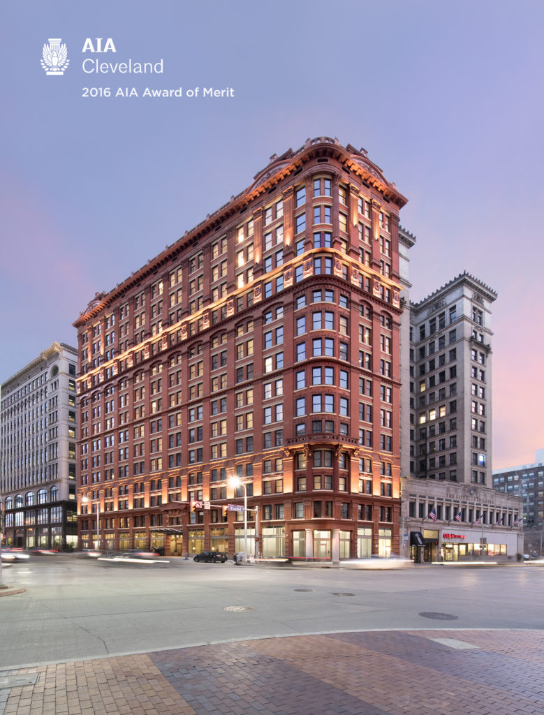
AIA Merit Award
Project Name:  The Schofield
Bialosky Team: Paul Deutsch, Ryan Parsons, Theodore Ferringer
Architect:  STUDIOCRM, Inc., Bialosky Cleveland and Sandvick Architects


Individual Awards

AIA Student Merit Award
Chris Persons, for Drydock No. 2

IIDA Student Honorable Mention
Kate Walker, for SCFBC

President's Citation
Hallie DelVillan


September 26, 2016

Bialosky Receives National Marketing Excellence Award

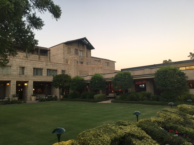
Firms from all corners of America came to represent their firms at the Arizona Biltmore, Designed by Frank Lloyd Wright.

Industry leaders from all corners of America came to represent their firms at the Arizona Biltmore, designed by Frank Lloyd Wright.

Over the weekend, Marketing Director, Hallie DelVillan and Graphic Designer, Chelsey Finnimore accepted the 2016 Zweig Group Marketing Excellence Award at the Arizona Biltmore Hotel in Phoenix on behalf of Bialosky Cleveland. Bialosky placed 3rd nationally in the Integrated Marketing category for our refreshed  branding and marketing strategy.

Winners in our category include:

  1. Hickok Cole Architects
  2. WGI
  3. Bialosky Cleveland
  4. EAPC
  5. JLG Architects
Bialosky's integrated marketing, including branding, environmental graphics, vision and values, and digital presence, garnered a national award from the AEC industry.

Bialosky's integrated marketing, including branding, environmental graphics, vision and values, and digital presence, garnered a national award from the AEC industry.

It is an honor to be recognized by our peers for the hard-work and dedication our people have put forth in creating an outward persona that truly reflects the values our firm was founded on.

What the judges had to say:

"We were impressed by the quality of the overall submittal package. The custom binding, high quality printing and paper, mirrored the high quality of their integrated marketing campaign. High marks were given due to the level of detail in the graphic standards, creativity of the environmental graphics, and achieved results."

Take a peak inside our 2016 submission:
[soliloquy id="3258"]

May 5, 2016

Bialosky Cleveland Receives Honorable Mention in 2016 COLDSCAPES Competition!

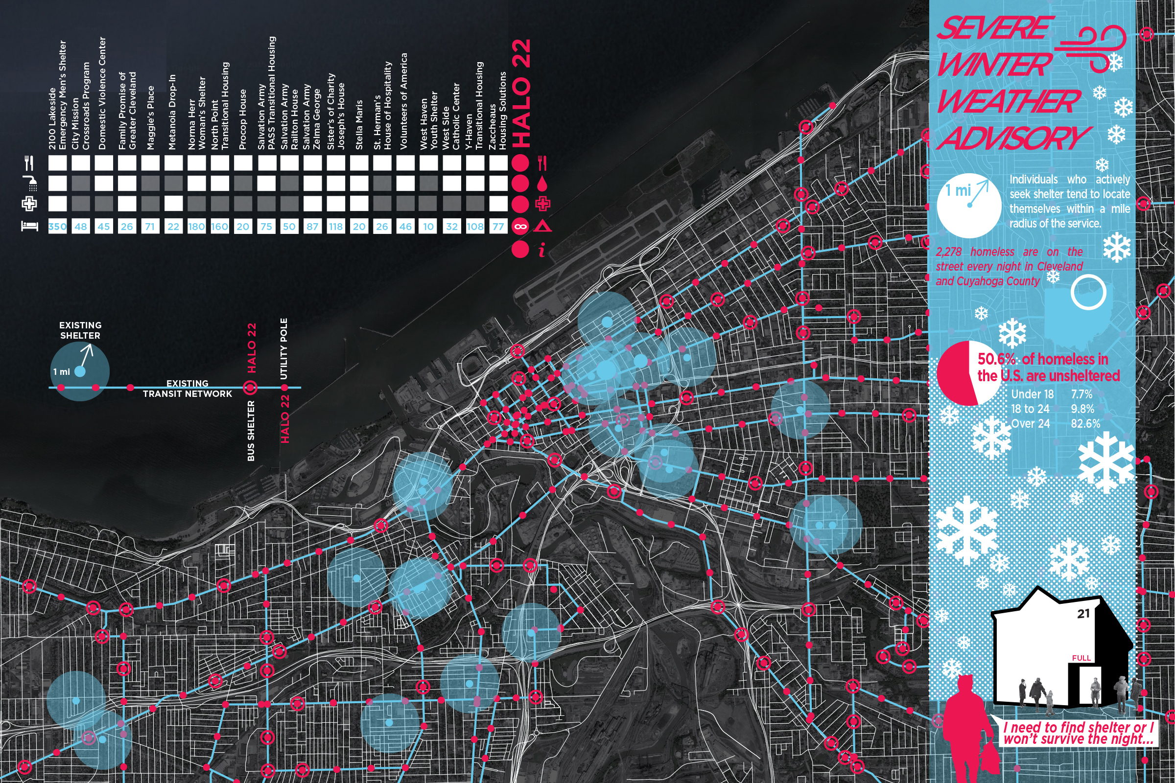
COLDSCAPES//Adapt is a multidisciplinary design competition seeking innovative responses to volatile weather conditions in winter cities organized by Kent State University’s Cleveland Urban Design Collaborative (CUDC).

Bialosky Cleveland received an Honorable Mention for their submission of HALO 22.  The project concept was inspired by the phenomenon from nature known as a 22˚ halo, an illusion caused by ice crystals refracting light in the atmosphere, forming a circular glow around the source. From this idea, the concept of HALO 22 was born, providing a critical step in survival for the homeless while beautifying the urban realm in the process.

halo 22_1-1


In Northeast Ohio there are 21 homeless shelters where people seek refuge from the elements. On freezing cold nights, the shelters overflow with people needing protection from the harsh conditions, and many are turned away due to the lack of space. With no resources to survive, HALO 22 provides those who were sent away with temporary shelter, food, water, first aid, and information.

Inspired by the 22˚ halo, circular light installations are attached to existing networks of infrastructure (such as bus signs and bus shelters). The halos appear suspended in a crystalline container that holds the supplies. In milder conditions, they appear as works of art, bringing light and interest to a space. However, in freezing, dangerous conditions, HALO 22 installations become beacons of hope, signaling help to those who need it the most.

halo 22_3


The competition team included Jeff Jasinski, Julie Roberts, Sai Sinbondit, Jeremy Smith, and Brad Valtman, with David Craun and Ted Ferringer serving as team advisors.

This year’s Coldscapes Competition was the second installment of an international competition hosted by the Cleveland Urban Design Collaborative. For more information, please visit the Coldscapes competition website at http://www.cudc.kent.edu/cold/2016-coldscapesadapt-competition-winners/.

November 26, 2015

Project Spotlight: Marshberry Corporation

At this year’s AIA / IIDA Cleveland Design Awards, Bialosky earned a 2015 IIDA Design Award for the recently completed project, Marshberry Corporation. Karen Miller, Senior Associate, Senior Interior Designer of NBBJ (Columbus) chaired the jury for this year’s interior design projects, and said of the project: “Marshberry exercised a well-edited interiors pallet, allowing a small gesture to have a large impact.”

news-4-1

Entry to Marshberry’s new corporate headquarters in Beachwood, OH.

With a bold and fresh new brand, Marshberry Corporation sought an office space that would embrace its new messaging, attract and retain new talent, and encourage a culture of collaboration. Previously disconnected by multiple floors with challenging interior spaces, Marshberry aimed to not only unify their team and enhance the experience of their clients, but also to add spatial flexibility and versatility to their working environment.

I sat down with one of our primary designers of the space, Mandisa Gosa, for a few Q&A’s.

______________________________________________________________________

What were the biggest challenges to overcome in the project? 

MG: Space planning was very important. Marshberry predicted to only need 75% of their new floorplate immediately, so space planning for the present as well as the future was critical to get right. Another huge factor of success relied on the aesthetic leap from their current offices, set in a Jeffersonian building, to a modern work environment, and have the employees be comfortable and feel “at home” as the Marshberry brand was changing.

Lobby, with a pop of color at the end of the corridor.

Can you describe the philosophy behind using neutrals vs. color?

MG: The design balances a vivid, yet minimalist palette, with clean neutrals and measured pops of color & texture. Bright white surfaces were used throughout to celebrate the fresh new space and enhance the natural light while also serving as a backdrop for key design features. Brilliant yellow was used to highlight key areas, such as the acrylic panels cloaking the reception desk and adjoining wall of the kitchen and dining area.

How did you encourage interaction in the space? How is the space flexible?

MG: The strategic use of glass was key; completely transparent glass signals an open line of communication. It’s a value Marshberry looked to promote in their new space. Private offices are built with clear glass, allowing managers to be more accessible, and to simply wave someone in or motion “just one second”. It’s much more welcoming. The multipurpose space is a great example of a flexible work environment. With movable walls, easy to move furniture, pin-up surfaces, the space can easily transform from Conference to Cafe.

November 24, 2015

Project Spotlight: The Midway Cleveland Conceptual Planning

Bialosky + Partners Architects recently earned a Merit Award at the 2015 AIA/IIDA Cleveland Design Awards, for conceptual planning and design of The Midway Bicycle Network for a stakeholder group led by Bike Cleveland. Thanks to all involved, in particular, Bike Cleveland Executive Director Jacob Van Sickle, Board Member Barb Clint, St. Clair Superior Development Corporation, and Ohio City Inc.

news-2-1

Conceptual Midway Network Plan

The Midway seeks to re-utilize the historic infrastructure of Cleveland’s former streetcar network and leverages excess vehicular lane capacities to create an 80+ mile protected cycle track network. Protected cycle tracks provide continuous physical protection to cyclists while still being a part of the curb-to-curb street right of way. While the application of this typology to Cleveland is wholly unique, protected (or separated) cycle tracks are common throughout the world and are proven to make streets safe and comfortable for “all users from 8 to 80”. This infrastructure provides significant economic benefits and significantly increases the mode share of cyclists. Learn more about this vision at midwaycle.org andbikecleveland.org/midway/. Follow the project on Facebook here:facebook.com/TheMidwayCleveland