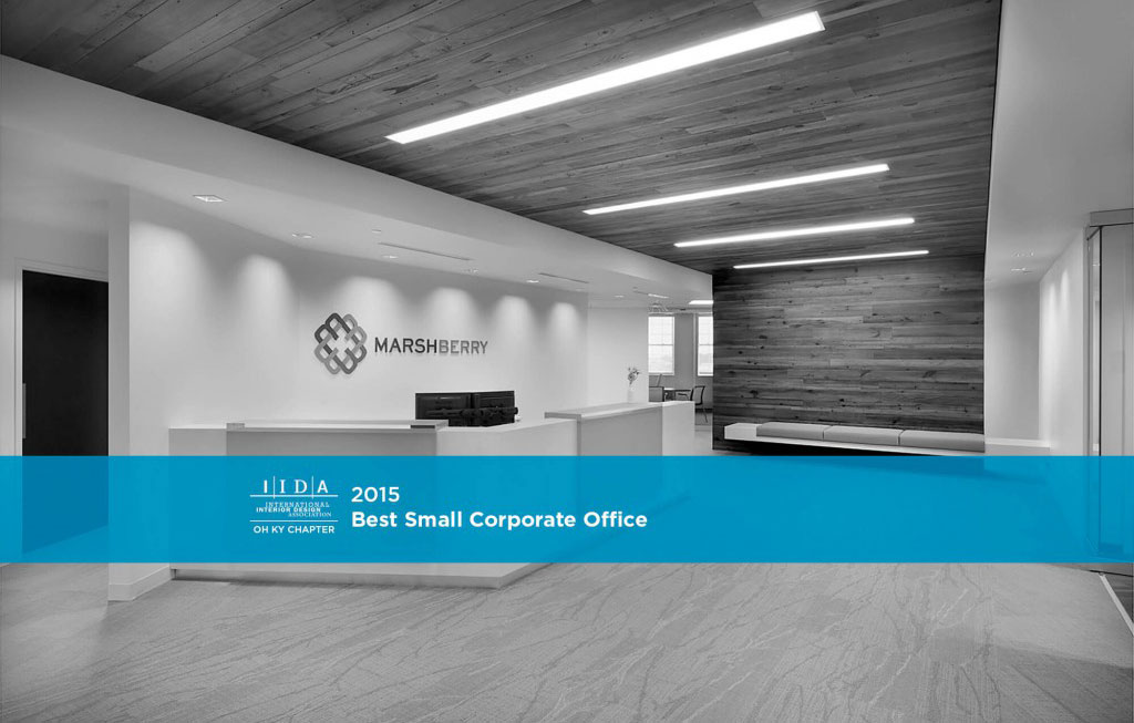
At this year’s AIA / IIDA Cleveland Design Awards, Bialosky earned a 2015 IIDA Design Award for the recently completed project, Marshberry Corporation. Karen Miller, Senior Associate, Senior Interior Designer of NBBJ (Columbus) chaired the jury for this year’s interior design projects, and said of the project: “Marshberry exercised a well-edited interiors pallet, allowing a small gesture to have a large impact.”

Entry to Marshberry’s new corporate headquarters in Beachwood, OH.
With a bold and fresh new brand, Marshberry Corporation sought an office space that would embrace its new messaging, attract and retain new talent, and encourage a culture of collaboration. Previously disconnected by multiple floors with challenging interior spaces, Marshberry aimed to not only unify their team and enhance the experience of their clients, but also to add spatial flexibility and versatility to their working environment.
I sat down with one of our primary designers of the space, Mandisa Gosa, for a few Q&A’s.
______________________________________________________________________
What were the biggest challenges to overcome in the project?
MG: Space planning was very important. Marshberry predicted to only need 75% of their new floorplate immediately, so space planning for the present as well as the future was critical to get right. Another huge factor of success relied on the aesthetic leap from their current offices, set in a Jeffersonian building, to a modern work environment, and have the employees be comfortable and feel “at home” as the Marshberry brand was changing.
Lobby, with a pop of color at the end of the corridor.
Can you describe the philosophy behind using neutrals vs. color?
MG: The design balances a vivid, yet minimalist palette, with clean neutrals and measured pops of color & texture. Bright white surfaces were used throughout to celebrate the fresh new space and enhance the natural light while also serving as a backdrop for key design features. Brilliant yellow was used to highlight key areas, such as the acrylic panels cloaking the reception desk and adjoining wall of the kitchen and dining area.
How did you encourage interaction in the space? How is the space flexible?
MG: The strategic use of glass was key; completely transparent glass signals an open line of communication. It’s a value Marshberry looked to promote in their new space. Private offices are built with clear glass, allowing managers to be more accessible, and to simply wave someone in or motion “just one second”. It’s much more welcoming. The multipurpose space is a great example of a flexible work environment. With movable walls, easy to move furniture, pin-up surfaces, the space can easily transform from Conference to Cafe.
