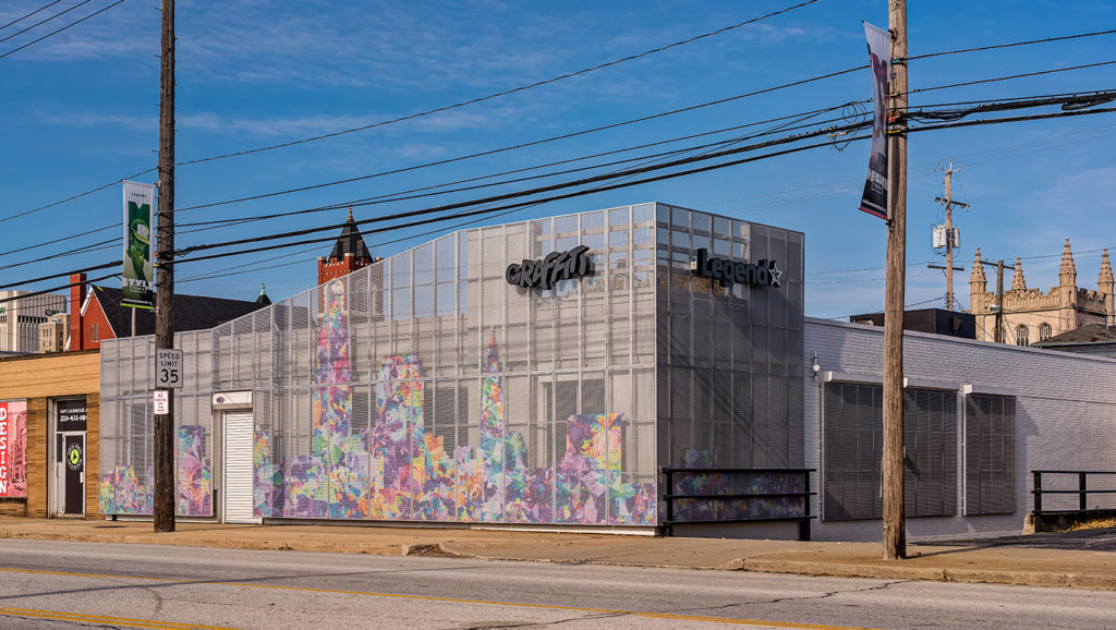
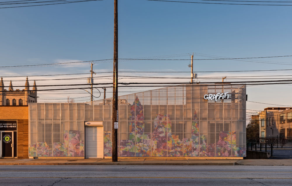
Constraints often create the best opportunities for design. When the owners of Graffiti and Legend asked us to re-design their Midtown storefront, the constraints were fairly evident. Some were typical, like budget and constructability, while others were more unique, like providing daylight to a retail store that requires a high level of security. Ultimately, these constraints drove the design and allowed us to create a unique storefront that brings a vibrant flash to the Midtown neighborhood while remaining true to the identity of its owners.

An Opportunity for Design
—
Existing Physical Conditions
The façade consisted of original brick masonry partially covered over as part of a renovation made up of tile and fiber-reinforced panels done in the 1980s. These renovated materials would be difficult to remove without potentially destroying the underlying brickwork, so we made the decision to simply leave them in place and paint all existing materials a single color to help unite them. We then covered them further with a perforated metal panel supported by an aluminum frame. The form is thus directly influenced by the existing constraints.

In Process South Elevation
Property Lines
The storefront sits directly adjacent to the city-owned sidewalk, meaning the aluminum support frame for the metal panel cannot engage the ground since it would cause potential issues for sidewalk replacement and plowing. Because of the existing facade materials, the frame had to be light enough to carry the new additional weight. The solution was to create smaller individual frames that could be installed independently and tied together laterally. The majority of these frames ended up being four feet wide, which precisely matched the dimensions of the perforated metal panels, meaning less material had to be wasted which is always a bonus.

Frame Attachment Detail: A. Overview B. Frame to Existing Wall C. Frame to Frame
Security
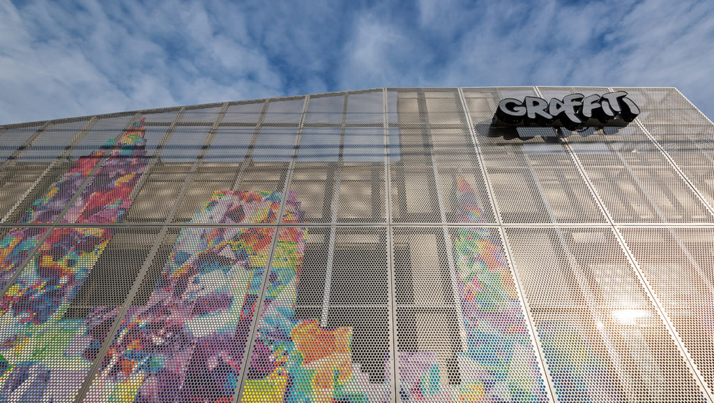
Prior to our design, motorized grilles covered all of the windows and were rarely opened up during the day, meaning minimal daylight was reaching the offices and showroom. The perforated panels offer a unique solution as they cover the windows completely, allowing the security grilles can remain open at all times, while the perforations are sized in a way that permits ample daylight to fill the interior. Tamper-proof screws add an additional level of security, ensuring the panels can’t be removed without specialized tools.
Visual Interest
Physical conditions, property lines, and security concerns are contributing factors to the design process, but the aesthetic of the finished product must still stand out and support the vibrant brands. After all, the name of the business is Graffiti!

In Process South Elevation with Metal Frame Detail
The concept was to integrate a city-themed graphic that would evoke the very heart of the business’s ethos: provide great product and service, right here in Cleveland.
We considered several options for painting or coating the metal panels. Printing directly onto the metal was an early idea, but the process proved too difficult as the perforations and size of the panels would make it hard to achieve a clean finished product that can withstand weather and time. We ultimately decided it would be interesting to treat the perforations as pixels and layer something colorful and vibrant behind the metal panel. We printed a graphic onto a vinyl material that was then wrapped over a thin aluminum composite panel. Prior to being wrapped, the aluminum panel was CNC routed to match the shape of our choice, the Cleveland skyline. These colorful panels were then “sandwiched” between the perforated metal panels and the aluminum frame, holding them in place. This method ensures longevity compared to printing directly onto the perforated metal panel while the layering provides further protection from UV light.
A Vibrant Solution
—

The solution to our constraints ended up providing more than we could have hoped for, as it allows the appearance of the façade to change as light hits the surface. At times, the grittiness of the metal panel stands out, while at others the graphic shines brighter.
Small projects can be challenging to find design inspiration, but by listening to the client’s needs, and understanding the design constraints, we realized that simple solutions have a huge impact.
For more information about the project, visit the project page.
