2016 has brought along quite a few changes here at Bialosky—new projects, new hires, a new place to call home at 6555 Carneige Ave, a new name, and a new brand identity to celebrate and highlight these exciting milestones.
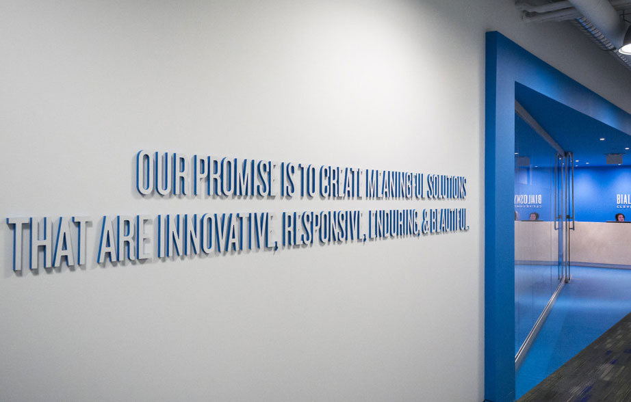
The first step in rebranding was to clearly define our promise to our clients and the process though which we make that promise a reality. To do this, we took a step back to analyze our design process and the values we hold as a firm. This introspection allowed us to define the four core values through which we interpret all aspects of the work we do: innovative, responsive, enduring, and beautiful. These four words and their corresponding promise were the jumping off point for the creation of the new Bialosky Cleveland identity.
Sketch, Discuss, Revise, Repeat
The cornerstone of the new identity is the name shift from 'Bialosky + Partners Architects' to simply 'Bialosky Cleveland.' Although we didn't intend for a name change when we set out on our rebranding mission, the name change grew organically out of the logo design process—reaffirming the value of an iterative design process of thoughtful discussion and intentional revisions. The design process began with a series of rough sketches exploring the basics of graphic identity: typography, mark, and color. These initial sketches were reviewed and discussed by our team and used to tease out successful ideas for further exploration. During the first round of sketches, we were drawn to concepts with bold typography that were simple, timeless, and clean while nodding to the idea of integration, cooperation and partnership. As these initial concepts were explored and refined, we found ourselves pairing down each iteration more and more until we landed on the final mark: a bold typographic treatment, stating simply 'who we are' and 'where we're from.'

This pairing down of the logo to its key parts led to the discussion of what exactly it would mean to simply be 'Bialosky Cleveland.' Bialosky's equity is not only tied to its leadership and history as an architectural firm, but also to its employees and its multi-disciplinary approach. We are a diverse group of individuals anchored by strong leadership and an even stronger history. We are architects, planners, interior designers, engineers, and environmental graphic designers. It's how we answer the phone and it's what our clients call us—we are Bialosky. The name change makes more sense now than ever before.

Color & Type
Pushing the ideas of simplicity, flexibility, and equity was key in the continued development of the Bialosky graphic identity. Blue—representing trust, loyalty, wisdom, confidence, and intelligence—has always been at the core of the Bialosky palette. The updated palette plays off of this equity with a bold pairing of blue/black and cyan. A classic navy and middle gray provide depth, while a bold pop of warm red rounds out the palette with an unexpected brightness.

Strong typography is the basis of the Bialosky Cleveland logo and is a pillar of the extended identity. The typography pays tribute to the equity of the past Bialosky + Partners Architects marks while adding a contemporary twist. The primary Bialosky typeface, Knockout, is a condensed sans-serif that subtly nods to the Bialosky + Partners condensed logotype of the 1990s. The secondary typeface Gotham, a geometric san-serif inspired by mid-twentieth century architectural signage, is a well-balance blend of new and old that adds a great deal of flexibility to the identity.

Function & Application
The flexibility of the new identity is continued throughout its various applications. As an integrated architectural firm, the Bialosky brand needed to be easily translated across a number of platforms from formal business letters and proposals, vibrant marketing collateral and environmental graphics throughout the office.


This work is protected and owned by Bialosky Cleveland and cannot be used, distributed, or displayed without permission.
