Bialosky + Partners Architects welcomes our newest team member, graphic designer and Cleveland Institute of Art (CIA) graduate (Communication Design BFA ’13) Chelsey Finnimore. Growing up Chelsey wanted to be a fashion designer, a writer or a detective. Combining her creativity, a passion for communicating, and a strong desire for problem solving, graphic design seemed like an obvious choice. Chelsey’s skill set will come in handy if the office decides well designed private detective work is a lucrative market. At CIA, Chelsey’s Communication Design program included an emphasis in Fiber and Material Studies. This interest in the digital and tactile resulted in developing skills in silk-screening. One such project included a series of “fake products”, like the Apocalypse Survivor Backpack. Backpack contents included tools like bug spray to protect one from giant locusts, and a rope with carabineer set in case of accidental accession. The project was a commentary on the role of technology becoming a hindrance to our survival in times of crisis.

Be Prepared For Anything... With Chelsey Finnimore's Apocalypse Backpack!
Chelsey’s favorite professor at CIA was Graphic Design professor, Gene Pawlowski. Chelsey learned from Professor Pawlowski’s “old school” style of teaching typography. He was detailed orientated, pushing his students to be specific and precise in their designs. Chelsey’s favorite class with him was a Hand Made Bookmaking Class. The class included learning and using tons of ancient gadgets for bookmaking. Chelsey is continuously striving to find a legitimate use for the font Adobe Giddy Up in her work. She loves storytelling and believes that great design can be used to tell great stories. Her dream project would be to design a coffee table book of objects organized neatly in rainbow order.
Adobe Giddy Up aka the New Comic Sans.
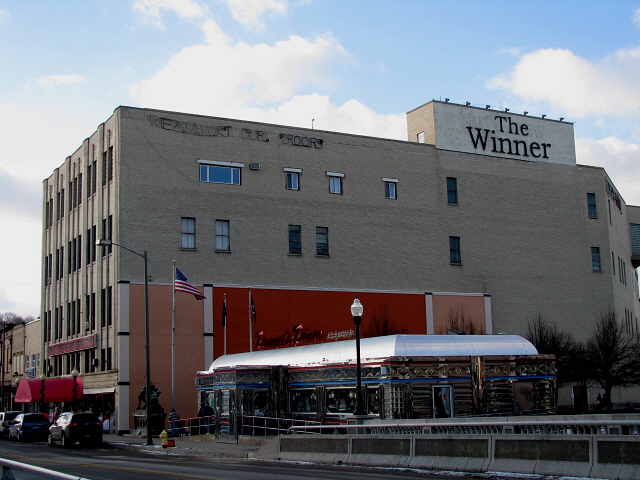
Prior to joining the team at Bialosky + Partners, Chelsey worked at Agnes Studio where she had interned since 2011. In addition to her work at Agnes, she has worked on freelance projects for Case Western Reserve University, Cuyahoga Community College, and Reclaimed Cleveland. Chelsey was attracted to the Bialosky team, as many of her favorite projects bridge the gap between the digital realm and the real world as tactile objects. This could be through environmental design or other means, with a particular interest in the ongoing life of projects and materials once the designer’s “scope of services” is complete. She brings value to our team with a multi-disciplinary skill set to engage with print and environmental design in unique ways. A native of Sharon, PA and former elevator operator at The World’s Largest Off-Priced Ladies’ Fashion store. Chelsey spent much of her childhood making “bad” fan websites for her favorite bands. Chelsey currently resides in Lakewood with her two feline roommates, Steve and Trevor. In her free time she enjoys riding bikes, drawing terrible horses, and telling bad jokes. One day she will own a kayak or a hammock to aid in her favorite hobby: marathon weekend napping.

The Winner - A Sharon, PA legend.
We recently sat down with Chelsey to learn a little more: Favorite designed object / project in the last year (could be a building, piece of graphic design, product design, etc.): I am a huge fan of pretty much anything Vallee Duhamel has produced in the last year—super playful graphic and motion design. I love to see designers bringing in tactile/handmade elements into their work.
Hidden talent: Not so much a hidden talent as much as a deep dark secret—I played bass in a sludge metal band called “Lightning Bug Collection” in high school. And I can solve a rubik's cube in a minute and a half. Alternate Reality Career: A florist or a CIA agent. If You Could Have Dinner With One Architect or Designer, who would it be and where or what would dinner be? Spaghetti with Massimo and Leila Vignelli off of their Heller dinnerware followed by an intense game of Risk and fashion parade of Leila’s jewelry.
Chelsey's table setting for dinner with Massimo and Leila Vignelli would look something like this.
We’re ignorant architects. What is the different between a typeface and a font? The best analogy I’ve ever heard for explaining the difference is that typeface is to song as MP3 is to font. Typeface refers to the design of the letter forms where as font refers to the physical (or digital) means for reproducing a letter. Bonus sub-question: Legendary designer Massimo Vignelli once said a designer should only use 5 typefaces (bodoni, helvetica, times roman, century and futura) in their career. Is he right or crazy? I obviously love Vignelli and think he’s pretty on point with this—while I love playing with new typefaces, I find that most that really stay with me are offshoots of those “classic” five.

